zj-port
v1.5.9
Published
Downloads
15

Readme
zjport

修订
| 修订人 | 时间 | 版本 | 备注 | | ------ | ---------- | ----- | ------------------------------------------------------------ | | 高成成 | 2022-05-24 | 1.3.7 | 新增使用指南 | | 高成成 | 2022-07-12 | 1.4.2 | EasyTable增加resetCurrentPage标志:列表刷新后是否将页码重置为1;支持斑马条纹;支持序号扩展项。新增大屏适配组件 | | 高成成 | 2023-01-10 | 1.5.2 | 修改案例,增加可视化使用文档 |
ps:版本是package.json的version
新增组件步骤
- 1、在目录 src/components 下新增组件同名的文件夹
- 2、增加组件和对应js,js用于导出单个组件
- 3、修改 src/index.js 文件,导入导出新增的组件
- 4、package.json version的版本递增如:1.0.7 -> 1.0.8
- 5、通知管理员,npm publish 上传到npm库
组件调试
可在app.vue内直接本地调试,新增一个组件就新增一个对应使用示例,再通知管理员更新文档。
组件引用
npm i zj-port同elementUI等组件框架,无需手工注册,在main.js内导入,然后use即可,如下:
import zjport from 'zj-port';
Vue.use(zjport);
注意事项
编写的组件需要定义 name 属性,原因如下:
// 遍历注册组件时候需要使用component.name 默认约定的规范是全小写,或者 小写-小写
const install = function (Vue, opts = {}) {
  components.map(component => {
  	Vue.component(component.name, component);
  })
};
使用指南
Tip: 以下示例会出现pug预处理写法,pug传送门
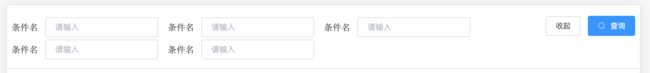
查询条件
TableSearch 查询条件栏
基础用法
tableSearch(@submit="search" :need-reset="true" @reset="reset" :showMoreCondition="false")
	div(slot="condition")
		el-form-item(label="查询条件")
			el-input(v-model="formData.a" size="small" placeholder="请输入" clearable)
search-group(
  :need-reset="true",
  :lableWidth="80",
  @submit="search",
  @reset="reset",
)
  div(slot="condition")
  	el-form-item(label="查询条件")
    	el-input(v-model="formData.x1" size="small" placeholder="请输入" clearable)
    el-form-item(label="查询条件")
    	el-input(v-model="formData.x2" size="small" placeholder="请输入" clearable)
    el-form-item(label="查询条件")
    	el-input(v-model="formData.x3" size="small" placeholder="请输入" clearable)
    el-form-item(label="是否")
      el-select(v-model="formData.x4" size="small" placeholder="请选择" clearable)
      	el-option( label="是" :value="1")
el-option( label="否" :value="2")使用TableSearch组件只需要使用slot="condition"引入插槽,在内部定义el-form-item表单项即可。
预览:

设置不隐藏
默认行内容超过3个条件,会显示更多,隐藏第二行,点击按钮伸缩隐藏内容。设置不隐藏,只要增加:showMoreCondition="true"
预览:
重置查询条件
table-search(:need-reset="true" @reset="reset")
	div(slot="condition")
		el-form-item(label="条件名")
el-input(v-model="formData.a" size="small" placeholder="请输入" clearable)重置查询条件,只需要开启选项:need-reset="true",同时自定义重置方法@reset="reset"
ps:因为重置不是单纯把入参置空,而是把入参重置到初始化状态,比如时间条件,重置为最近一周,所以需要自定义重置逻辑。
预览:

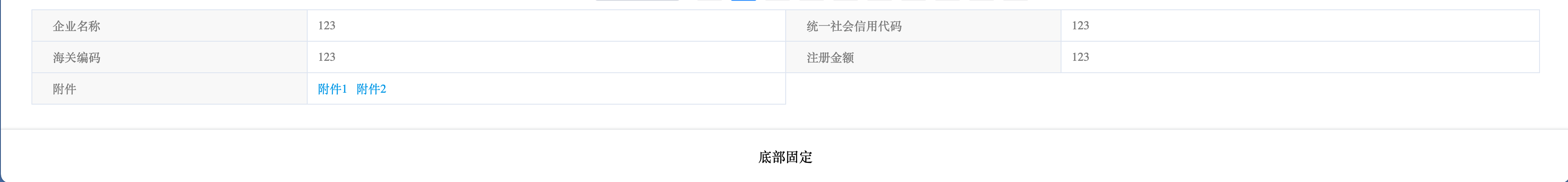
描述性表格
DescriptionsTable 描述性表格
基础用法
DescriptionsTable(:data="dTable")
// 数据
dTable: [
  {
    label: '企业名称',
    value: '123',
  }, {
    label: '统一社会信用代码',
    value: '123',
  }, {
    label: '海关编码',
    value: '123',
  }, {
    label: '注册金额',
    value: '123',
  }
],基础用法只有数据一项要求,格式要符合数组对象,对象属性为label和value。
预览:

默认span是6,以大众算法24格制,即一行有24/6 = 4列值对。可以设置:span="12"等比例,修改每行列数
预览

描述框内容自定义
部分场景需要自定义描述框的内容,比如附件,需要下载
descriptionsTable(:data="dTable" :span="12")
  template(v-slot:label)
    span 附件
  template(v-slot:value)
span.file-text 附件1 附件2 实现上述场景,只要使用v-slot:label和v-slot:value两个命名插槽,对应自定义名称和内容
预览:

底部固定
Fixed 底部固定
基础用法
Fixed
	template(v-slot)
div(style="text-align: center") 底部固定部分场景需要固定一块底部内容,比如底部按钮,底部菜单等。Fixed组件只要使用插槽即可完成这个场景。
预览:
内容滚动
内容滚动 RollingDynamic
基础用法
RollingDynamic.rolling(:data="financingData" :showNum="6" :cacheLength="15" :isScroll="true")
	template(v-slot:title)
		p.rolling_title 融资动态
	template(v-slot:list='item')
		p.rolling_item
			span {{item.data.company}} 在
			span {{item.data.date}} 申请了
			span {{item.data.product}}
// 数据
financingData: [
  { company: '杭州****公司1', product: "中国银行xxx产品", date: "08月10日" },
  { company: '杭州****公司2', product: "中国银行xxx产品", date: "08月10日" },
  { company: '杭州****公司3', product: "中国银行xxx产品", date: "08月10日" },
  { company: '杭州****公司4', product: "中国银行xxx产品", date: "08月10日" },
  { company: '杭州****公司5', product: "中国银行xxx产品", date: "08月10日" },
  { company: '杭州****公司6', product: "中国银行xxx产品", date: "08月10日" },
  { company: '杭州****公司7', product: "中国银行xxx产品", date: "08月10日" },
]
//- showNum = cacheLength 时,数据轮完停止,直到新数据加入后继续轮
RollingDynamic.rolling(:data="financingData" :showNum="6" :cacheLength="6")
template(v-slot:title)
p.rolling_title 融资动态
template(v-slot:list='item')
p.rolling_item <span>{{item.data.company}}</span> 在 <span>{{item.data.date}}</span> 申请了 <span>{{item.data.product}}</span>部分业务场景用到滚动效果,如滚动表格,滚动新闻等。RollingDynamic可以满足这类需求
使用这个组件,需要赋值数组数据:data="financingData",同时可选的自定义标题和自定义滚动内容。v-slot:list='item'插槽对应数组内对象,通过item.data取到对象数据。
ps: 若要实现滚动表格,v-slot:list='item' 在这个插槽下定义一行表格样式的内容即可
显示滚动行数
设置选项 :showNum="6" 即可,默认展示6行数据
滚动开关
设置选项 :isScroll="true" 即可,默认开启滚动
滚动数据缓存
设置选项 :cacheLength="15" 即可,默认15条数据
滚动数据缓存的使用场景:滚动内容是一个数组,而这个数据是由接口定时查询得到的最新数据,当接口返回最新数据是少量时,如2条,滚动内容只有2条,不符合期望。通过
cacheLength避免这类问题,由它指定实际滚动数据,滚动内容总数据为指定数量,如默认值15
预览:
分页表格
分页表格 easy-table
基础用法
easy-table(
	:columns="tableColumns"
	:data="tableData"
)
// 数据
tableData: [
  {
    aa: '如果超人不会飞',
    bb: 100,
    cc: 1,
  }, {
    aa: '如果超人不会飞2',
    bb: 200,
    cc: 1,
  },
],
// 列声明
tableColumns: [
  {
    name: 'aa',
    title: '字段1',
  },
  {
    name: 'bb',
    title: '字段2',
    show: () => {
    	return false;
    },
  },
  {
    name: 'cc',
    title: '字段3',
    formatter: (row, cell, value) => {
      let dic = {
        0: '申请中',
        1: '通过'
      };
      console.log(cell)
      return dic[value];
  	}
  },
  {
    title: '操作',
    type: 'operate',
    width: '150',
    buttons: [
      {
        name: '详情',
        click: this.doHandle.bind(this),
        show: (row) => {
          return row.cc == 1;
        }
      },
  	]
  }
],只需要声明表格数据-data和表格列字段-columns即可
表格数据 和 表格列字段 都要求是数组对象格式,columns通过name获取字段数据,title命名表格列名称
ps:name在数据源里不存在则返回空内容
预览:

显示分页
显示分页有两种情况
1、默认,当前表格行数量 大于 每页数量(pageSize) 自动显示分页。ps:pageSize默认一页10条数据
2、设置showPagination属性为 true。默认是false
mounted() {
  for (let i = 0; i <1200 ; i++) {
    this.tableData.push({
    	billNo: '如果超人不会飞'+i,
    })
  }
}
增加表格数据后
预览:
- 前端分页
使用场景,用户一般关注最新数据,且经常切换页面,减少了每次切换页面就触发接口调用的问题。
默认一次查询给200条,若数据不够,点击更多加载后200条。
选项设置:show-load-more="true",显示更多按钮,@load-more="loadMore"获取分页数据,如下将接口获取数据,concat拼接到原数据表格数组
easy-table(
  :tableLoading="loading"
  :columns="tableColumns"
  :data="tableData"
  @load-more="loadMore"
  :show-load-more="true"
)
// 查询更多
loadMore () {
  let page = this.tableData.length / 200;
  let data = {...this.formData};
  data.currentPage = page + 1;
  this.loading = true;
  queryInvtUpload(data).then((resp) => {
    this.loading = false;
    this.tableData = this.tableData.concat(resp.list ? resp.list : []);
  }).catch(() => {
  	this.loading = false;
  });
},
自定义表头样式
部分场景,表格需要自定义样式,使用headerStyle即可,入参为对象类型,对象内容是style内容
表格加载动画
设置tableLoading的布尔置即可
easy-table(
	:columns="tableColumns"
	:data="tableData"
	:tableLoading="tableLoading"
)
//
data() {
	return {
		tableLoading: false,
	};
}
// 可以在await前后时候,也可以使用then语法,加一层finally内使用。建议是后者,无论接口是否成功,加载动画应当都关闭
methods: {
	aysnc searchTable() {
		this.tableLoading = true;
		let resp = await search();
		this.tableLoading = false;
	},
	// or
	searchTable() {
		this.tableLoading = true;
		search().then((resp) => {
			...
		}).finally(() => {
			this.tableLoading = false;
		});
	},
}
高亮当前行
设置highlightCurrentRow的布尔值即可,默认true
表格高度
设置tableHeight即可,类型可以是 string 或者 number
显示表格线
设置border即可,布尔类型,默认false
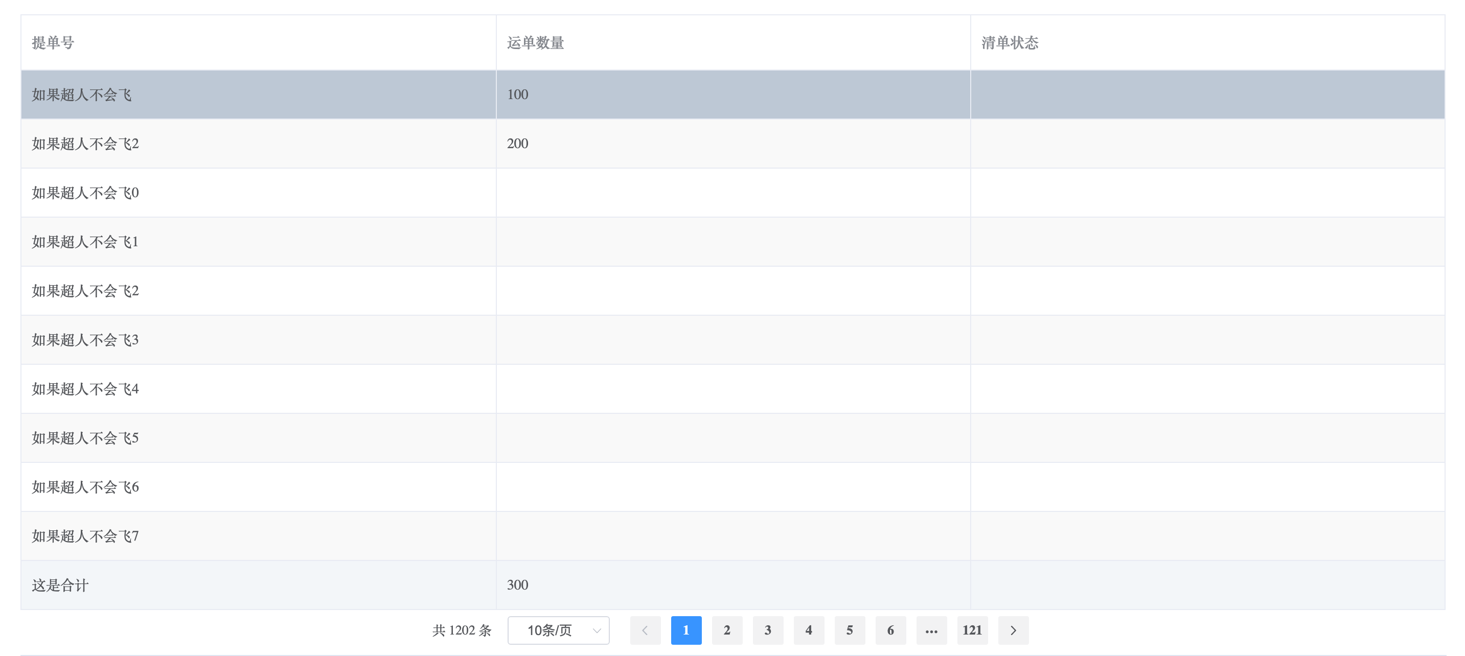
表格列内容合计
easy-table(
  :columns="tableColumns"
  :data="tableData"
  :border="true"
  :showSummary="true"
  sumText="这是合计"
  :needSummaryIndex="[1]"
)
// 数据
tableData: [
  {
    billNo: '如果超人不会飞',
    logisticsNo: 100,
  }, {
    billNo: '如果超人不会飞2',
    logisticsNo: 200,
  },
],
tableColumns: [
  {
    name: 'billNo',
    title: '提单号',
  },
  {
    name: 'logisticsNo',
    title: '运单数量',
  },
  {
    name: 'refundStatusName',
    title: '清单状态',
  },
],showSummary:是否显示合计行,布尔类型;
sumText: 自定义合计的文案,字符串类型;
needSummaryIndex:选择需要合计的列,第一列下标0,第二列下标1,如此类推。
预览:
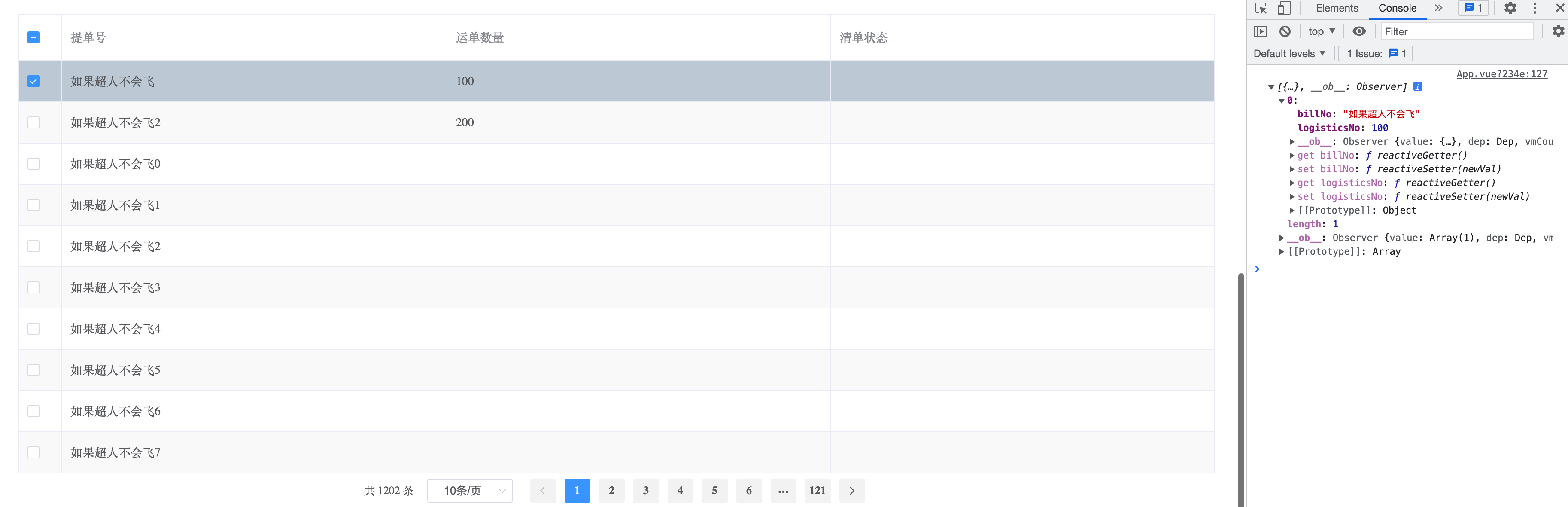
数据多选
部分场景需要勾选表格行数据,再结合其它业务操作。
easy-table(
  :columns="tableColumns"
  :data="tableData"
  :border="true"
  @current-change="(currentRow) => { selectedRow = currentRow }" // 选中的当前行数据
  :selection="true"
  @select="select"
  @select-all="selectAll"
)
//
methods: {
  select(row) {
  	console.log(row);
  },
  selectAll(rows) {
    console.log('全选');
    console.log(rows);
  },
},selection是否显示多选列,布尔类型;
@select选一行触发的事件;
@select-all选多行触发的事件
ps:回调内容见日志
预览:
操作列
部分场景需要在行内实现修改,删除,详情,申报等业务操作
// 列声明
tableColumns: [
  {
    name: 'billNo',
    title: '提单号',
  },
  {
    name: 'logisticsNo',
    title: '运单数量',
  },
  {
    name: 'refundStatusName',
    title: '清单状态',
  },
  {
    title: '操作',
    type: 'operate',
    width: '150',
    buttons: [
      {
        name: '申报',
        click: this.handleDeclare.bind(this),
        show: (row) => {
        	return row.logisticsNo == 100
        }
      },
    ]
  }
],
// 方法
methods: {
  handleDeclare(index, row) {
  	console.log(row);
  },
},在列声明时候增加type: 'operate'选项,buttons选项,类型是数组。buttons数组内一个对象,对应一个操作。show是在什么业务场景下可显示此操作,默认不写为true。click是点击操作后的回调方法,方法可得到当前行数据。
预览:
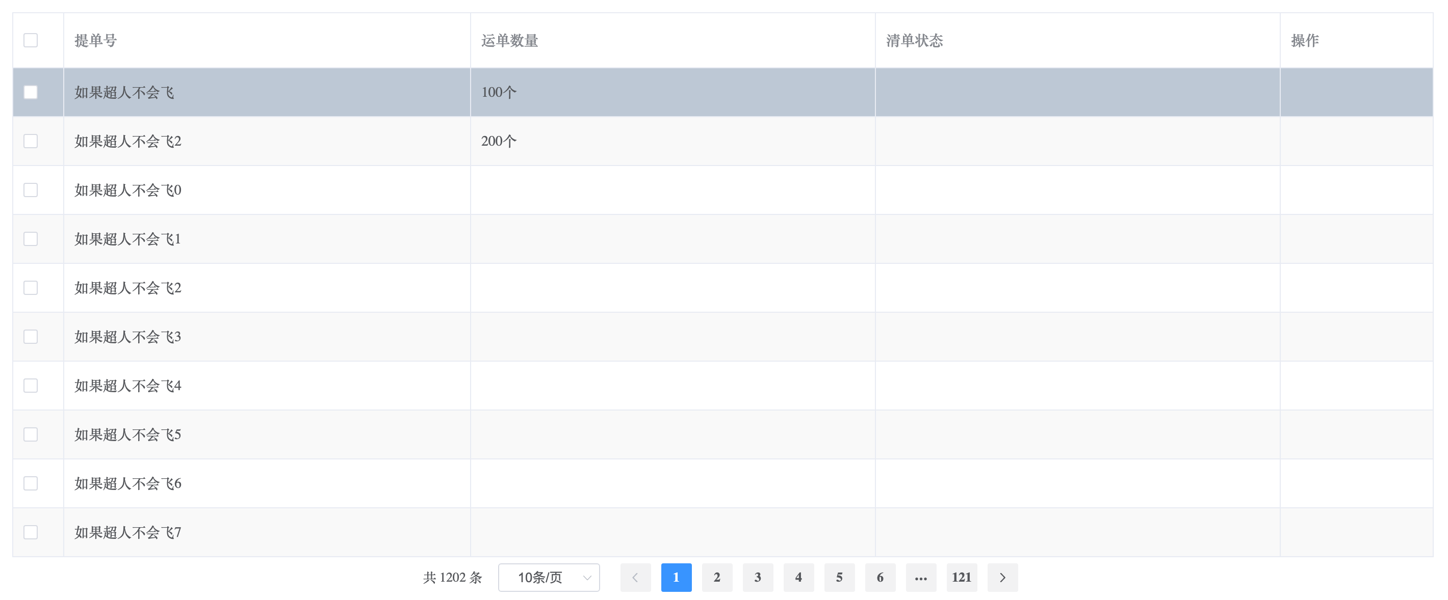
自定义列内容
部分场景列单元格需要自定义内容,如字典翻译,增加单位等
tableColumns: [
  {
    name: 'billNo',
    title: '提单号',
  },
  {
    name: 'logisticsNo',
    title: '运单数量',
    formatter: (row, column, cell) => {
      if (row.logisticsNo) return `${row.logisticsNo}个`
      return '';
    },
  },
  {
    name: 'refundStatusName',
    title: '清单状态',
  },
],增加formatter属性,return需要的字符串即可
预览: