yoshino
v0.8.25
Published
A customizable PC terminal component library based on react which has strong expansibility, it can output corresponding components according to different business scenarios.
Downloads
35
Readme
English | 🇨🇳简体中文
📄Docs
📔Usage
import * as React from 'react';
import { Button } from 'yoshino';

export default function () {
  return (
    <div>
      <Button type="primary">Primary</Button>
      <Button>Default</Button>
      <Button type="dashed">Dashed</Button>
      <Button type="danger">Danger</Button>
    </div>
  )
}
Using css via import:
import 'yoshino/lib/index.css'🤓Install
Using npm:
npm install yoshino --save👗Themes
Yoshino offer theme-site, developers can share yoshino-theme with others! How to share you themes?Follow the steps below:
- use yoshino-cli to genearate theme template and do what you want
- upload yours themes to github
- fork this rep and edit
docs/pages/themes/index.tsxto add your theme msg - then pull request
- merge and you can search your theme on theme-site
Developes want to use these themes?click yoshino-cli
🤔How to Design?
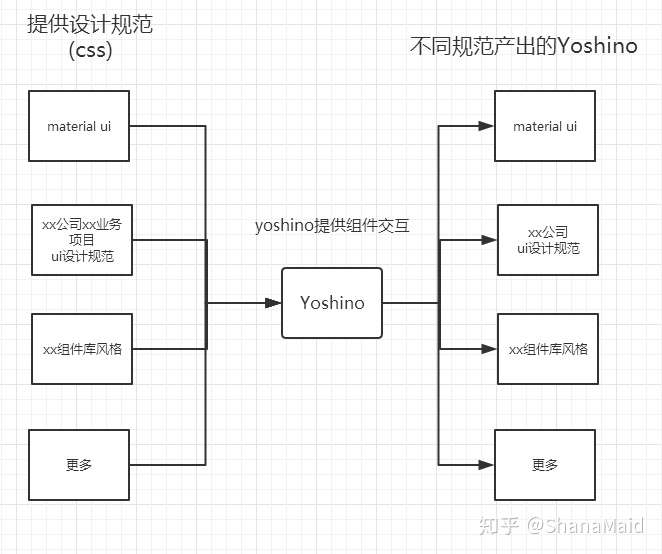
Yoshino is similar to Hexo.The different style components of yoshino are equal to Hexo various theme,Hexo official only provides a set of tools and a basic theme. Yoshino is also such.
Developers can output the components of the style they need, just like configuring the Hexo theme. You can even use cli to output multiple different styles of components in the same project.
Different themes of Yoshino need to be completed by the open source community, and the official will provide a similar yoshino-theme-site to show different themes, similar to hexojs/site

Currently the yoshino-cli tool only supports component creation outputs, such as creating custom Alert components.
yoshino new AlertLater, yoshino-cli can output corresponding specification components through instructions similar to the following, such as outputting the Alert component of the material-ui specification.
yoshino new Alert --theme material-uiEven a component library that directly outputs the entire theme.
yoshino new all --theme material-ui✨Features
- Develop with
TypeScript, provided.tsfiles to help developers increase development speed - Advocate the concept of
OFA(one for all)andAFO(all for one), before project development by yoshino-cli. According to project ui, standardize the output of components. - In addition to the simple and generic
uicomponent,yoshinodraws out some of the more usable effects (features) components, such as- Helpers
- Ripple
- Transitions
Iconcomponent based on archer-svgs, load on demand, only load.svgthat you use
👍Contributos
💪Development process
npm run dev // 启动开发环境
npm run new ComponentName // 新建组件