yaa-grid
v0.2.0
Published
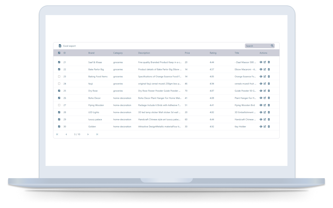
YAA Grid control is a powerful and flexible tool for displaying and manipulating data. Specify your datasource and field names and you're ready to go. The Grid also offers support for features such as sorting, filtering, paging. These features allow you t
Downloads
17
Maintainers
Readme
YAA Grid
YAA Grid control is a powerful and flexible tool for displaying and manipulating data. Specify your datasource and field names and you're ready to go. The Grid also offers support for features such as sorting, filtering, paging. These features allow you to easily manipulate and present large datasets in an efficient and user-friendly way.
PS this package is under development, please contact me for additional features

Changelog
Theme color customization by passing color prop e.g. color="red", color="#406882"
Images support are now added you just need to specify its type as below
{ field: 'thumbnail', header: 'Thumbnail', type: 'img', width: '100' },Striped table view
Custom actions icons
Setup
To install the Grid and its dependent packages, use the following command.
npm install yaa-grid # or yarn add

import "yaa-grid/dist/style.css";
Using the library
Now it’s time to cover use cases. Starting from its basic form.
import { Grid } from 'yaa-grid';

import 'yaa-grid/dist/style.css';

const App: React.FC = () => {
  const [data, setData] = React.useState();
  const [loading, setLoading] = React.useState(false);
  const [pageNumber, setPageNumber] = React.useState(1);

  React.useEffect(() => {
    const fetchData = async () => {
      setLoading(true);
      const data = await fetch(`https://dummyjson.com/products?skip=${(pageNumber - 1) * 10}&limit=10`);

      const result = await data.json();

      setData(result);
      setLoading(false);
    };

    fetchData();
  }, [pageNumber]);

  /*
   * Column width is measured by pixels
   */
  const columns = [
    { field: 'id', header: 'ID', width: '50' },
    { field: 'brand', header: 'Brand', width: '100' },
    { field: 'category', header: 'Category', width: '100' },
    { field: 'description', header: 'Description', width: '200' },
    { field: 'price', header: 'Price', width: '100' },
    { field: 'rating', header: 'Rating', width: '100' },
    { field: 'title', header: 'Title', width: '100' },
    { field: 'thumbnail', header: 'Thumbnail', type: 'img', width: '100' },
  ];

  const onView = (e: string) => alert(`View ${e}`);
  const onEdit = () => alert('edit');
  const onDelete = () => alert('delete');

  return (
    <Grid
      rtl={false}
      // variant="stipe"
      search={false}
      jsonExport={false}
      data={data?.products}
      onView={onView}
      onEdit={onEdit}
      onDelete={onDelete}
      loading={loading}
      columns={columns}
      pageSize={10}
      pageNumber={pageNumber}
      totalRecords={data?.total}
      setPageNumber={setPageNumber}
      onSelect={(ids: any) => alert(ids)}
    />
  );
};
Props
| Name | Type | Description |
| --------------- | -------------------------------------------------- | ----------------------------------- |
| data | any | Data source |
| color | string | e.g. "red" or "#406882" |
| columns | { field: string; header: string; width: string }[] | columns data shape |
| variant | string | stripe |
| height | string | Set the grid height |
| rtl | boolean | RTL support for arabic |
| search | boolean | display search input |
| jsonExport | boolean | display export option |
| loading | boolean | defaultValue: false |
| pageNumber | number | defaultValue: 1 |
| totalRecords | number | used only with frontend pagination. |
| viewIcon | ReactNode | |
| editIcon | ReactNode | |
| deleteIcon | ReactNode | |
| onView | (id: string) => void | |
| onEdit | (id: string) => void | |
| onDelete | (id: string) => void | |
| onSelect | (ids: string[]) => void | Perform action on selected records |
| setPageNumber | React.Dispatch<React.SetStateAction> | Pagination |
Contact
Please contact me for adding more features or package ideas
