npm package discovery and stats viewer.

Discover Tips

  • General search

    [free text search, go nuts!]

  • Package details

    pkg:[package-name]

  • User packages

    @[username]

Sponsor

Optimize Toolset

I’ve always been into building performant and accessible sites, but lately I’ve been taking it extremely seriously. So much so that I’ve been building a tool to help me optimize and monitor the sites that I build to make sure that I’m making an attempt to offer the best experience to those who visit them. If you’re into performant, accessible and SEO friendly sites, you might like it too! You can check it out at Optimize Toolset.

About

Hi, 👋, I’m Ryan Hefner  and I built this site for me, and you! The goal of this site was to provide an easy way for me to check the stats on my npm packages, both for prioritizing issues and updates, and to give me a little kick in the pants to keep up on stuff.

As I was building it, I realized that I was actually using the tool to build the tool, and figured I might as well put this out there and hopefully others will find it to be a fast and useful way to search and browse npm packages as I have.

If you’re interested in other things I’m working on, follow me on Twitter or check out the open source projects I’ve been publishing on GitHub.

I am also working on a Twitter bot for this site to tweet the most popular, newest, random packages from npm. Please follow that account now and it will start sending out packages soon–ish.

Open Software & Tools

This site wouldn’t be possible without the immense generosity and tireless efforts from the people who make contributions to the world and share their work via open source initiatives. Thank you 🙏

© 2024 – Pkg Stats / Ryan Hefner

x-toggle-button

v0.0.2

Published

Component for simple toggle button

Downloads

5

Readme

Built With Stencil

Simple Toggle Button

A simple toggle button to be used in any app as a component, made using Stenciljs.

Node Modules

Run npm install x-toggle-button --save

Put a script tag similar to this <script src='node_modules/x-toggle-button/dist/toggle-button.js> in the head of your index.html Then you can use the element anywhere in your template, JSX, html etc.
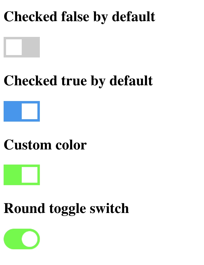
##Appearance Demo

#In a stencil-starter app

Run npm install x-toggle-button --save Add this import to your root component or root module: import 'x-toggle-button';

Then you can use the anywhere in your template, JSX, html etc

Parameters

| Attribute | Default | Description | | --------------- | ----------------- | --------------------------------------------------- | | type | round | Available types are round and square | | checked | false | true or false to check or uncheck the toggle button | | name | 'x-toggle-button' | Component name | | checked-color | #2196F3 | Any Color code in HEX | | unchecked-color | #CCCCCC | Any Color code in HEX |

Retrieving value for toggle switch

Getting the value is very easy, you can do the following

document.getElementById("toggle-button").checked

It will always return either true or false based on the current state of the toggle button.

#License Free to use and modify for personal and commercial purposes as well.

PS: Credits to w3schools.com for help in css.