wxser
v1.1.1
Published
cli for wxser
Downloads
121

Readme
wxser 命令行工具 npm install -g wxser
- 小程序如何使用wxser :
- 获取框架代码
- 方式一
- wxser.wxss
- 在app.wxss内添加
import wxser.wxss
- 方式二
- 首先确保已经安装wxser :
npm install -g wxser - 使用wxser命令获取框架代码 :
wxser code - 在app.wxss内粘贴内容即可
- 首先确保已经安装wxser :
- 【到这步则已经引用了该文件, 后续可以按照框架文档开发界面了】
- 方式一
- 若需要wxser辅助快速开发,则打开控制台
- 首先确保已经安装wxser :
npm install -g wxser - 使用wxser命令
wxser ls列出所有元素wxser get <type>指定查看某类元素的二级类型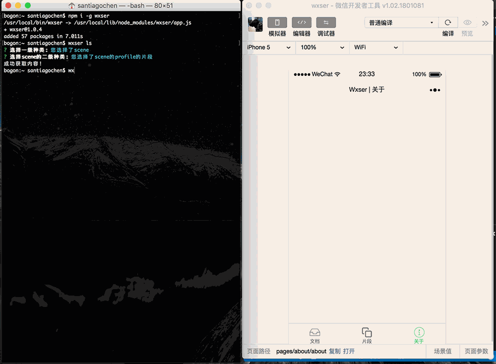
- 首先确保已经安装wxser :
- 获取框架代码
- 框架文档
- 基础
- 文本对齐方式
has-text-left, has-text-centered, has-text-right - 文本颜色
has-text-dark, has-text-gray, has-text-white, has-text-danger, has-text-info, has-text-warning, has-text-primary - 背景颜色
has-bg-dark, has-bg-gray, has-bg-white, has-bg-danger, has-bg-info, has-bg-warning, has-bg-primary - 主题颜色(应用于容器或复合组件)
is-dark, is-white, is-danger, is-info, is-warning, is-primary - 形状
is-square(方形), is-round(圆形) - 尺寸
is-large(大),
is-medium(中),
is-small(小)
- 文本对齐方式
- 表单
- button 可应用颜色,尺寸,形状
wxser命令:
wxser get button - input 可应用颜色,尺寸,形状
wxser命令:
wxser get input - textarea 可应用颜色,尺寸,形状
wxser命令:
wxser get textarea
- button 可应用颜色,尺寸,形状
wxser命令:
- 容器
- section
<view class="section"></view>wxser命令:wxser get section - container
<view class="container"></view>wxser命令:wxser get container - hero 可应用主题
<view class="hero"></view>wxser命令:wxser get hero - footer
<view class="footer"></view>wxser命令:wxser get footer
- section
- 布局
- 网格 [columns>column] 一行(columns)最多12等分(column)
- columns
<view class="columns"></view>wxser命令:wxser get columns - column
<view class="column"></view>wxser命令:wxser get column - 细节
- 按column个数等分columns

<view class="columns"> <view class="column"></view> <view class="column"></view> <view class="column"></view> <view class="column"></view> </view> - 指定size的column [ is-{size} ];
e.g. is-2, is-3, ..., is-11

<view class="columns"> <view class="column is-6"></view> <view class="column"></view> </view> - 指定几分之几的column [ is-{num-numth} ];
e.g. is-one-third, is-half, ..., is-three-quarter

<view class="columns"> <view class="column is-one-third"></view> <view class="column"></view> </view> - 指定具体px的column [ is-narrow ] 同时指定 style="width:280px" ;

<view class="columns"> <view class="column is-narrow" style="width:280px"></view> <view class="column"></view> </view> - 指定偏移的column [ is-offset-{size} ] ;
e.g. is-offset-2, is-offset-4, ...

<view class="columns">
    <view class="column is-6 is-offset-3"></view>
    <view class="column"></view>
</view>
- 按column个数等分columns
- columns
- 浮动 [float>float-left] [float>float-right]
wxser命令:
wxser get float- 细节
- 左浮动
<view class="float"> <view class="float-left"></view> </view> - 右浮动
<view class="float">
    <view class="float-right"></view>
</view>
- 左浮动
- 细节
- 乐高 [lego]+[is-ancestor|is-parent|is-child]+[is-vertical]
wxser命令:
wxser get lego- 细节
- 水平乐高

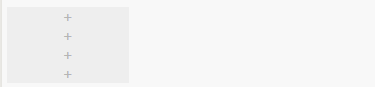
<view class="lego is-ancestor"> <view class="lego"><text>+</text></view> <view class="lego"><text>+</text></view> <view class="lego"><text>+</text></view> <view class="lego"><text>+</text></view> </view> - 垂直乐高
<view class="lego is-ancestor is-vertical"> <view class="lego"><text>+</text></view> <view class="lego"><text>+</text></view> <view class="lego"><text>+</text></view> <view class="lego"><text>+</text></view> </view> - 混合乐高
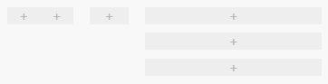
<view class="lego is-ancestor">
    <view class="lego is-3">
        <view class="lego is-parent">
            <view class="lego is-child"><text>+</text></view>
            <view class="lego is-child"><text>+</text></view>
        </view>
    </view>
    <view class="lego is-2">
        <view class="lego is-parent">
            <view class="lego is-child"><text>+</text></view>
        </view>
    </view>
    <view class="lego is-7">
        <view class="lego is-parent is-vertical">
            <view class="lego is-child"><text>+</text></view>
            <view class="lego is-child"><text>+</text></view>
            <view class="lego is-child"><text>+</text></view>
        </view>
    </view>
</view>
- 水平乐高
- 细节
- 大头针 [pin]+[top|bottom|center]?+[abs]
- wxser命令:
wxser get pin - 细节
- fixed定位
- center
<view class="pin center"><view>+</view></view> - top
<view class="pin top"><view>+</view></view> - bottom
<view class="pin bottom"><view>+</view></view>
- center
- absolute定位
- center
<view class="pin abs center"><view>+</view></view> - top
<view class="pin abs top"><view>+</view></view> - bottom
<view class="pin abs bottom"><view>+</view></view>
- center
- fixed定位
- wxser命令:
- 网格 [columns>column] 一行(columns)最多12等分(column)
- 组件
- wxser命令:
wxser get {组件名} - 组件名:
- accordion
- accordions
- breadcrumb
- card
- comment
- icon(遵循Font-Awesome规范)
- media
- menu
- message
- modal
- notification
- panel
- tabs
- tag
- wxser命令:
- 基础