webform-toolkit
v3.1.5
Published
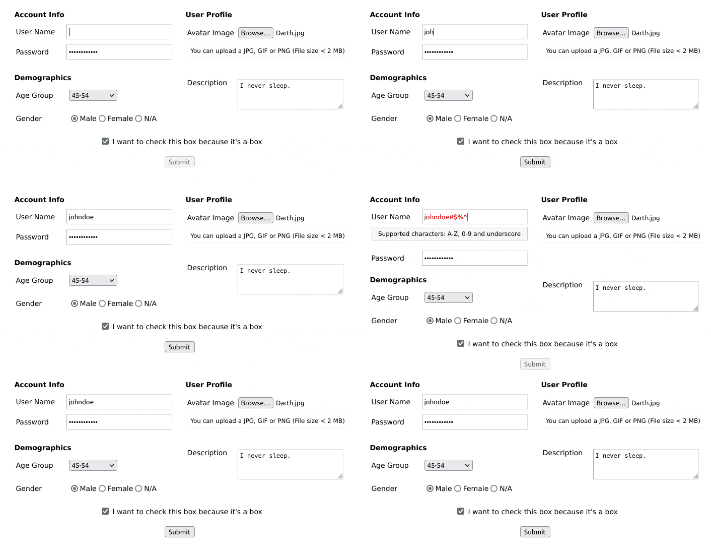
Create a HTML form with field validation and custom errors.
Downloads
119
Maintainers
Readme
Webform Toolkit
Create a HTML form with field validation and custom errors.

Features
- Extensible HTML/CSS interface.
- Compatible with all modern desktop and mobile web browsers.
- Easy to set-up and customize. No dependencies.
- Provides form input validation using REGEX (regular expressions)
- Supports synchronous form-data POST
- Supports FORM submit callback for custom AJAX handling.
- Supports dynamic (on the fly) field creation.
Checkout the demo for examples of use.
Dependencies
Installation
Install the package into your project using NPM, or download the sources.
$ npm install webform-toolkitUsage
There are two ways you can use this package. One is by including the JavaScript/CSS sources directly. The other is by importing the module into your component.
Script include
After you build the distribution sources the set-up is fairly simple..
<script type="text/javascript" src="path/to/webform-toolkit.min.js"></script>
<link rel="stylesheet" href="path/to/webform-toolkit.min.css" media="all" />

<script type="text/javascript">
  webformToolkit(container, settings, callback);
</script>
Module import
If your using a modern framework like Aurelia, Angular, React, or Vue
import WebFormToolkit from 'webform-toolkit';
import 'webform-toolkit/dist/webform-toolkit.css';

const webformToolkit = new WebformToolkit(container, settings, callback);
HTML markup
<div id="webform-toolkit"></div>Example
const settings = {
  action: 'https://www.domain.com/handler',
  params: 'name1=value1&name2=value2',
  submit: false, // Override submit button creation.
  groups: [
    {
      legend: 'Login Form',
      fields: [
        {
          id:          'username',
          label:       'User Name',
          type:        'text',
          name:        'username',
          value:       null,
          maxlength:   15,
          filter:      '^\\w{0,15}$',
          description: null,
          placeholder: null,
          error:       'Supported characters: A-Z, 0-9 and underscore',
          required:    true
        },
        {
          id:          'password',
          label:       'Password',
          type:        'password',
          name:        'password',
          value:       null,
          maxlength:   15,
          filter:      '^(?!password)(.{0,15})$',
          description: null,
          placeholder: null,
          error:       'The password entered is not valid',
          required:    true
        }
      ]
    }
  ]
};

const container = document.getElementById('webform-toolkit');

const webformToolkit = new WebformToolkit(container, settings, callback);
Supported types
checkbox, color, date, email, file, hidden, number, password, quantity, radio, range, select, submit, text, textarea, time
Field definitions
| Attribute | Description | Required |
|-------------|---------------------------------------------------------|----------|
| id | Field ID value. | true |
| label | Field label value. | true |
| type | Supported types | true |
| name | Form element name. | true |
| value | Default value. | false |
| maxlength | Input maximum length (password, text) | false |
| max | Input number max (number, quantity) | false |
| min | Input number min (number, quantity) | false |
| step | Input number step (range) | false |
| filter | Validate form input using REGEX | false |
| description | Custom field description (Supported text tokens). | false |
| placeholder | Input field type placeholder text. | false |
| error | Custom error message (Required, if filter is defined) | false |
| required | Required field. | false |
Supported text tokens
The following Markdown elements are supported in the description attribute:
| Token Type | Example | |--------------|--------------------------| | Bold | **bold** | | Italic | *italic* | | Link | [alt text](https://www.example.com) |
Callback processing
When a callback function is defined a form object is returned. This allows you to define a custom AJAX handler based on the requirements of your application. The following function corresponds to the example provided above.
function callback(form) {
  const xhr = new XMLHttpRequest();

  xhr.addEventListener('load', function() {
    if (this.status == 200) {
      alert(response);
    }
  });

  xhr.open('POST', form.getAttribute('action'));
  xhr.send(new FormData(form));
}
Adding fields
I have added a method to dynamically create form fields that can be added to an existing webform. An optional callback has also been provided to for post-processing FORM and field elements. This makes it easy to show/hide fields using conditions and expressions.
webformToolkit.create({
  id:          'new_field_id',
  label:       'New Field',
  type:        'text',
  name:        'new_field',
  value:       null,
  maxlength:   null,
  filter:      '^[a-zA-Z0-9_]{0,255}$',
  description: 'This is my new field',
  placeholder: null,
  error:       'Supported characters: A-Z, 0-9 and underscore',
  required:    true
},
function(form, elm) {
  form.appendChild(elm); // default: last in fieldset
});
Best practices
Just because you are filtering form input on the client-side is NO EXCUSE to not do the same on the server-side. Security is a two-way street, and BOTH ends should be protected.
Developers
CLI options
Run ESLint on project sources:
$ npm run lintTranspile ES6 sources (using Babel) and minify to a distribution:
$ npm run buildRun WebdriverIO E2E tests:
$ npm run testContributions
If you fix a bug, or have a code you want to contribute, please send a pull-request with your changes. (Note: Before committing your code please ensure that you are following the Node.js style guide)
Versioning
This package is maintained under the Semantic Versioning guidelines.
License and Warranty
This package is distributed in the hope that it will be useful, but without any warranty; without even the implied warranty of merchantability or fitness for a particular purpose.
webform-toolkit is provided under the terms of the MIT license


