
vue3-timetable
v1.1.0
Published
A versatile timetable component for Vue 3
Downloads
120
Maintainers
 michelvermeer
Readme
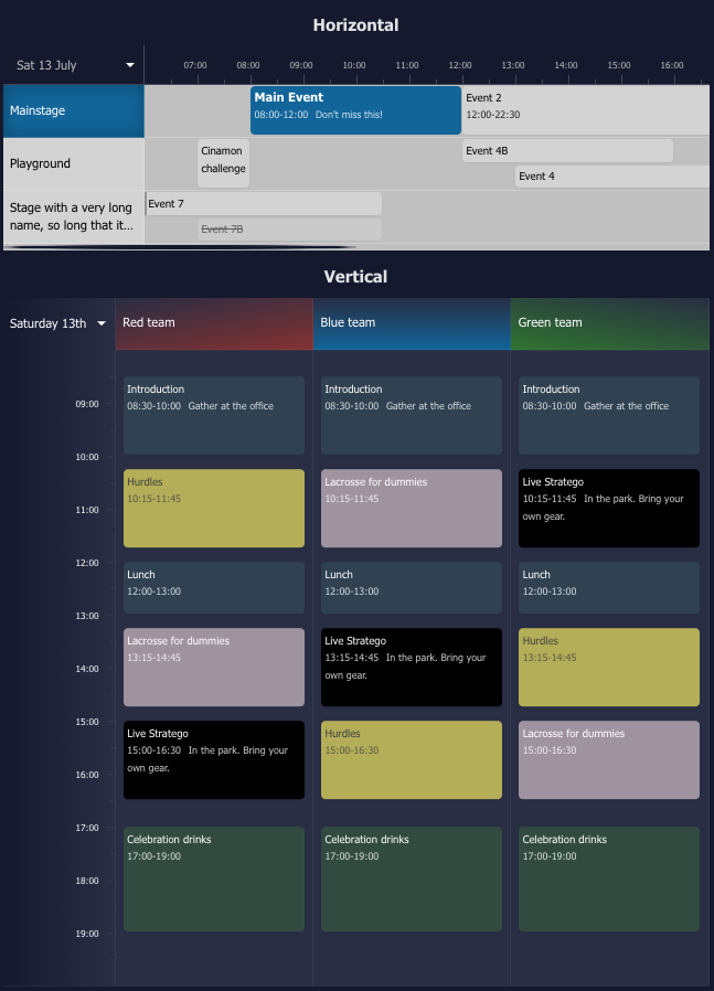
Vue 3 Timetable
A versatile, configurable and responsive timetable component for Vue 3. Ideal for showing the agenda for locations on a specific date.
Changes in version 1.1
- Items can contain a
cancelledproperty - Increased test coverage
- Items starting before or ending after the timetable scope show an indicator
- Increased configurability of the timetable style and its locations and items
- The current time indicator can be hidden
- Fixed the horizontal scrollbar which was hidden, so mouse-only users couldn't scroll horizontally
- The display format of the dates is now configurable
- Selectable dates can be predefined using the
datesoption - Timetable data can be loaded asynchronously using
onDateChange
Installation
npm i vue3-timetableUsage example
<script lang="ts">
import { defineComponent } from 'vue';
import { TimeTable, type TimeTableItem, type TimeTableLocation } from 'vue3-timetable';

export default defineComponent({
    name: 'App',
    components: { TimeTable },
    setup() {
      const items: TimeTableItem[] = [
        {
          id: "e3",
          locationId: 2,
          startDate: `2024-07-09T14:00:00`,
          endDate: `2024-07-09T16:00:00`,
          name: "Surprise Event",
        }
      ];

      const locations: TimeTableLocation[] = [
        {
            id: 1,
            name: "Mainstage",
            items: [
              {
                id: "e1",
                startDate: `2024-07-09T08:00:00`,
                endDate: `2024-07-09T11:00:00`,
                name: "Main Event",
                info: "Don't miss it!",
                style: {
                  backgroundColor: "#999",
                  color: "#000",
                },
              },
            ],
          },
          {
            id: 2,
            name: "Playground",
            items: [
              {
                id: "e2",
                startDate: `2024-07-09T12:00:00`,
                endDate: `2024-07-09T17:00:00`,
                name: "Fun Time",
                cancelled: true,
              },
            ],
          }
      ];

      return {
        items,
        locations,
      };
    },
  });
</script>

<template>
  <div class="timetable">
    <TimeTable variant="horizontal" :items="items" :locations="locations" />
  </div>
</template>
API Reference
TimeTable
Options
| Option | Type | Required | Default | Description |
| --------------- | ---------------------------------------------------- | -------- | ----------- | ----------------------------------------------------------------------------------------------------------------------------------------------------------------- |
| locations | TimeTableLocation[] | yes | | The locations to show in the timetable |
| items | TimeTableItem[] | no | [] | The events to show in the timetable |
| variant | string | no | horizontal | The display style of the timetable. Can be horizontal or vertical. Defaults to vertical when unspecified and there is only 1 location |
| dates | string[] | no | | Predefined dates to choose from to load timetable data async with onDateChange. The first date will be selected by default. The format needs to be yyyy-MM-dd |
| startingHour | number | no | 6 | Starting hour of a day |
| numberOfHours | number | no | 24 | Number of hours to display for a single day |
| styles | TimeTableStyles | no | | Custom styling to apply to the timetable |
| onDateChange | function(date: string) => void | no | | Callback function when a date is changed |
| onItemClick | function(item: TimeTableRenderedItem<T>) => void | no | | Callback function when an item is clicked |
| onLocationClick | function(item: TimeTableLocation) => void | no | | Callback function when a location is clicked |
| dateFormat | string | no | eee dd MMMM | Date format of the date picker. Guide |
| showTimeMarker | boolean | no | true | Show or hide the current time marker |
TimeTableLocation
Options
| Option | Type | Required | Default | Description | | ------ | ------------------------------------------- | -------- | ------- | ----------------------------- | | id | string / number | yes | | Location ID | | name | string | yes | | Location name | | items | TimeTableItem[] | no | | Event items for the location | | style | CustomCSSProperties | no | | Custom style for the location |
TimeTableItem
Options
| Option | Type | Required | Default | Description | | --------- | ------------------------------------------- | -------- | ------- | ----------------------------------------- | | id | string / number | yes | | Item ID | | name | string | yes | | Item name | | info | string | no | | Item extra information | | startDate | Date / string | yes | | Item start date | | endDate | Date / string | yes | | Item end date | | data | {} | no | | Optional extra data. Useful for callbacks | | style | CustomCSSProperties | no | | Custom style for the item | | className | string | no | | Custom additional class for the item | | cancelled | boolean | no | false | Shows the item as cancelled |
TimeTableStyles
Options
| Option | Type | Default | Description | | ------------------------- | -------- | ------------------------ | ----------------------------------------------------------- | | backgroundColor | string | #1f2937 | Timetable Background | | borderStyle | string | solid 2px #374151 | CSS Border style, specify "none" to remove borderStyle | | dateBackgroundColor | string | #1f2937 | Background of the date and hours. Avoid using "transparent" | | dateTextColor | string | inherit | Text color of the date and hours | | datePickerBackgroundColor | string | #1f2937 | Background of the date picker | | itemBackgroundColor | string | #304151 | Background of an item | | itemTextColor | string | inherit | Text color of an item | | locationBackgroundColor | string | #000 | Background of a location | | locationTextColor | string | inherit | Text color of a location | | textColor | string | #fff | General text color used in the timetable | | timeMarkerColor | string | rgba(255, 255, 255, 0.3) | Color of the current time indicator |
CustomCSSProperties
Options
| Option | Example | Description | | --------------- | ------------------------------------- | ---------------- | | background | #1f2937 | Background | | backgroundColor | red | Background color | | border | solid 2px #000 | Border style | | boxShadow | inset 0 0 5px 5px #000 | Box shadow | | color | blue | Text color | | font | italic small-caps bold 16px/2 cursive | Font properties | | fontWeight | bold | Font weight | | fontSize | 14px | Font size | | fontFamily | Arial, sans-serif | Font family | | fontStyle | italic | Font style | | opacity | 0.8 | Opacity |