
vue-virtual-selector
v1.1.1
Published
Blazing fast scrolling for any amount of data (based on : Akryum/vue-virtual-scroller)
Downloads
161
Maintainers
 kwange
Readme
vue-virtual-selector


⚡️ Blazing fast scrolling for any amount of data (based on : Akryum/vue-virtual-scroller)
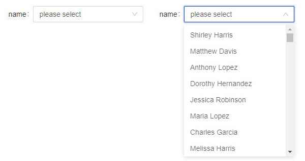
Demo : Select PK
Installation
npm install --save vue-virtual-selectorImport
Install the component :
import Vue from "vue";
import VueVirtualSelector from "vue-virtual-selector";

Vue.use(VueVirtualSelector);
Usage
Basic usage
<VirtualSelector
  :list="list"
  :option="listOption">
</VirtualSelector>
or
<virtual-selector
  :list="list"
  :option="listOption">
</virtual-selector>
The list and option props are required.
Using all props, events and slots as follows.
<virtual-selector
  :loading="loading"
  label="virtual selector"
  placeholder="please select"
  v-model="selected"
  :list="list"
  :option="listOption"
  @focus="handleFocus"
  @search="handleSearch"
  @select="handleSelect">
  <div slot="loading">loading...</div>
  <div slot="item" slot-scope="{ item }">
    {{ item.name }}
  </div>
</virtual-selector>
. . .
<script>
export default {
  data() {
    return {
      loading: false,
      selected: {},
      list: [],
      listOption: {
        itemNameKey: "name",
        itemValueKey: "value",
        itemPageSize: 8,
        itemGap: 5,
      },
    };
  },
  methods: {
    handleFocus( { id, focus } ) {
      console.log("focus : ", { id, focus });
    },
    handleSearch( { id, search } ) {
      this.selected = search;
      console.log("search : ", { id, search });
    },
    handleSelect( { id, select } ) {
      this.selected = select;
      console.log("select : ", { id, select });
    },
  },
}
</script>
"list" data example :
[
  {
    name: "aaa",
    value: "1",
  },
  {
    name: "bbb",
    value: "2",
  },
  {
    name: "ccc",
    value: "3",
  },
];
In this example, "itemNameKey" of "listOption" is "name", "itemValueKey" of "listOption" is "value", which are specifing dropdown item display and value.
If you want to select a value by default, selected data should be assigned like below
this.selected = { name: "aaa", value: "1" };Props
v-model (Object): vue directive, to create two-way data bindings.list (Array): list of items display in the selector dropdown.label (String): when you want to show what the selector is, give this option.placeholder (String): input element's placeholder.loading (Boolean): this option works with slot.option (Object): this option use withlistprop, and contain some properties.itemNameKey (String): specify selector dropdown item display.itemValueKey (String): specify selector dropdown item value.itemPageSize (Number): specify how many items display in the dropdown box (default is 8).itemGap (Number): specify interval between the items (default is 0).
Events
focus: emitted when the input focused.search: emitted when the input changed.select: emitted when the dropdown item is selected.
Every event callback function will get a emitted data, which is object type, contain component id and event data named with event name.
Slots
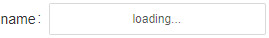
You can set loading like below
<virtual-selector>
  <div slot="loading">loading...</div>
</virtual-selector>
The display effect is as follows :
Usually, we need to customize the selector dropdown item. for this purpose, there is item slot to use.
<virtual-selector>
  <div slot="item" slot-scope="{ item }">
    {{ item.name }} ({{ item.value }})
  </div>
</virtual-selector>
In this case, if you want to select a value by default, and display with the customize pattern, please complete this job at selected name (itemNameKey) property.
For example, customized selector dropdown item like this "aaa (1)", "bbb (2)", "ccc (3)" (under the above list data example). the default setted value display should be like this.
this.selected = { name: "aaa (1)", value: "1" };