
vue-table-data
v1.0.6
Published
`vue-table-data`is a highly customizable data table component designed for Vue 3. It provides robust features such as pagination, sorting, and filtering, making it a powerful tool for displaying and managing tabular data in Vue 3 applications. This compon
Downloads
23
Maintainers
 ylberzeqiri
Readme
Vue 3 Data Table Component
vue-table-datais a highly customizable data table component designed for Vue 3. It provides robust features such as pagination, sorting, and filtering, making it a powerful tool for displaying and managing tabular data in Vue 3 applications. This component is designed for seamless integration into Vue 3 projects and offers extensive customization options to fit various design needs.
Features
- Pagination: Navigate through pages of data.
- Sorting: Sort data by column in ascending or descending order.
- Filtering: Filter data by column with dynamic filters.
- Customization: Easily customize styles and column widths.
Installation
To install this component via npm, use the following command:
npm i vue-table-datausage / example
import vue3datatable compnent in main.js:
import vue3datatable from "vue-table-data";
import "vue-table-data/dist/style.css";

const app = createApp(App);
app.use(vue3datatable);
app.mount("#app");
use of the vue3Datatable
<script setup>
const options = {
showCard: true,
columns: [
{
key: "id",
name: "Id",
filter: true,
sort: true,
width: "90px",
},
{
key: "name",
name: "Name",
filter: true,
sort: true,
},
{
key: "lastName",
name: "LastName",
filter: true,
sort: true,
},
],
data: [
{ id: 1, name: "Alina", lastName: "Smith" },
{ id: 2, name: "John", lastName: "Dozez" },
{ id: 3, name: "Emma", lastName: "Johnson" },
... more data
],
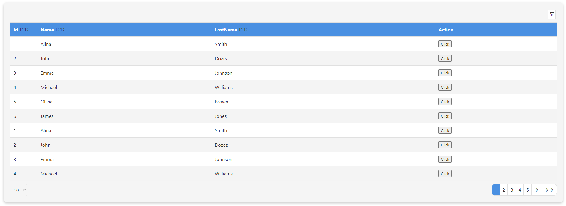
colors: {
headRow: "#4a90e2",
oddRow: "#ffffff",
evenRow: "#f4f4f4",
font: "#333333",
fontHeaderTable: "#ffffff",
border: "#e0e0e0",
card: "#f5f5f5",
},
};
</script>
<template>
<vue3datatable :options>
<template #end-column-names>
<th>Action</th>
</template>
<template #end-column-filter>
<th></th>
</template>
<template #end-column-data>
<td><button>Click</button></td>
</template>
</vue3datatable>
</template>
Props
The vue-table-data component accepts the following props:
options(Object): Configuration object for the data table.showCard(Boolean): Show the table in a card layout. Default istrue.columns(Array): Array of column definitions.key(String): Key to match the data field.name(String): Column header name.filter(Boolean): Enable filtering for this column.sort(Boolean): Enable sorting for this column.width(String): Custom width for the column.
data(Array): Array of data objects to display in the table.colors(Object): Custom colors for the table.headRow(String): Background color for the table header row.oddRow(String): Background color for odd rows.evenRow(String): Background color for even rows.font(String): Font color for text.fontHeaderTable(String): Font color for header text.border(String): Border color.card(String): Background color for the card.
Slots
The vue-table-data component provides the following slots for additional customization:
front-column-names: Slot before the column headers.end-column-names: Slot after the column headers.front-column-filter: Slot before the filter inputs.end-column-filter: Slot after the filter inputs.front-column-data: Slot before the data cells.end-column-data: Slot after the data cells.
Customization
The vue-table-data component offers extensive customization options to match your design needs.
Color Customization
You can customize the colors of various parts of the table through the colors property in the options prop. The available color options include:
headRow: Background color for the table header row.oddRow: Background color for odd rows.evenRow: Background color for even rows.font: Font color for text.fontHeaderTable: Font color for header text.border: Border color.card: Background color for the card.
By default, the component uses the following colors:
const defaultColors = {
  headRow: "#4a90e2",
  oddRow: "#ffffff",
  evenRow: "#f4f4f4",
  font: "#333333",
  fontHeaderTable: "#ffffff",
  border: "#e0e0e0",
  card: "#f5f5f5",
};
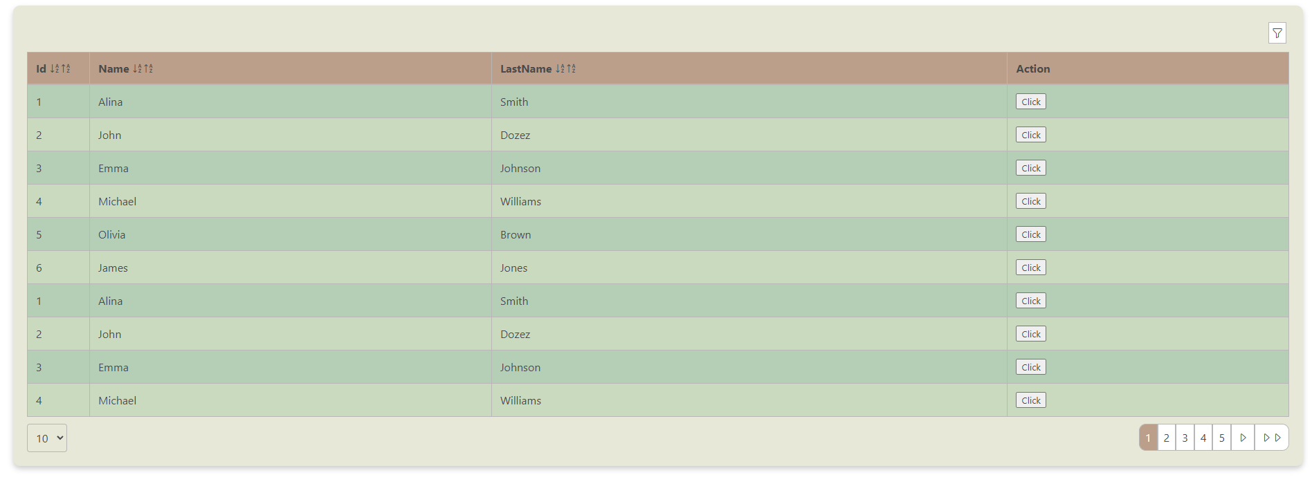
Here are two samples demonstrating how to use the following colors. You can easily customize these colors by changing the props:
const colors = {
    "headRow": "#BC9F8B",      // Primary Terracotta
    "oddRow": "#B5CFB7",       // Soft Sage
    "evenRow": "#CADABF",      // Light Olive
    "font": "#4a4a4a",         // A neutral gray for text (you can adjust this to match the palette if needed)
    "fontHeaderTable": "#4a4a4a", // Neutral Gray (for consistency)
    "border": "#b9b6b6",       // Pale Moss
    "card": "#E7E8D8"          // Pale Moss
}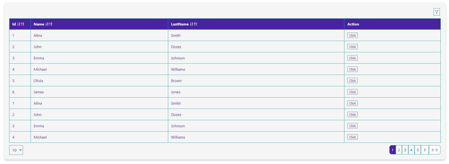
const colors = {
"headRow": "#4A249D",      // Royal Purple
"oddRow": "#F6F5F5",       // Light Gold
"evenRow": "#F6F5F5",      // Soft Gray
"font": "#4A249D",         // Royal Purple (for consistency and readability)
"fontHeaderTable": "#fff", // Royal Purple (for consistency)
"border": "#009FBD",       // Bright Cyan
"card": "#F6F5F5"          // Soft Gray
}
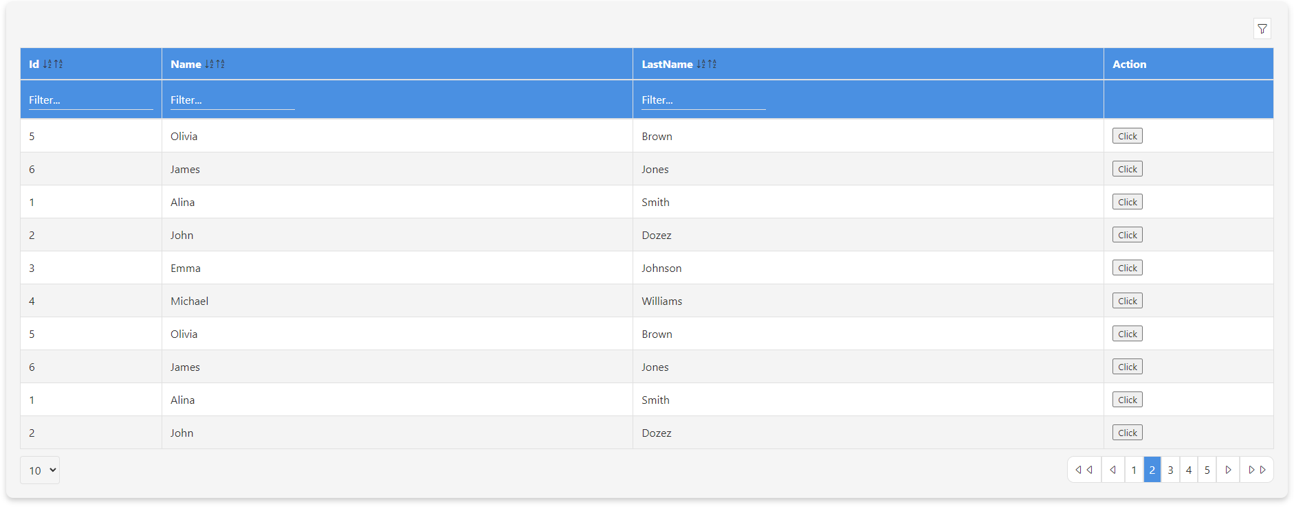
Preview datatable with filter
Thanks a lot
If you appreciate my work and want to support future projects, consider buying me a coffee! ☕️