vue-step-wizard-bootstrap
v0.1.22
Published
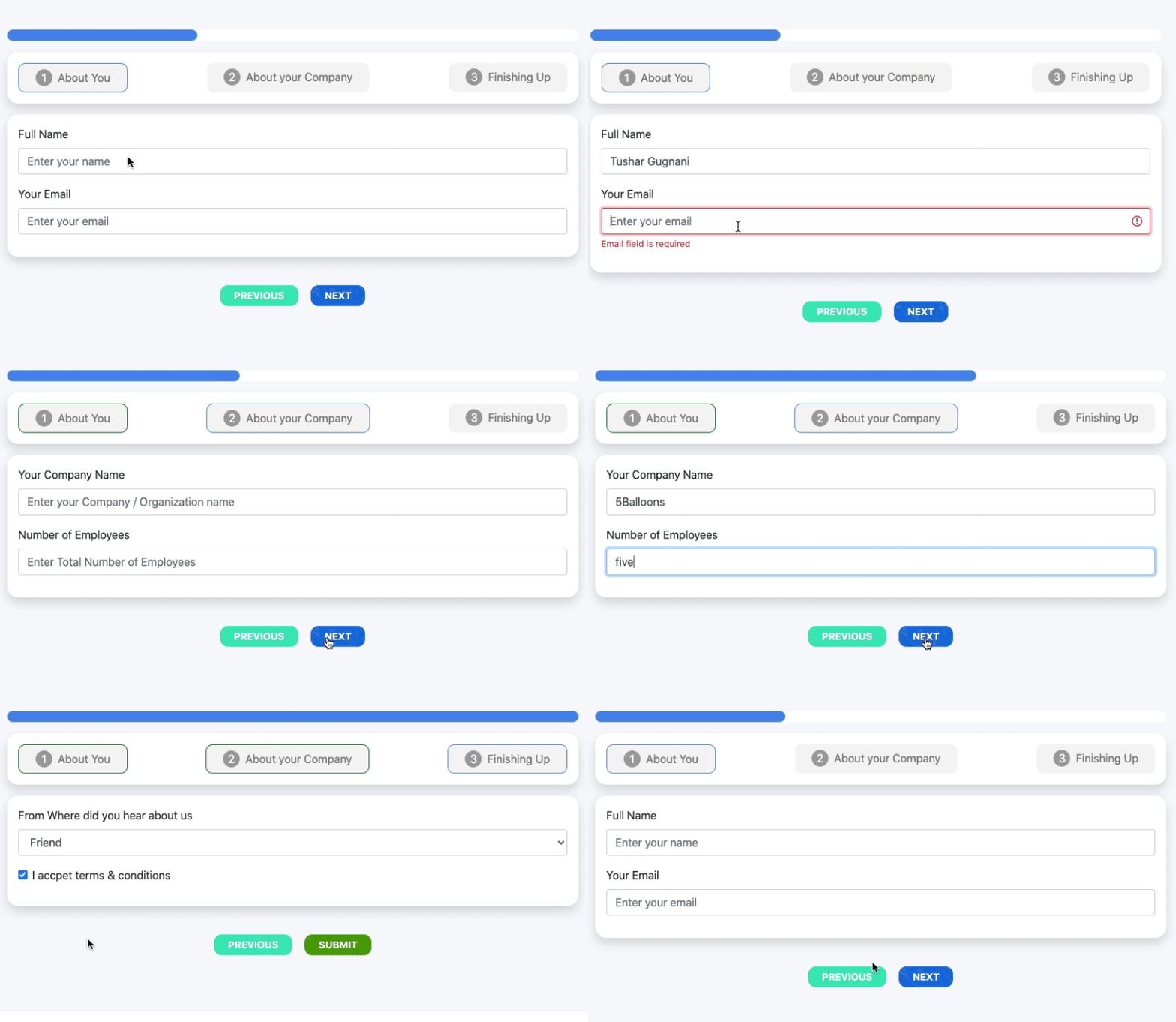
A simple vuejs step/form wizard plugin. Forked version
Downloads
24
Maintainers
Readme
vue-step-wizard

Documentation
Forked from https://github.com/tushargugnani/vue-step-wizard
You can find documentation here: https://tushargugnani.github.io/vue-step-wizard/#/
Installing Plugin
npm install --save vue-step-wizardImport Globally
import VueStepWizard from 'vue-step-wizard'
import 'vue-step-wizard/dist/vue-step-wizard.css'
Vue.use(VueStepWizard);
Import and use Components Locally
//local registration
import {FormWizard, TabContent} from 'vue-step-wizard'
import 'vue-step-wizard/dist/vue-step-wizard.css'
//component code
components: {
  FormWizard,
  TabContent
}
Bootstrap version
Customization
You can two ways to customize this plugin. You can pass classes prop to override default classes
or you can define your own layout for header and footer sections. You also can combine then.
To customize using classes prop you should pass classes prop to WizardComponent:
{
    "previous_button": "step-button step-button-previous",
    "next_button": "step-button step-button-next",
    "submit_button": "step-button step-button-submit",
    "reset_button": "step-button step-button-reset",

    "tabs": "nav nav-pills bg-light nav-justified form-wizard-header mb-3",
    "tab_single": "nav-item",

    "wizard_container": "",
    "wizard_content": "tab-content b-0 mb-0 pt-0",
    "wizard_header": "wizard-header",

    "wizard_progress": "progress mb-3",
    "progress_bar": "bar progress-bar progress-bar-striped progress-bar-animated bg-success"
}
In other way, you can override header and footer sections by defining slots. For example, if you want override tab layout:
<template v-slot:tab-layout="tabProps">
    <!-- Your layout here -->
</template>
You also can enable or disable progress bar.
Importantly that you can only modify default Wizard - FormWizard, You can't add any changes to Bootstrap
version, so if you need them - you need create your own wizard on top of FormWizard.
When you overriding layout through slots, you will have next contexts:
Tab layout
| Variable | Description | |----------|---------------------| | tab | TabContent instance | | index | Tab's index |
Footer
| Variable | Description |
|-------------------|----------------------------------------------------------------|
| submitSuccess | When form successfully sent, this variable will equal true |
| previousEnabled | true if previous button enabled and can be clicked |
| nextEnabled | true if next button enabled and can be clicked |
| submitEnabled | true if submit button enabled and can be clicked |
| previousTab | function, shows previous tab |
| nextTab | function, shows next tab |
| onSubmit | function, sends the form |
| reset | function, resets the form |
Progress Bar
If you do not need progress bar, you can hide it by setting this properties:
| Property | Description | |----------------------------|--------------------------------------------------------------| | progressBeforeTabs | Show progress bar before tabs | | progressAfterTabs | Show progress bar after tabs inside tabs content block |
Validation
We use vuelidate package for validation. You should define validation rules by wizard steps.
All validation rules should be under validationRules data field:
{
  "formData": {
      "firstName": null
  },
  "validationRules": [
      { "firstName": { /* validation rules */ } }
  ]
}
By default validation works on formData nested object, so you should use formData to store your data.
However, you can change it by setting up $formName field. When $formName field is present, then we'll use
nested object with this name. Example:
{
  "$formName": "userDetails",
  "userDetails": {
      "firstName": null
  },
  "validationRules": [
      { "firstName": { /* validation rules */ } }
  ]
}
Buy original author a Pizza
You have an option to buy me a pizza if you found this plugin useful
https://www.buymeacoffee.com/wLrF3Z0tE
