
vue-phylogram
v3.4.3
Published
Vue component for displaying phylogenetic trees
Downloads
29
Maintainers
 lcottret
Readme
vue-phylogram
Synopsis
Vue component for displaying phylogenetic trees
Installation
npm install --save vue-phylogramFeatures
- Sources: json or newick
- Zoom & Pan
- Display branch lengths or not
- Circular or linear layout
- Metadata on nodes, branches and labels (size, color)
- Display pies on nodes
- Collapse nodes
Browse the tree
- Zoom with the mouse wheel
- Drag & drop to move into the tree
- Hover a node or a label to increase its size
Import in a .vue file
import { VuePhylogram } from 'vue-phylogram';Data Sources
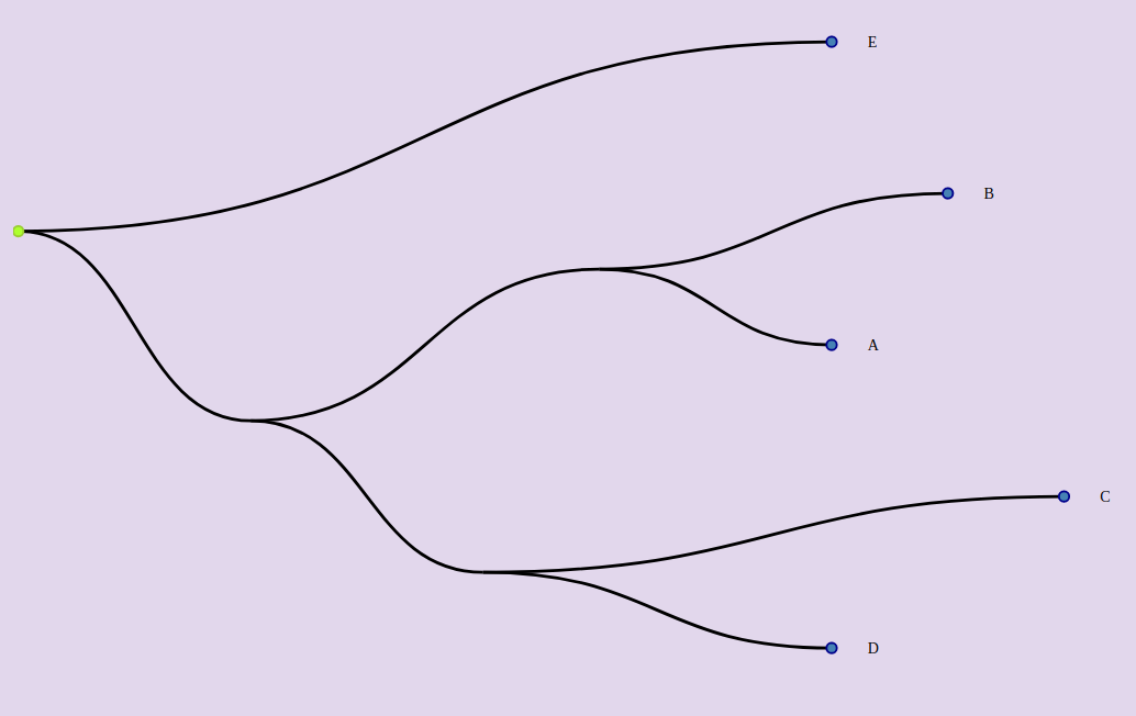
The following tree can be represented by two formats : newick or json object.
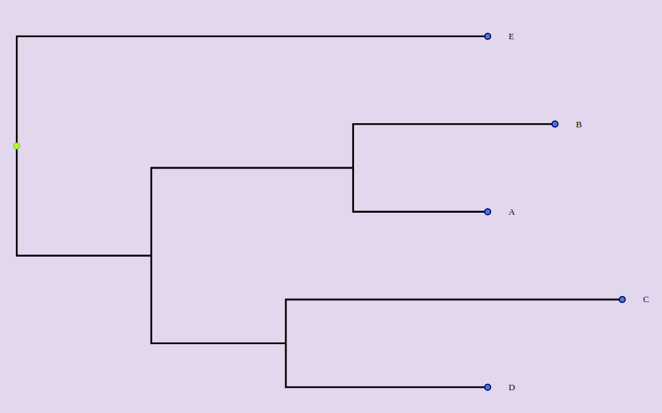
From newick
<Phylogram :newick="newick"></Phylogram> data () {
return {
newick : "(((A:0.2, B:0.3):0.3,(C:0.5, D:0.3):0.2):0.3, E:0.7):1.0"
....From Json String
Be careful, after the version 2.1.2, inputTree is not an object anymore but a String.
<Phylogram :inputTree="tree"></Phylogram>Each node can have these attributes :
- id : if not, will be computed. Be careful, to map metadata on nodes, they must have an id.
- name : if not, the node label won't be displayed.
- length : the length of the branch before the node. If not, the length will be 0.
- branchset : the list of the nodes starting from this node. If absent, the node will be a leaf of the tree.
 data () {
    return {
  tree: `{
        "id": "ABCDE",
        "branchset": [
          {
            "id": "ABCD",
            "length": 0.2,
            "branchset": [
              {
                "length": 0.3,
                "id": "AB",
                "name": "AB",
                "branchset": [
                  {
                    "name": "A",
                    "id": "A",
                    "length": 0.2
                  },
                  {
                    "id": "B",
                    "name": "B",
                    "length": 0.3
                  }
                ]
              },
              {
                "length": 0.2,
                "id": "CD",
                "name": "CD",
                "branchset": [
                  {
                    "id": "C",
                    "name": "C",
                    "length": 0.5
                  },
                  {
                    "id": "D",
                    "name": "D",
                    "length": 0.3
                  }
                ]
              }
            ]
          },
          {
            "id": "E",
            "name": "E",
            "length": 0.7
          }
        ]
      }`
  ....
Generic layout
These props set up the generic layout :
- width (default : 600)
- height (default : 400)
- margin (default : {top:10, right;10, bottom:10, left:10})
- labelWidth : space allowed to display the labels (default : 200)
Display a cladogram or a phylogram
A cladogram does not represent the branch lengths instead of the phylogram.
Display a phylogram (default)
<Phylogram :newick="newick"></Phylogram>or
<Phylogram :newick="newick" :branch-lengths="true" ></Phylogram>or
<Phylogram :newick="newick" branch-lengths ></Phylogram>Display a cladogram
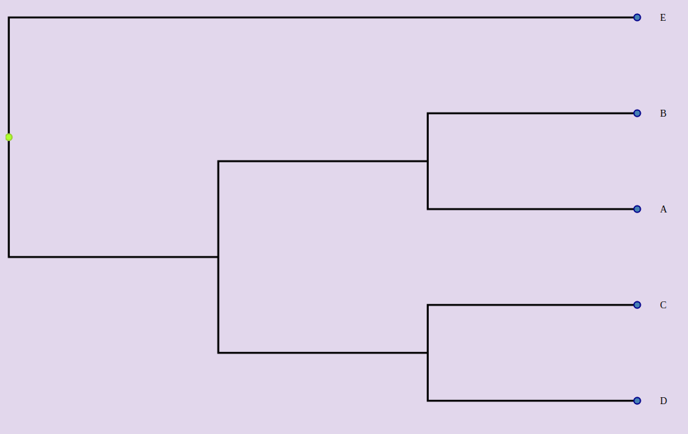
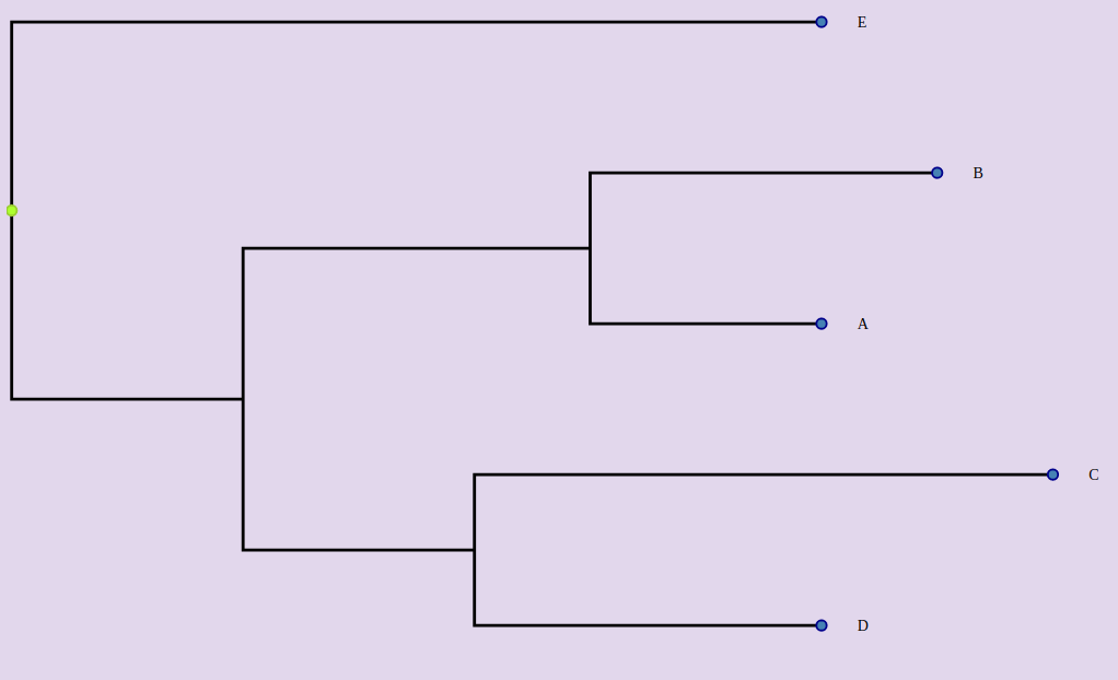
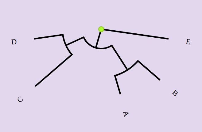
<Phylogram :newick="newick" :branch-lengths="false" ></Phylogram>Display tree with right or smooth angles
Display tree with right angles (default)
<Phylogram :newick="newick" right-angle></Phylogram><Phylogram :newick="newick" :right-angle="true" ></Phylogram>Display tree with smooth angles
<Phylogram :newick="newick" :right-angle="false" ></Phylogram>Circular layout
By default, the tree is displayed in a linear way. If you want to display the tree as a circle:
<Phylogram :newick="newick" circular ></Phylogram>Display leaves
Leaves are displayed by default. To hide them:
<Phylogram :newick="newick" :display-leaves="false" ></Phylogram>Display inner nodes
Inner nodes are hiddent by default. To show them:
<Phylogram :newick="newick" :display-inner-nodes="true" ></Phylogram>Display leaf labels
The leaf labels are displayed by default. To hide them:
<Phylogram :newick="newick" :display-leaf-labels="false" ></Phylogram>Display inner labels
The inner labels are hidden by default. To show them:
<Phylogram :newick="newick" :display-inner-labels="true" ></Phylogram>Align labels
By default, labels are displayed close to the nodes. If you want to right align them :
<Phylogram :newick="newick" align-labels ></Phylogram>Space for labels
If you want to increase or reduce the width of the space assigned to the labels, use the label-width prop:
<Phylogram :newick="newick" :label-width=400 ></Phylogram>Display support values
Support values (e.g bootstrap values) can be read from newick string following the two ways described [here](https://link.
In the json object, the source node must have a key called "support":
"branchset": [
  {
    "id": "ABCD",
    "support":85,
    "length": 0.2,
    "branchset": [
      {
        "length": 0.3,
        "id": "AB",
        "support":90,
        "name": "AB",
        "branchset": [
        ...
Metadata
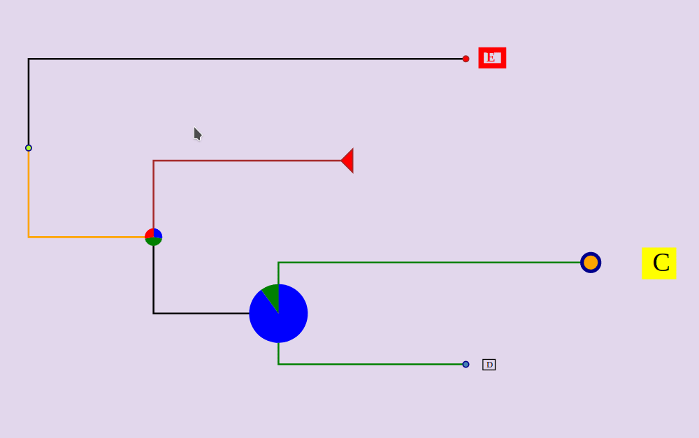
Branch colors
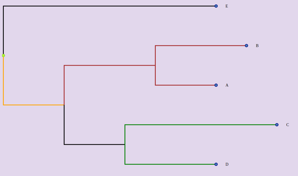
Default branch colors can be set with the defaultColors props:
<Phylogram :inputTree="tree" :default-colors="defaultColors">defaultColors: {
branch: 'grey',
selected_branch: 'yellow'
}Colors for specific branches can also be set with the branchStyles props.
<Phylogram :inputTree="tree" :branch-styles="branchStyles">The branches are identified by the node that they reach (type:'to') or that they start from (type:'from') or both (type:'both') (default)
branchStyles: {
  CD: {
    color: 'green',
    type: 'from'
  },
  ABCD: {
    color: 'orange',
    type: 'to'
  },
  AB: {
    color: 'brown',
    type: 'both'
  }
}
Node styles
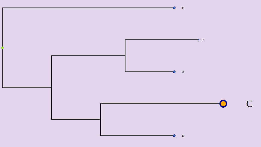
Default fill and outline node colors can be set with the defaultColors props.
<Phylogram :inputTree="tree" :branch-styles="branchStyles">defaultColors:{
"leaf_fill":"#B0C4DE",
"inner_fill":"#6495ED",
"root_fill":"#32CD32",
"selected_fill":"#B22222",
"leaf_stroke":"#4682B4",
"inner_stroke":"#4169E1",
"root_stroke":"#556B2F",
"selected_stroke":"#FF0000"
}Size and color can be set for each leaf node with the nodeStyles props.
<Phylogram :inputTree="tree" :node-styles="nodeStyles">nodeStyles: {
C: {
size: 3,
fill: 'orange'
},
B: {
size: 0.5,
stroke: 'red'
}
}
}Label styles
<Phylogram :inputTree="tree" :label-styles="labelStyles">Default colors for all labels and labels of selected nodes are configurable in the defaultColors prop:
defaultColors: {
  label_color: 'black',
  selected_label_color: 'red'
}
Background, border and stroke colors can also be set for each label.
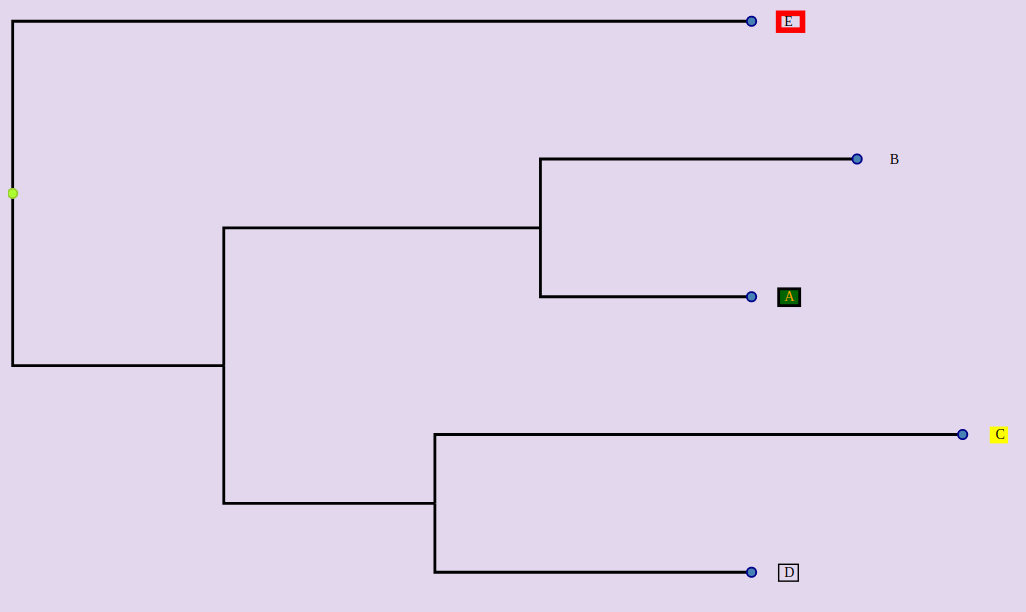
<Phylogram :inputTree="tree" :label-styles="labelStyles">labelStyles: {
A: {
color: 'orange',
background: 'darkgreen',
borderWidth: 2
},
C: {
background: 'yellow'
},
D: {
borderWidth: 1
},
E: {
borderWidth: 4,
borderColor: 'red'
}
}Display pies on nodes
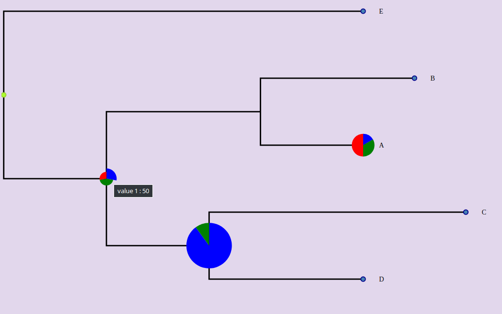
Hover a part of the pie to display the corresponding values.
<Phylogram :inputTree="tree" :pies="pies">Be careful, the ids of the nodes must be well specified.
pies: {
  A: {
    data: [
      { label: 'value 1', value: 10, color: 'blue' },
      { label: 'value 2', value: 20, color: 'green' },
      { label: 'value 3', value: 30, color: 'red' }
    ],
    size: 5
  },
  ABCD: {
    data: [
      { label: 'value 1', value: 50, color: 'blue' },
      { label: 'value 2', value: 80, color: 'green' },
      { label: 'value 3', value: 50, color: 'red' }
    ],
    size: 3
  },
  CD: {
    data: [
      { label: 'value 1', value: 90, color: 'blue' },
      { label: 'value 2', value: 10, color: 'green' }
    ],
    size: 10
  }
}
If you want to hide pies :
<Phylogram :inputTree="tree" :pies="pies" :show-pies="false">Display glyphs beside leaves
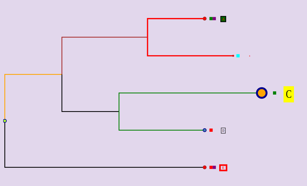
<Phylogram :inputTree="tree" :glyphs="glyphs">The glyphs must be an array with this format :
glyphs: [
  {
    label: 'Good/Bad',
    categories: [
      {
        label: 'good',
        style: { fill: 'green' },
        ids: ['A', 'C']
      },
      {
        label: 'bad',
        style: { fill: 'red' },
        ids: ['D', 'E']
      }
    ]
  },
  {
    label: 'Yes/No',
    categories: [
      {
        label: 'yes',
        style: { fill: 'cyan' },
        ids: ['B']
      },
      {
        label: 'no',
        style: { fill: 'purple' },
        ids: ['A', 'E']
      }
    ]
  }
]
If you want do hide glyphs:
<Phylogram :inputTree="tree" :glyphs="glyphs" :show-glyphs="false">If you don't want that a tooltip is displayed when a glyph is hovered:
<Phylogram :inputTree="tree" :glyphs="glyphs" :show-glyph-labels="false">If you want to add margin between each glyph:
<Phylogram :inputTree="tree" :glyphs="glyphs" glyph-margin="5">Select nodes from props
Use the "selected" props and put the node ids separateb by commas.
<Phylogram :inputTree="tree" :selected="AB,E">Collapse nodes from props
Use the "selected" props and put the node ids separateb by commas.
<Phylogram :inputTree="tree" :collapsed="AB,CD">Layout mode
By default, branches are not ordered (layout-mode=0) To sort the branches by ascending length:
<Phylogram :inputTree="tree" :layout-mode="1">To sort the branches by descending length:
<Phylogram :inputTree="tree" :layout-mode="2">Events
select-nodes: when the user selects or deselect one node, returns the array of the selected node ids.
collapse-nodes: when the user collapses a node or uncollapse a node, returns the array of the collapsed node ids.
click-node
right-click-node
hover-node
click-outside : click outside the nodes
click-label
right-click-label
hover-label
Project setup
npm installCompiles and hot-reloads for development
npm run serveCompiles and minifies for production
npm run buildRun your unit tests
npm run test:unitLints and fixes files
npm run lint