npm package discovery and stats viewer.

Discover Tips

  • General search

    [free text search, go nuts!]

  • Package details

    pkg:[package-name]

  • User packages

    @[username]

Sponsor

Optimize Toolset

I’ve always been into building performant and accessible sites, but lately I’ve been taking it extremely seriously. So much so that I’ve been building a tool to help me optimize and monitor the sites that I build to make sure that I’m making an attempt to offer the best experience to those who visit them. If you’re into performant, accessible and SEO friendly sites, you might like it too! You can check it out at Optimize Toolset.

About

Hi, 👋, I’m Ryan Hefner  and I built this site for me, and you! The goal of this site was to provide an easy way for me to check the stats on my npm packages, both for prioritizing issues and updates, and to give me a little kick in the pants to keep up on stuff.

As I was building it, I realized that I was actually using the tool to build the tool, and figured I might as well put this out there and hopefully others will find it to be a fast and useful way to search and browse npm packages as I have.

If you’re interested in other things I’m working on, follow me on Twitter or check out the open source projects I’ve been publishing on GitHub.

I am also working on a Twitter bot for this site to tweet the most popular, newest, random packages from npm. Please follow that account now and it will start sending out packages soon–ish.

Open Software & Tools

This site wouldn’t be possible without the immense generosity and tireless efforts from the people who make contributions to the world and share their work via open source initiatives. Thank you 🙏

© 2024 – Pkg Stats / Ryan Hefner

vue-gallery-pictures

v0.0.7

Published

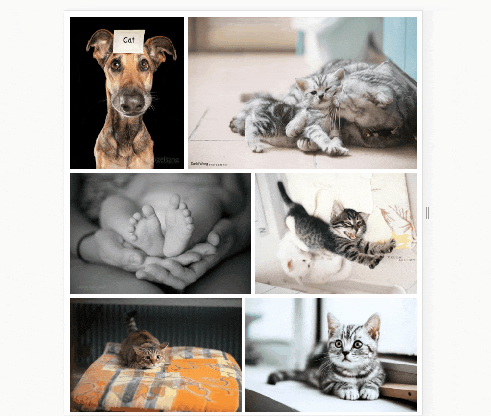
Responsive Pictures Gallery

Downloads

19

Readme

vue-gallery-pictures npm package

自适应画廊组件

这个组件实际上是对 vue-gallery-layout 的封装,专门用于图片画廊的展示

特点

  • 每个 box 等比拉伸
  • box 在水平方向将占满每行,无多余空白
  • 每行的高度保持相同,底部对齐
  • 自动加载图片,更新图片状态
  • 画廊样式可自定义

PS: 自适应指:高宽均不可控

例子

例子

另可参考 example 文件夹的 gallery-pictures-example.html

安装

npm install vue-gallery-pictures -s

用法

局部引入

import VueGalleryPictures from 'vue-gallery-pictures';

// demo.vue
...
export default {
  components: {
    VueGalleryPictures
  }
}

全局引入

import VueGalleryPictures from 'vue-gallery-pictures';
import Vue from 'vue';

Vue.use(VueGalleryPictures);

Broswer 引入(文件在 dist 文件夹下)

// 全局暴露变量 VueGalleryPictures
<script src="../dist/vue-gallery-pictures.js></script>
<script>
  new Vue({
    el: '#app',
    components: {
      GalleryPictures
    }
  })
</script>

具体使用

<template>
  <div>
    <gallery-layout
      :items="items"
      :box-container-class="boxContainerClass"
      :box-init-ratio="boxInitRatio"
      lastLineMode="origin"
      @loaded="loaded"
      @error="error">
      <template>
        <span></span>
      </template>
    </gallery-layout>
  </div>
</template>

<script>
export default {
  //...

  data() {
    return {
      items: [
        {
          {
            id: 1,
            width: 200,
            height: 100,
            src: './xxx.png',
            loading: true,
            error: false
          },
          {
            id: 2,
            width: 300,
            height: 200,
            src: './xxx.png',
            loading: true,
            error: false
          }
        }
      ],
      boxContainerClass: 'box-container-margin',
      boxInitRatio: 100
    }
  },

  methods: {
    loaded(item) {},
    error(item, error) {}
  }
}
</script>

props

  • items: Array<[item...]>

    • item: Object<{width, height, ratio, id}>
      • id: Any 标识符
      • src: String 图片地址
      • loading: Boolean 加载状态
      • error: Boolean 加载状态
      • width: Number 宽,必需
      • height: Number 高,必需
      • ratio: Number, ratio = width / height,有 ratio 则不需要 width 以及 height
  • lastLineMode: String, 'full' / 'origin',默认为 'full'

    在图片列表的最后一行,可能会只有比较少的图片,这就会导致图片普遍变大,与整体的图片大小不符。因此我们通过给最后一行增加占位符,将占位符的 flex-grow 设置较大,从而使最后一行的图片不进行放大,占位符来占满剩余空间。

    full-mode:

    full-mode

    origin-mode

    origin-mode

  • boxContainerClass: String,默认为 ''; box 容器类名

  • boxInitRatio: Number,默认 200

    假设大部分 box 的比例 2: 1,初始屏幕宽度为 1600px,你希望可以大部分情况下可以容纳 4 个 box,那么你的 boxInitRatio 小于 200。注意:由于自适应的存在,每行容纳 box 实际上是由 boxInitRatio, item 的 ratio,每行宽度决定的。

events

  • loaded(item)
  • error(item, error)

LICENSE

MIT