volkeno-react-country-state-city
v1.0.0
Published
Made with create-react-library
Downloads
152
Readme
volkeno-react-country-state-city
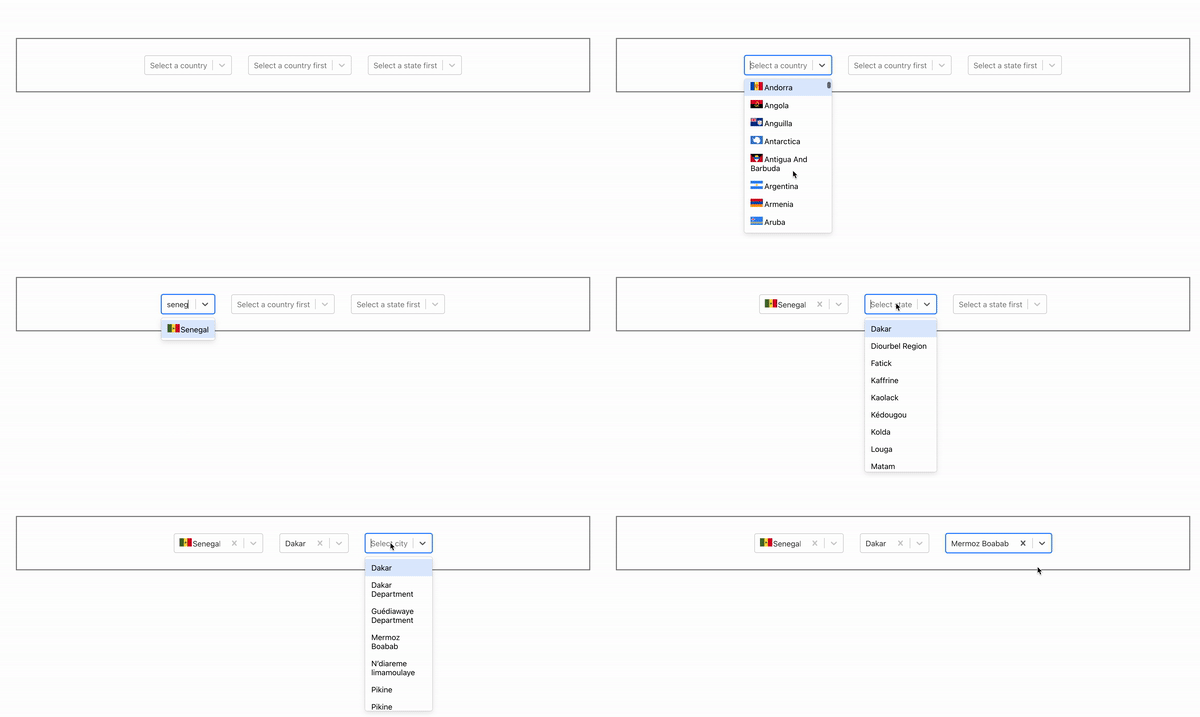
This library provides React components to display dropdowns of connected countries, states and cities (choose a country, it displays the affected states, choose a state, it has displays the affected cities).

Install
npm install --save volkeno-react-country-state-cityUsage
import React, { useState } from 'react'
import {
  CountrySelector,
  StateSelector,
  CitySelector
} from 'volkeno-react-country-state-city'
import 'volkeno-react-country-state-city/dist/index.css'

const App = () => {
  const [country, setCountry] = useState<any>('')
  const [state, setState] = useState<any>('')
  const [city, setCity] = useState<any>('')

  const handleCountrySelect = (option: any) => {
    setCountry(option)
  }

  const handleStateSelect = (option: any) => {
    setState(option)
  }

  const handleCitySelect = (option: any) => {
    setCity(option)
  }
  return (
    <div style={{display: 'flex', justifyContent: 'center', alignItems: 'center', border: '2px solid grey', margin: '5rem'}}>
      <CountrySelector
        onChange={handleCountrySelect}
        name='country'
        placeholder='Select a country'
        value={country}
      />
      <StateSelector
        country={country}
        name='state'
        value={state}
        countryPlaceholder='Select a country first'
        onChange={handleStateSelect}
      />
      <CitySelector
        state={state}
        name='city'
        value={city}
        statePlaceholder='Select a state first'
        onChange={handleCitySelect}
      />
    </div>
  )
}

export default App
Configuration - Props
<CountrySelector/>
| Property | Type | Require | Default | Description | | ------------------------ | :-----------------: | :-------:| :-------:| :------------------------------------------------------------------------------ | | name | string | false | country | name of input | | containerClass | string | false | ... | ClassName of select container | | onChange | function | true | ... | Callback that gets called when the user selects a country. Use this to store the value in whatever store you're using. | | optionClass | string | false | ... | ClassName of label container | | styleContainer | React.CSSProperties | false | ... | Apply a style to the select container | | value | number | true | ... | The currently selected country. | | placeholder | string | false | "Select Country" | The default option label.
<StateSelector/>
| Property | Type | Require | Default | Description | | ------------------------ | :-----------------: | :-------:| :-------:| :------------------------------------------------------------------------------ | | country | object | true | ... | The currently selected country. | name | string | false | state | name of input | | containerClass | string | false | ... | ClassName of select container | | onChange | function | true | ... | Callback that gets called when the user selects a state. Use this to store the value in whatever store you're using. | | optionClass | string | false | ... | ClassName of label container | | styleContainer | React.CSSProperties | false | ... | Apply a style to the select container | | value | number | true | ... | The currently selected country. | | placeholder | string | false | "Select State" | The default option label. | countryPlaceholder | string | false | "Select Country" | The label that appears in the state dropdown when the user hasn't selected a country yet.
<CitySelector/>
| Property | Type | Require | Default | Description | | ------------------------ | :-----------------: | :-------:| :-------:| :------------------------------------------------------------------------------ | | state | object | true | ... | The currently selected state. | name | string | false | city | name of input | | containerClass | string | false | ... | ClassName of select container | | onChange | function | true | ... | Callback that gets called when the user selects a state. Use this to store the value in whatever store you're using. | | optionClass | string | false | ... | ClassName of label container | | styleContainer | React.CSSProperties | false | ... | Apply a style to the select container | | value | number | true | ... | The currently selected state. | | placeholder | string | false | "Select State" | The default option label. | statePlaceholder | string | false | "Select State" | The label that appears in the city dropdown when the user hasn't selected a state yet.
License
MIT © VolkenoMakers


