
vodo-npm
v1.1.2
Published
React resusable components for VODO fronend developers
Downloads
12
Maintainers
 aboel3z
Readme
VODO-REACT-COMPONENTS
Npm package created to supply reusable components to VODO developers.
How to use it ?
Before installing package, you should have tailwindCSS installed and configured in your project as the package styling is built using tailwindCSS.
You should also include the index.css file of the package in the top of your app ( eg. in the top of App.tsx - your main file that contains the whole application - ) as following :
import React from "react";

// The following import must be included to apply styles used
// in the package
import "../node_modules/vodo-react-components/dist/index.css";

// This is an example for importing some components from package
import { Submit, UserNav } from "vodo-react-components";

function App() {
  return (
    <div className="container">
      <UserNav
        name="Zain Ali"
        avatarUrl="https://i.pravatar.cc/150?img=3"
        className="p-1.5 rounded-full shadow-[#EB3D34_7px_-3px]"
        avatarClass=" w-8 h-8"
        email="[email protected]"
      />
    </div>
  );
}
Table of components
🛠 Components included in the package :
1- UserNav
The userNav takes 5 props:
- name : username
- avatarUrl : url of avatar
- className : TailwindCSS styles you want to add to the whole component.
- avatarClass : TailwindCSS classes you want to apply to avatar
- email : user's email
<UserNav
  name="Zain Ali"
  avatarUrl="https://i.pravatar.cc/150?img=3"
  className="p-1.5 rounded-full shadow-[#EB3D34_7px_-3px]"
  avatarClass=" w-8 h-8"
  email="[email protected]"
/>
This usernav acts as a like-popup card that appears when you press on a container with the username and the avatar. The card that appears contains : section containing username,avatar and user's email and two buttons which are edit account and logout.

//=================================================
//=================================================
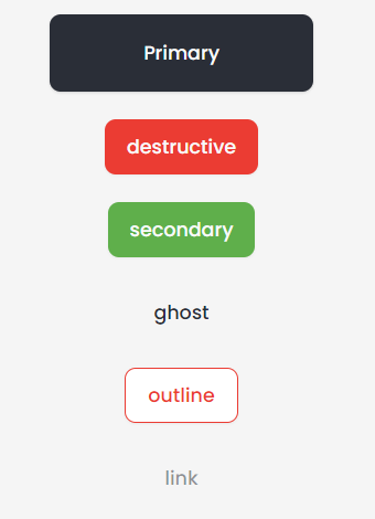
2- Button
The Button takes 5 props :
- Variant : each variant apply styles. Downwards you will find different varaints values with corresponding styles.
- classname ?: TailwindCSS classes to apply
- size ?: each size has corresponding style will be illustrated downwards.
- props ?: additional button props (eg. onClick, onBlur, ...)
- ref ?: to add refrence to the button
    <Button className="w-[191px] h-[56px]">Primary</Button>
    <Button variant="destructive">destructive</Button>
    <Button variant="secondary">secondary</Button>
    <Button variant="ghost">ghost</Button>
    <Button variant="outline">outline</Button>
    <Button variant="link">link</Button>
Diffrent variants and sizes available :
    variant: {
        default:
          "bg-primary text-primary-foreground shadow hover:bg-primary/90",
        destructive:
          "bg-destructive text-destructive-foreground shadow-sm hover:bg-destructive/90 focus:bg-[#C4332B] active:bg-[#C4332B] active:shadow-custom",
        outline:
          "border border-destructive text-destructive bg-background shadow-sm hover:bg-destructive/[0.05] hover:text-destructive focus:bg-destructive/[0.05] active:bg-destructive/[0.15] active:shadow-custom",
        secondary:
          "bg-secondary text-secondary-foreground shadow-sm hover:bg-secondary/80",
        ghost: "hover:bg-accent hover:text-accent-foreground",
        link: "text-muted-foreground/50 underline-offset-4 hover:underline hover:text-primary",
      },
      size: {
        default: "h-10 px-4 py-2",
        sm: "h-9 rounded-md px-3",
        lg: "h-11 rounded-md px-8",
        icon: "h-10 w-10",
      },
//=================================================
//=================================================
3- CardWrapper
The CardWrapper takes 4 props :
- cardTitle : Title appears on the top of the card
- classname ?: TailwindCSS classes to apply
- showFooter ?: boolean value to show footer if true
- footerHref ?: Link appears in the footer ( The footer has a - view all - word which refs to a link )
<CardWrapper className="w-[500px]" showFooter footerHref="#" cardTitle="Add business">
  Card Content
</CardWrapper>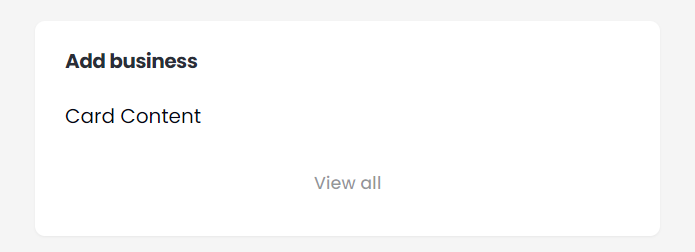
//=================================================
//=================================================
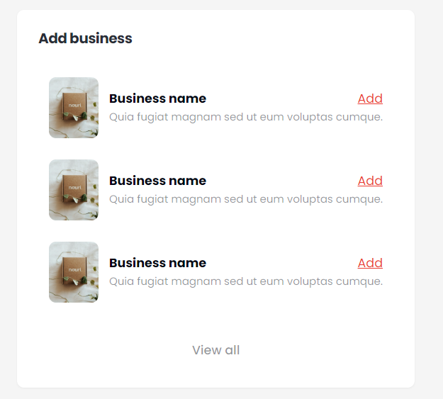
4- businessCard
The businessCard takes 4 props :
- title
- description
- imageUrl
- addHref : link added to the - add - keyword
<BusinessCard
  addHref="#"
  imageUrl={businessCard}
  title="Business name"
  description="Quia fugiat magnam sed ut eum voluptas cumque."
/>
CardWrapper containing business cards :
//=================================================
//=================================================
5- Switcher
A drop list with a search bar.
The Switcher takes 5 props :
- placeHolder : The value appears initially in the droplist section
- className?
- items : items appear in the drop list
- heading : the title of the options in the drop list (eg. sizes)
- setSelectedOption : Used to get the selected option. This prop is the setState function you pass to the component.
const [item, setItem] = (useState < null) | (string > null);
<Switcher
  items={["Large", "Medium", "Small"]}
  heading="Sizes"
  setSelectedOption={(item: null | string) => setItem(item)}
  placeHolder="Select your size"
/>;
//=================================================
//=================================================
Used to upload file to a specific URL ( images ony allowed !! ).
The InputFile takes 3 props :
- url : url to which file will be uploaded.
- className?
- disabled ?: boolean value to indicate of the input is disabled or not
<InputFile url="https://store1.gofile.io/uploadFile" />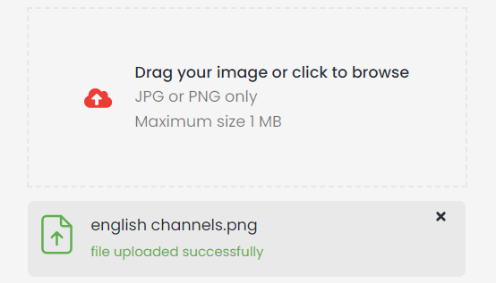
//=================================================
//=================================================
8- SideBar
<SideBar />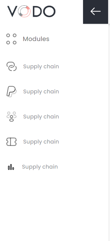
//=================================================
//=================================================
9- UserInput
A drop list with a search bar.
The UserInput takes same props as default input field
<UserInput label="Username" type={"text"} placeholder="type your username" />
<UserInput disabled label="Password" type={"password"} />
//=================================================
//=================================================
10- Status
Button contains on/off status
The Status takes one prop ( status ) which takes only two value : on - off
<Status status={"on"} />
<Status status={"off"} />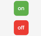
//=================================================
//=================================================
11- NavigationTrail
The NavigationTrail takes 2 props :
- trailPage : The current page with the different color which will be the last element in the trial
- trailLink : These are the remaining previous elements in the trial. It is an array of objects, each object contains two properties ( label : the name of elements & href : the link to which the label refers )
<NavigationTrail
  trailLink={[
    { label: "Home", href: "/" },
    { label: "Products", href: "/" },
  ]}
  trailPage="Products Details"
/>
//=================================================
//=================================================
12- UserProfile
The UserProfile takes 4 props :
- name
- avatarUrl : img url
- className ?: addition TailwindCSS classes to apply
<UserProfile
  className=" rounded-b-[32px]"
  name="Zain Ali"
  email="[email protected]"
  avatarUrl={avatar}
/>
//=================================================
//=================================================
13- SearchInput
The SearchInput takes 4 props :
- setInputValue : setState function to get the value of the input field
- disabled ?
- props ?: default input props
- className ?: addition TailwindCSS classes to apply
<SearchInput setInputValue={setInputValue} disabled />
<SearchInput setInputValue={setInputValue}/>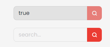
//=================================================
//=================================================
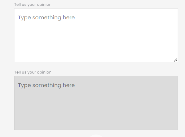
14- TextArea
The TextArea takes 4 props :
- label
- disabled?: boolean;
- placeHolder?
- className?: TailwindCSS classes;
- error?: error message to show;
- success?: success message to show;
- onChange?
- onBlur?
- onFocus?
<TextArea
    label="Tell us your opinion"
    placeHolder="Type something here"
/>
<TextArea
    label="Tell us your opinion"
    placeHolder="Type something here"
    disabled
/>
//=================================================
14- Accordion
https://ui.shadcn.com/docs/components/accordion
<Accordion type="single" collapsible className="w-full">
<AccordionItem value="item-1">
<AccordionTrigger>Is it accessible?</AccordionTrigger>
<AccordionContent>Yes. It adheres to the WAI-ARIA design pattern.</AccordionContent>
</AccordionItem>
<AccordionItem value="item-2">
<AccordionTrigger>Is it styled?</AccordionTrigger>
<AccordionContent>
Yes. It comes with default styles that matches the other components'
aesthetic.
</AccordionContent>
</AccordionItem>
<AccordionItem value="item-3">
<AccordionTrigger>Is it animated?</AccordionTrigger>
<AccordionContent>
Yes. It's animated by default, but you can disable it if you prefer.
</AccordionContent>
</AccordionItem>
</Accordion>
//=================================================
15- Dialog
https://ui.shadcn.com/docs/components/dialog
<Dialog>
  <DialogTrigger asChild>
    <Button variant="outline">Edit Profile</Button>
  </DialogTrigger>
  <DialogContent className="sm:max-w-[425px]">
    <DialogHeader>
      <DialogTitle>Edit profile</DialogTitle>
      <DialogDescription>
        Make changes to your profile here. Click save when you're done.
      </DialogDescription>
    </DialogHeader>
    <div className="grid gap-4 py-4">
      <div className="grid grid-cols-4 items-center gap-4">
        <Label htmlFor="name" className="text-right">
          Name
        </Label>
        <Input id="name" value="Pedro Duarte" className="col-span-3" />
      </div>
      <div className="grid grid-cols-4 items-center gap-4">
        <Label htmlFor="username" className="text-right">
          Username
        </Label>
        <Input id="username" value="@peduarte" className="col-span-3" />
      </div>
    </div>
    <DialogFooter>
      <Button type="submit">Save changes</Button>
    </DialogFooter>
  </DialogContent>
</Dialog>
//=================================================
16- Dropdown Menu
https://ui.shadcn.com/docs/components/dropdown-menu
<DropdownMenu>
  <DropdownMenuTrigger asChild>
    <Button variant="outline">Open</Button>
  </DropdownMenuTrigger>
  <DropdownMenuContent className="w-56">
    <DropdownMenuLabel>My Account</DropdownMenuLabel>
    <DropdownMenuSeparator />
    <DropdownMenuGroup>
      <DropdownMenuItem>
        Profile
        <DropdownMenuShortcut>⇧⌘P</DropdownMenuShortcut>
      </DropdownMenuItem>
      <DropdownMenuItem>
        Billing
        <DropdownMenuShortcut>⌘B</DropdownMenuShortcut>
      </DropdownMenuItem>
      <DropdownMenuItem>
        Settings
        <DropdownMenuShortcut>⌘S</DropdownMenuShortcut>
      </DropdownMenuItem>
      <DropdownMenuItem>
        Keyboard shortcuts
        <DropdownMenuShortcut>⌘K</DropdownMenuShortcut>
      </DropdownMenuItem>
    </DropdownMenuGroup>
    <DropdownMenuSeparator />
    <DropdownMenuGroup>
      <DropdownMenuItem>Team</DropdownMenuItem>
      <DropdownMenuSub>
        <DropdownMenuSubTrigger>Invite users</DropdownMenuSubTrigger>
        <DropdownMenuPortal>
          <DropdownMenuSubContent>
            <DropdownMenuItem>Email</DropdownMenuItem>
            <DropdownMenuItem>Message</DropdownMenuItem>
            <DropdownMenuSeparator />
            <DropdownMenuItem>More...</DropdownMenuItem>
          </DropdownMenuSubContent>
        </DropdownMenuPortal>
      </DropdownMenuSub>
      <DropdownMenuItem>
        New Team
        <DropdownMenuShortcut>⌘+T</DropdownMenuShortcut>
      </DropdownMenuItem>
    </DropdownMenuGroup>
    <DropdownMenuSeparator />
    <DropdownMenuItem>GitHub</DropdownMenuItem>
    <DropdownMenuItem>Support</DropdownMenuItem>
    <DropdownMenuItem disabled>API</DropdownMenuItem>
    <DropdownMenuSeparator />
    <DropdownMenuItem>
      Log out
      <DropdownMenuShortcut>⇧⌘Q</DropdownMenuShortcut>
    </DropdownMenuItem>
  </DropdownMenuContent>
</DropdownMenu>
//=================================================
17- Popover
https://ui.shadcn.com/docs/components/popover
<Popover>
  <PopoverTrigger asChild>
    <Button variant="outline">Open popover</Button>
  </PopoverTrigger>
  <PopoverContent className="w-80">
    <div className="grid gap-4">
      <div className="space-y-2">
        <h4 className="font-medium leading-none">Dimensions</h4>
        <p className="text-sm text-muted-foreground">
          Set the dimensions for the layer.
        </p>
      </div>
      <div className="grid gap-2">
        <div className="grid grid-cols-3 items-center gap-4">
          <Label htmlFor="width">Width</Label>
          <Input id="width" defaultValue="100%" className="col-span-2 h-8" />
        </div>
        <div className="grid grid-cols-3 items-center gap-4">
          <Label htmlFor="maxWidth">Max. width</Label>
          <Input id="maxWidth" defaultValue="300px" className="col-span-2 h-8" />
        </div>
        <div className="grid grid-cols-3 items-center gap-4">
          <Label htmlFor="height">Height</Label>
          <Input id="height" defaultValue="25px" className="col-span-2 h-8" />
        </div>
        <div className="grid grid-cols-3 items-center gap-4">
          <Label htmlFor="maxHeight">Max. height</Label>
          <Input id="maxHeight" defaultValue="none" className="col-span-2 h-8" />
        </div>
      </div>
    </div>
  </PopoverContent>
</Popover>
//=================================================
18- Switch
https://ui.shadcn.com/docs/components/switch
<div className="flex items-center space-x-2">
  <Switch id="airplane-mode" />
  <Label htmlFor="airplane-mode">Airplane Mode</Label>
</div>
//=================================================
19- Calendar
https://ui.shadcn.com/docs/components/calendar
<Calendar
  mode="single"
  selected={date}
  onSelect={setDate}
  className="rounded-md border shadow"
/>
//=================================================
20- Select
https://ui.shadcn.com/docs/components/select
<Select>
  <SelectTrigger className="w-[180px]">
    <SelectValue placeholder="Select a fruit" />
  </SelectTrigger>
  <SelectContent>
    <SelectGroup>
      <SelectLabel>Fruits</SelectLabel>
      <SelectItem value="apple">Apple</SelectItem>
      <SelectItem value="banana">Banana</SelectItem>
      <SelectItem value="blueberry">Blueberry</SelectItem>
      <SelectItem value="grapes">Grapes</SelectItem>
      <SelectItem value="pineapple">Pineapple</SelectItem>
    </SelectGroup>
  </SelectContent>
</Select>
//=================================================
21- Icons
Various icons as shown in the image below.
<EyeIcon />
<AddBusinessIcon />
<ArrowDownIcon />
<ArrowMenuIcon />
<BurgerIcon />
<CalendarIcon />
<DeleteIcon />
<DownloadIcon />
<ExportIcon />
<FilterSearchIcon />
<LinkIcon />
<LogoIcon />
<ModulesIcon />
<NotificationIcon />
<PaypalIcon />
<PeopleIcon />
<PhoneIcon />
<StatsIcon />
<TicketIcon />
<EditIcon />
<ErrorIcon />
<TickIcon />
<ClearIcon />
<EyePasswordIcon />
<EyeSlashIcon />