
viewportsegments-css-polyfill
v1.0.3
Published
Polyfill for CSS viewport segments media query
Downloads
19
Maintainers
 darktears
Readme
CSS Viewport Segments polyfill
This is a polyfill for the proposed CSS Viewport Segments.
Web developers targeting foldable devices want to be able to effectively lay out the content in a window that spans multiple displays. CSS Viewport Segments provides a mean to do that using stylesheets.
The 'horizontal-viewport-segments' and 'horizontal-viewport-segments' CSS media features
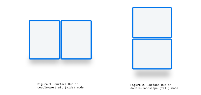
A display can consist of virtual segments (Windows Zones, foldable displays) or simply have segments because the display is made up of multiple physical displays like dual screen devices. The 'horizontal-viewport-segments' and 'horizontal-viewport-segments' CSS media features can be used to test whether the browser window is displayed across multiple segments.
Syntax
The 'horizontal-viewport-segments' and 'horizontal-viewport-segments' media feature value represents the number of vertical or horizontal segments.
Using CSS viewport segments environment variables you can get informations about each of the segments using the two dimensions.
For more information please look at the following article from Microsoft.
Example
A map application that presents a map on one window segment and search results on another

@media (vertical-viewport-segments: 2) {
  body {
    flex-direction: row;
  }

  .map {
    flex: 1 1 env(viewport-segment-width 0 0);
  }

  .locations-list {
    flex: 1;
  }
}
Viewport Segments CSS Variables
There are 4 pre-defined CSS environment variables, which can be used to calculate each screen segment size at both landscape and portrait orientations.
- viewport-segment-top [x][y]
- viewport-segment-left [x][y]
- viewport-segment-bottom [x][y]
- viewport-segment-right [x][y]
- viewport-segment-width [x][y]
- viewport-segment-height [x][y]
The coordinates are assigned from the top-left segment:
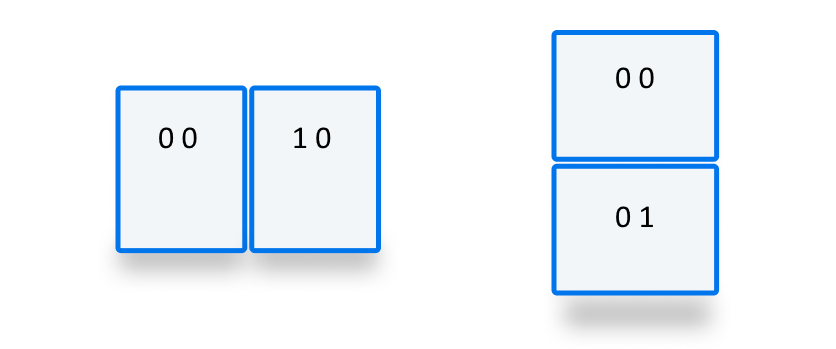
Using these variables you can calculate and layout your content. Here is a diagram to clarify:

The values of these variables are CSS pixels, and are relative to the layout viewport (i.e. are in the client coordinates, as defined by CSSOM Views).
When evaluated while not in one of non standard viewport segment states (more than one vertical or horizontal segment), these values will be treated as if they don't exist, and use the fallback value as passed to the env() function.
How to use the polyfill
This polyfill is packaged as a JavaScript module. It is available on NPM over here.
To install the polyfill just run:
npm install --save viewportsegments-css-polyfillThen you can include it in your project:
<script type="module" src="/path/to/modules/viewportsegments-css-polyfill.js"></script>or in your JavaScript source file
import "/path/to/modules/viewportsegments-css-polyfill/viewportsegments-css-polyfill.js";and start using the new CSS features.
- That's it. See the
demo/directory for examples.
In order to change the display configuration, you can use the polyfill together with an emulator or you can change the settings manually. The settings are stored across sessions.
Manually changing the display configuration
You can update values such as verticalViewportSegments, horizontalViewportSegments, foldSize and browserShellSize by importing the FoldablesFeature object. You can also subscribe to the 'change' event
to be notified whenever the 'verticalViewportSegments' or 'horizontalViewportSegments' media query feature or the environment variables change. That can happen due to window resizes or because the configuration values were changed programmatically.
  import { FoldablesFeature } from '/path/to/modules/viewportsegments-css-polyfill/viewportsegments-css-polyfill.js';

  const foldablesFeat = new FoldablesFeature;

  // Add an event listener.
  foldablesFeat.onchange = () => console.log("change");

    // Add as many event listeners as you want.
  foldablesFeat.addEventListener('change', () => console.log("change"));

  // Change a single value; results in one update (one 'change' event firing).
  foldablesFeat.foldSize = 20;

  // Change multiple values by assignment; results in one update.
  Object.assign(foldablesFeat, { foldSize: 50, verticalViewportSegments: "2"});

  // Change multiple values in one scope; results in one update
  (function() { foldablesFeat.foldSize = 100; foldablesFeat.verticalViewportSegments = "2" })();
Special note on web components and lit-element
In order for the polyfill to work with web components and lit-element, a bit of extra work is needed. There are a couple of examples in the demo/ directory.
The polyfill provides two methods, one to register and one to observe and adjust to updates.
import { adjustCSS, observe } from "viewportsegments-css-polyfill/viewportsegments-css-polyfill.js";In the constructor of your web component make sure to pre-process and make the CSS browser valid by calling the adjustCSS method:
let sheet = shadowRoot.querySelector("style");
sheet.innerText = adjustCSS(sheet.innerText, "test-element");
Now to make sure the style is updated whenever the configuration changes you need to add in your component class:
  connectedCallback() {
    observe(this);
  }
Please note that if connectedCallback() exists on the parent, don't forget to call super.connectedCallback().
For lit-element, a bit of extra work is needed if you're styling your element with the css template literal (which is the recommended way).
import { html, css as litCSS, LitElement } from 'https://cdn.pika.dev/lit-element@^2.2.1';
import { adjustCSS, observe } from "viewportsegments-css-polyfill/viewportsegments-css-polyfill.js";

const css = (strings, ...values) => {
  const string = adjustCSS(strings[0], "test-element");
  return litCSS([string], ...values);
};
The observe method is also needed (see above).
Special note for handling of stylesheets manually constructed from CSS rules
If you build your CSS style sheets in JavaScript, the polyfill can't automatically convert your style sheets. However you can do something like this:
import { adjustCSS, observe } from "viewportsegments-css-polyfill/viewportsegments-css-polyfill.js";

const css = sheets => {
  const rule = adjustCSS(sheets[0]);
  return rule ? rule : "* {}"; // Avoid empty rules.
}

sheet.insertRule(css`@media (horizontal-viewport-segments: 2) {
  .div {
    flex: 0 0 env(viewport-segment-height 0 0);
    margin-bottom: calc(env(viewport-segment-top 0 1) - env(viewport-segment-height 0 1));
    background-color: steelblue;
  }
}`, sheet.cssRules.length);
Documentation
Located here.
Demos
Head over here.
Test suite
There are unfortunately no web-platform-tests available yet.
Known issues
Check GitHub here.
Learn more
- Explainer - a document explaining how this feature was designed and how it fits together with other APIs.