
video_uploader_bmdrm
v1.0.10
Published
Our fully customized package allows you to effortlessly upload your videos. Simply enter your API key and you're ready to go
Downloads
9
Maintainers
 chafroudtarek
Readme
BMDRM VIDEO UPLOADER
Our fully customized package allows you to effortlessly upload your videos. Simply enter your API key and you're ready to go
Installation
npm i video_uploader_bmdrm
yarn add video_uploader_bmdrm
Features
- Quick and Easy Setup
- Super easy to customize
- Place it anywhere,
- Open, close, or stop with ease
- Supports multiple file uploads
- Attractive and responsive user interface
- Drag and Drop
Usage
import { BmdrmVideoUploader } from 'video_uploader_bmdrm'

function App() {
  return (
      <div>
           <BmdrmVideoUploader apiKey={"xxxxxxxx"}/>
      </div>
  )
}- For retrieving video IDs and progress
import { BmdrmVideoUploader,useProgressListener } from 'video_uploader_bmdrm'
function App() {
const inProgressVideo = useProgressListener()
const videosIds = inProgressVideo.map((video) => video.uploadJobId)
return (
<div>
<BmdrmVideoUploader apiKey={"xxxxxxxx"}/>
</div>
)
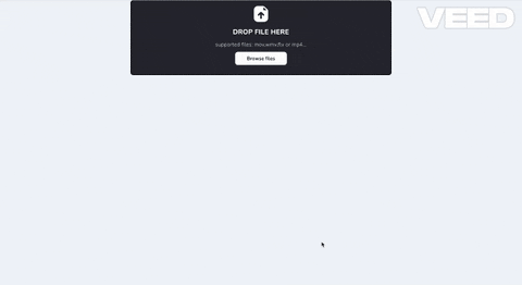
}Demo
Package Props
| Prop Name | Type | Description | |---------------|----------|------------------------------------------------| | apiKey | string | User Apikey necessary for upload | | bmdrmUploader | Object | Customize the styling of the uploader input | | bmdrmProgressWidget | Object | Customize the styling of the progress Widget |
- bmdrmUploader
| Prop Name | Type | Description |
|---------------|----------|------------------------------------------------|
| icon | React.ReactElement | Customize the input icon |
| deleteIcon | React.ReactElement | Customize the delete icon |
| videoIcon | React.ReactElement | personalize the video icon displayed when dropping files |
| btnStyle | { background?: string; color?: string; width?: string; } | Customize the browse files btn |
| style | { background?: string; color?: string; fontSize?: string; fontFamily?: string; } | Customize the styling of the global dnd container |
| videoStyle | { background?: string; color?: string; fontSize?: string; fontFamily?: string; borderColor?: string; } | customize the styling of individual video items |
- bmdrmProgressWidget
| Prop Name | Type | Description | |---------------|----------|------------------------------------------------| | right | number | Customize widget position | | left | number | Customize widget position | | backgroundColor | string | personalize background color | | headerBackgroundColor | string | personalize header background color | | color | string | Personalize the text color of the container | | headerFontColor | string | Personalize the text color of the header | | videoIcon | React.ReactElement | personalize the video icon | | cancelIcon | React.ReactElement | personalize the cancel icon | | checkIcon | React.ReactElement | personalize the validation icon |
Example:
<BmdrmVideoUploader
       bmdrmUploader={{
         icon: <img src='' alt='test' />,
         deleteIcon: <img src='' alt='test' />,
         videoIcon: <img src='' alt='test' />,
         btnStyle: {
           background: 'red',
           color: 'white',
           width: '500px'
         },
         style: {
           background: 'green',
           color: 'blue',
           fontSize: '16px',
           fontFamily: 'Arial'
         },
         videoStyle: {
           background: 'yellow',
           color: 'red',
           fontSize: '22px',
           fontFamily: 'Gill Sans',
           borderColor: 'blue'
         }
       }}
       apiKey={'xxxxxxxxxx'}
       bmdrmProgressWidget={{
         style: {
           left: 0,
           backgroundColor: 'red',
           headerBackgroundColor: 'green',
           color: 'yellow',
           headerFontColor: 'blue',
           videoIcon: <i className='ri-computer-line text-[30px]' />,
           cancelIcon: <i className='ri-computer-line text-[30px]' />,
           checkIcon: <i className='ri-computer-line text-[30px]' />
         }
       }}
     />