use-doc-theme
v0.3.1
Published
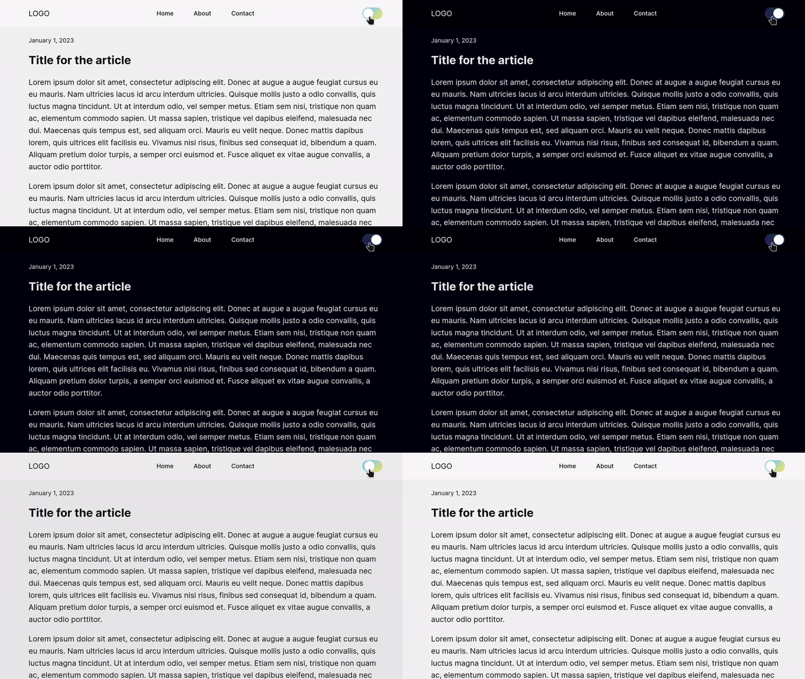
React hook for switching theme between light, dark and system. Compatible with TailwindCSS.
Downloads
17
Readme

Features
This library for Reactjs includes two hooks:
- useDocTheme
- Supports dark, light and system theme with body class of
dark. - Supports Tailwind CSS.
- By default apply system theme.
- Supports dark, light and system theme with body class of
- useLocalStorage
- Supports saving and loading data from browser's local storage.
Installation
npm install use-doc-theme --save
@latestversion supports React 18.3.1. Use@0.2.0for earlier React versions.
Usage
See the demo, built with Reactjs and pure CSS: https://codepen.io/gauravjot/full/yLQexGR
1. useDocTheme
This is the simplest implementation of the hook. Intializing the hook will apply the theme and will give you access to its methods.
/* import */
import { useDocTheme } from "use-doc-theme";

function App() {
  /* initialize */
  const theme = useDocTheme();

  return (
    <>
      {/* usage */}
      <button onClick={theme.toggle}>Toggle</button>
    </>
  );
}
If you only want to apply the theme, you can skip assigning the hook to a variable.
import { useDocTheme } from "use-doc-theme";

function App() {
  // applies the theme
  useDocTheme();

  return (...);
}
Default Behavior
Using the hook will apply the system theme or the theme saved in local storage. This behavior can be changed by passing false into hook initialization that will skip applying the theme.
// Does not automatically apply theme
const theme = useDocTheme(false);
Available Options
These are all the available methods and options.
const theme = useDocTheme();

// Switch to Light Mode
theme.light();

// Switch to Dark Mode
theme.dark();

// Apply System Theme
theme.system();

// Toggle between dark and light
theme.toggle();

/*
 * Check active theme
 */
if (theme.isDarkMode) {
 // Dark Theme is active
}
if (theme.isLightMode) {
 // Light Theme is active
}
if (theme.isSystemMode) {
 // System Theme is active
}
Tailwind CSS Support
Add this to your tailwind.config.js file.
module.exports = {
  darkMode: 'class',
  // ...
}
Learn more here: Dark Mode - Tailwind CSS.
Regular CSS
Use .dark class. For example:
.hello {
  background: white;
  color: black;
}

.dark .hello {
  /* dark theme */
  background: black;
  color: white;
}
For body tag, use
body.dark {
  /* dark theme */
  background: black;
  color: white;
}
2. useLocalStorage
The useLocalStorage hook takes two string parameters. The first parameter is the name of key in local storage and the second is the default value in case local storage does not already have value for the key.
It behaves identical to useState with plus side that the state is saved in local storage.
import { useLocalStorage } from "use-doc-theme";

function App() {
  const [book, setBook] = useLocalStorage<string>("book", "The Alchemist by Paulo Coelho");

  return (
    <>
      <button
        onClick={() => {
          setBook("Happy Place by Emily Henry");
        }}
      >
        Switch Book
      </button>

      <h1>Current book</h1>
      <p>{book}</p>
    </>
  );
}
Data saved into local storage gets JSON stringified so you may also save objects.
Contribution
Community contributions are welcomed.
