timeline-calendar
v0.1.12
Published
Simple timeline calendar for React that is easy to customize and work with.
Downloads
96
Maintainers
Readme
Timeline Calendar for React.
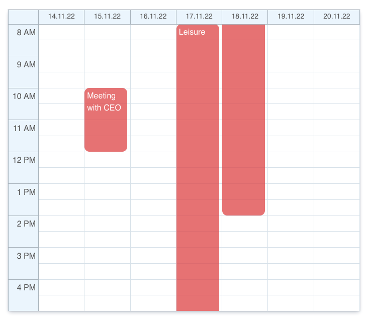
Simple timeline calendar for React that is easy to customize and work with.
import React, { useState } from "react";
import TimelineCalendar from "timeline-calendar";

// Import this CSS file if you do not want to implement all the details yourself.
import "../node_modules/timeline-calendar/dist/lib.esm.css";

let events = [
    {
      id: 1,
      title: "Meeting with CEO",
      start: new Date("2022-11-15 10:00"),
      end: new Date("2022-11-15 12:00"),
    },
    {
      id: 2,
      title: "Leisure",
      start: new Date("2022-11-17 08:00"),
      end: new Date("2022-11-18 14:00"),
    }
];

let options = {
    events: events,
    // events: Event[];
    // numberOfColumns?: number; Defaults to 7 (weekly).
    // onCellClick?: (date: Date) => void;
    // onEventClick?: (event: Event) => void;
    // disableCellPredicate?: (date: Date) => boolean; Defaults to false.
    // hourWindowDateFormat?: string; Format of the string is based on Unicode Technical Standard #35
    // dateWindowDateFormat?: string; Format of the string is based on Unicode Technical Standard #35
    // businessHourStart?: number; Defaults to 8.
}

export default function App() {
    let [date, setDate] = useState(new Date());

    return <TimelineCalendar {...options} currentDate={date} />;
}
It is easy to customize the theme by defining CSS variables in :root.
:root {
    --cell-divider-color: #dce5ec;
    --cell-bg-color: white;
    --xy-bg-color: #eef6fd;
    --xy-color: #606060;
    --xy-divider-color: #b1bbc4;
    --border-color: transparent;
    --event-color: rgba(225, 81, 83, 0.75);
    --cell-hover-color: #a8a8a8;
    --cell-disabled-color: rgb(245, 245, 245);
}
Change height by assigning height to this CSS class:
.timeline-calendar {
    height: 800px !important;
}

.calendar-grid {
    height: 600px !important;
}
This package exports ESM only at this point in time.
