
test-react-btr-modal
v0.0.7
Published
Add dialogs to your site for light boxes, user notifications, or completely custom content.
Downloads
3
Maintainers
 abinaya
Readme
React Bootstrap Dynamic Modal
Add dialogs to your site for lightboxes, user notifications, or completely custom content.
import { BasicModal, ConfirmationModal } from "react-bootstrap-dynamic-modal"; Basic Modal
Basic modal behaves similar to bootstrap modal
- Default it has the close button and modal body is scrollable.
Confirmation Modal
Modal would not hide until unless user take an action by clicking buttons. It would not hide by pressing ESC button and clicking outside of the modal.
- Does not have the close button and modal body is scrollable.
Example
function App() {
const [modalFlag, setModalFlag] = useState(false);
const [confirmationModalFlag, setConfirmationModalFlag] = useState(false);
const [errorModalFlag, setErrorModalFlag] = useState(false);
let basicModalProps = {
title: "Basic Modal",
size: 'lg',
modalClass: 'modal-width',
bodyClass:'modal-body-bg',
headerClass:'modal-header-bg',
isAnimate: false,
buttons: [
{
variant: "secondary",
handler: () => setModalFlag(false),
label: "Cancel"
},
{
variant: "primary",
handler: () => setModalFlag(false),
label: "Save"
}
],
onHide: () => setModalFlag(false)
}
let confirmationModalProps = {
title: "Confirmation Modal",
body: "Are you sure?",
size: 'xs',
isAnimate: false,
isCenter: true,
buttons: [
{
variant: "secondary",
handler: () => setConfirmationModalFlag(false),
label: "Cancel"
},
{
variant: "primary",
handler: () => setConfirmationModalFlag(false),
label: "Yes"
}
]
}
let errorModal = {
title: "Session Time",
body: "Your session timeout due to security",
size: 'xs',
isAnimate: false,
isCenter: true,
buttons: [
{
variant: "primary",
handler: () => setErrorModalFlag(false),
label: "Logout"
}
],
}
return (
<div className="App">
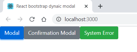
<ButtonToolbar>
<Button variant="primary" onClick={() => setModalFlag(true)}>Modal</Button>
<Button variant="secondary" onClick={() => setConfirmationModalFlag(true)}>Confirmation Modal</Button>
<Button variant="success" onClick={() => setErrorModalFlag(true)}>System Error</Button>
</ButtonToolbar>
{/* pass visibility flag to show/hide modal */}
<BasicModal {...{ ...basicModalProps, "visibility": modalFlag }} />
<ConfirmationModal {...{ ...confirmationModalProps, "visibility": confirmationModalFlag }} />
<ConfirmationModal {...{ ...errorModal, "visibility": errorModalFlag }} />
</div>
);
}
export default App;Output
Basic Modal

Confirmation Modal

Alert Modal

Modal Properties
| Name |Type |Default | Description | | ------------ | ------------ | ------------ | ------------ | | title | String, Number and HTML(DOM) String | | Displays title in the modal header | | body | String, Number and HTML(DOM) String | | Displays content in the modal body | |size | xl/lg/xs/sm/ | lg | Renders the size of the modal as xl/lg/xs/sm | | headerClass | String | | Customizable class to be applied on modal header | | bodyClass | String | | Customizable class to be applied on modal body | | modalClass | String | | Customizable class to be applied on modal | | isAnimate | Boolean | true | A Modal can also be animated. For that set the "animation" prop to false/true. | | isCenter | Boolean | false | A Modal can also be position Centered. For that set the "isCenter" prop to false/true. | | buttons | Array of objects | | Represents button in modal footer | | onHide | Function | | Fired(Triggered) when modal hides |