
svelte-overlay
v1.4.1
Published
Svelte Overlay component. Great for creating dropdowns, tooltips and popovers
Downloads
597
Maintainers
 wysher
Readme
Svelte overlay
Fully customizable Svelte overlay which fits to available space
Great for creating dropdowns, tooltips and popovers
Svelte overlay is wrapper copmponent which makes all difficult stuff for you, but you decide when to open/close it and how it looks.
Features
- may be nested
- if content has not enough space on one side it will try to render on other side. For instance if position is set to
top-leftand there's no room on top position will be set tobottom-left. This feature listens to window resize event - may be open/closed on every trigger and content event or from outside
- you decide how trigger and content looks
- may be closed on click outside, window keydown, or body scroll
- may update position on scroll
- dispatches toggle event when open state changed

Example REPL
<script>
import Overlay from 'svelte-overlay';
</script>
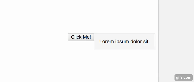
<Overlay>
<!-- TRIGGER -->
<button slot="parent" let:toggle on:click={toggle}>
Click Me!
</button>
<!-- CONTENT -->
<div slot="content">
Lorem ipsum dolor sit.
</div>
</Overlay>
Installation
npm install --save svelte-overlay
or
yarn add svelte-overlay
Props
Important To get it work component requires two slots:
parentcontent
Overlay props
| Prop name | Type | Default | Description |
| --- | --- | --- | --- |
| isOpen | Boolean | false | isOpen state |
| position | String | bottom-right | top-lefttop-centertop-rightbottom-leftbottom-centerbottom-rightleft-topleft-centerleft-bottomright-topright-centerright-bottomUses default position when wrong position was passed. You may import array of all positions with: import { positions } from 'svelte-overlay'; |
| zIndex | Number | 1 | value of z-index for overlay and content |
| class | string | "" | global class name |
| style | string | "" | style string which will be added at the end of component style attribute |
| closeOnClickOutside | Boolean | false | if true - click outside will close overlay |
| closeOnScroll | Boolean | false | if true - scrolling outside content will close overlay |
| updateOnScroll | Boolean | false | if true - scrolling will update content position |
| onWindowKeyDown | Function | undefined | triggers when overlay is opened and user hit any button.Gets Event as first argument and object of { open, close, toggle, isOpen } |
| on:toggle | Function | undefined | Event dispatched on overlay toggle.Gets Event as first argument and object of { open, close, toggle, isOpen } |
slot props
Each slot gets theese props, available through let:propName
| Prop name | Type | Description | | --- | --- | --- | | isOpen | Boolean | isOpen state | | toggle | Function | allows to toggle open state. Gets current isOpen value as argument | | open | Function | allows to open overlay | | close | Function | allows to close overlay |
Usage
Close on escape keydown and click outside REPL
<script>
  import Overlay from 'svelte-overlay';
	let isOpen = false;

	function handleWindowKeyDown(event) {
		if (event.key === 'Escape') {
			isOpen = false;
		}
	}
</script>

<Overlay
	onWindowKeyDown={handleWindowKeyDown}
	closeOnClickOutside
	bind:isOpen={isOpen}
>
  <button slot="parent" let:toggle on:click={toggle}>
    Click Me!
  </button>

  <div slot="content" let:close>
    <p>Lorem ipsum dolor sit.</p>
    <button on:click={close}>Close</button>
  </div>

</Overlay>
Close from content REPL
<script>
  import Overlay from 'svelte-overlay';
</script>

<Overlay>
  <button slot="parent" let:toggle on:click={toggle}>
    Click Me!
  </button>

  <div slot="content" let:close>
    <p>Lorem ipsum dolor sit.</p>
    <button on:click={close}>Close</button>
  </div>

</Overlay>
Open/close on mouseenter/mouseleave REPL
<script>
  import Overlay from 'svelte-overlay';
</script>

<Overlay>
  <button slot="parent" let:open let:close on:mouseenter={open} on:mouseleave={close}>
    Hover Me!
  </button>

  <div slot="content">
    Lorem ipsum dolor sit.
  </div>

</Overlay>
Open from outside REPL
<script>
  import Overlay from 'svelte-overlay';
  let isOpen = false;

  function toggleFromOutside() {
    isOpen = !isOpen;
  }
</script>

<button on:click={toggleFromOutside}>Toggle from outside</button>

<Overlay bind:isOpen={isOpen} >
  <div slot="parent">
    I am a parent
  </div>

  <div slot="content">
    Lorem ipsum dolor sit.
  </div>

</Overlay>
With backdrop, disabled scroll and animations REPL
<script>
  import Overlay from 'svelte-overlay';
  import { fly, fade } from 'svelte/transition';

  let isOpen = false;

  function handleToggle(event) {
    if (event.detail !== isOpen) {
      isOpen = event.detail;
      document.body.classList.toggle('no-scroll', isOpen);
    }
  }
</script>

{#if isOpen}
  <div class="backdrop" transition:fade={{ duration: 200 }}/>
{/if}

<Overlay
  on:toggle={handleToggle}
  closeOnClickOutside
  zIndex={100}
  bind:isOpen={isOpen}>
  <button slot="parent" let:toggle on:click={toggle}>Click Me!</button>
  <div slot="content" transition:fly={{ y: 5, duration: 200 }} class="content">
    Lorem ipsum dolor sit.
  </div>
</Overlay>

<style>
  :global(.no-scroll) {
    overflow: hidden;
  }

  .backdrop {
    z-index: 99;
    position: fixed;
    top: 0;
    right: 0;
    bottom: 0;
    left: 0;
    width: 100%;
    height: 100%;
    background: rgba(0, 0, 0, 0.2);
  }

  .content {
    border: 1px solid #ddd;
    background: #f7f7f7;
    padding: 1em;
    width: max-content;
  }
</style>
Nested with click outside and close on esc key REPL
<script>
  import Overlay from 'svelte-overlay';
  let isOpen = false;

  function toggleFromOutside() {
    isOpen = !isOpen;
  }
</script>

<button on:click={toggleFromOutside}>Toggle from outside</button>

<Overlay bind:isOpen={isOpen} >
  <div slot="parent">
    I am a parent
  </div>

  <div slot="content">
    Lorem ipsum dolor sit.
  </div>

</Overlay>
License
