
svelte-fluttered
v0.3.0
Published
Flexible Svelte layout components as abstraction layer inspired by Flutter.
Downloads
8
Maintainers
 samuelstroschein
Readme
svelte-fluttered
General idea:
Make HTML/CSS layout more readable. If I want a row, I should just be able to write <Row> the same way as I can just write <h1>. Furthermore, CSS alignment is confusing. Six different alignment properties for actually only two different things: the main and the cross axis. Why not call it main and cross axis?
Example:
Let's say I want to display a row, in which the children are centered on the main axis (x):
Row(mainAxisAlignment: MainAxisAlignment.center,
children: [
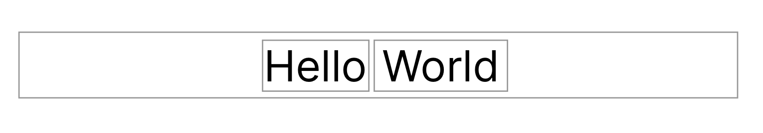
Text('Hello'),
Text('World'),
])Besides the brackets, it is clear what I can expect. A row, whose main axis is centered and which has two children.
HTML & CSS implementation:
<div style="display:flex; flex-direction: row; justify-content: center;">
  <p>Hello</p>
  <p>World</p>
</div>
Svelte-Fluttered implementation:
<Row mainAxisAlignment="center">
  <p>Hello</p>
  <p>World</p>
</Row>
Why fluttered is better than pure HTML & CSS:
If you read the fluttered implementation, it is clear what you can expect: A row with two <p> children which are centered along the main axis (x-axis) of the row. Looking at the CSS implementation, the first problem araises with the second character: Why is everything a div? HTML has meaningful tags such as a <p>. I have to look into the CSS (whether inline or not) to understand that the following div is displayed as a row. Furthermore, "justify-content", "justify-items", "justify-self", "align-content", "align-items", "place-content", "place-items" and "place-items". Which CSS property is the correct one? I have no clue. Telling by the memes, I am not alone.
What about Tailwind CSS/CSS classes in general?
Every component has a globalClass parameter. GlobalClass works just like the regular class="something" except that the class has to be globally defined due to Svelte limitations. Because Tailwind classes are globally defined, you should be able to just use a component and pass Tailwind CSS classes to the parameter "globalClass".
<Row globalClass="w-4 h-4" mainAxisAlignment="end">
  <p>A child element</p>
</Row>
More about the mentioned Svelte shortcoming can be read here.
Documentation:
Disclaimer: This package is under development. Any PR is welcome.
Legend:
Note: Every component allows you to pass globally defined CSS classes via the globalClass="..." property. PS tailwindCSS is globally defined ;)
<Component [globalClass] [parameter1] [parameter2] ... />
    <child1 />
    <child2 />
<Component/>
Components:
<Center> </Center>
<Column [mainAxisAlignment] [crossAxisAlignment] [mainAxisSize]> </Column>
<Row [mainAxisAlignment] [crossAxisAlignment] [mainAxisSize]> </Row>
<Expanded> </Expanded>
<SizedBox [height] [width]> </SizedBox>
Parameters:
Generally, all valid CSS works. But since this proposal is about clearing up CSS mess, the alignment options can be written as shorthand e.g. instead of "flex-start" only "start".
[mainAxisAlignment]="start"|"end"|"center"|"between"|"around"|"evenly"
[crossAxisAlignment]="start"|"end"|"center"|"between"|"around"|"evenly"
[mainAxisSize]="min"|"max"
TODO
- [x] Basic layout components such as Column, Row, Center and Expanded
- [ ] The mainAxisSize needs to take an overwrite into account:
<Column crossAxisAlignment="end">
    <Row mainAxisSize="min">Child</Row>
</Colum>
The example above does not work yet. One would expect that the Row only takes as much space as needed starting from the right, e.g. does not stretch. Align-self has to be used with the property "flex-end" to achieve that effect. But how can the cross axis direction from the parent Column, which is either "start", "center" or "right" be passed down to the Row in order to use the correct value for align-self (hardcoding align-self: flex-start" would break if the columns cross axis is set to "end").
- [ ] More (unstyled) layout components from Flutter