
svelte-aria-dialog
v1.0.0
Published
A tiny svelte component that provides a mostly unstyled, WAI-ARIA accessible modal dialog with a few simple options.
Downloads
2,509
Maintainers
 tropix126
Readme
svelte-aria-dialog
Yet another Svelte dialog component.
Why?
While there are plenty of packages out there that provide modals or dialogs in Svelte, most fall short in at least one these aspects:
- They are not accessible to users of assistive technologies, or are not ARIA-compliant.
- Their APIs are overengineered and not especially intuitive. Some are not declarative, others abuse the Context API for showing/hiding.
- They take opinions on styling and layout, making them difficult to adapt to the needs of a particular project.
This project aims to fill these gaps. svelte-aria-dialog is a tiny svelte component that provides a mostly unstyled, WAI-ARIA accessible modal dialog with a few simple options.
Focus trapping is provided by the lightweight focus-trap module.
Installation
npm
npm install svelte-aria-dialogpnpm
pnpm install svelte-aria-dialogyarn
yarn add svelte-aria-dialogUsage
To open a dialog, bind the open prop to a boolean value.
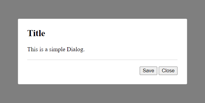
Basic 2-Button Dialog
<script>
    import { Dialog } from "svelte-aria-dialog";

    let open = false;

    function save() {
        alert("Saved");
        open = false;
    }
</script>

<button on:click={() => open = true}>Open Dialog</button>

<Dialog bind:open title="Title">
    This is a simple Dialog.
    <svelte:fragment slot="footer">
        <button on:click={save}>Save</button>
        <button on:click={() => open = false}>Close</button>
    </svelte:fragment>
</Dialog>
Non-closable Dialog
<script>
    import { Dialog } from "svelte-aria-dialog";

    let open = false;
</script>

<button on:click={() => open = true}>Open Dialog</button>

<Dialog bind:open closable={false} title="Title">
    I can't be closed!
</Dialog>
Custom DOM Target (Portal)
<script>
    import { Dialog } from "svelte-aria-dialog";

    let open = false;
</script>

<button on:click={() => open = true}>Open Dialog</button>

<Dialog bind:open title="Title" append={document.body}>
    This dialog will be appended to <body>.
</Dialog>
Dialog Events - on:open and on:close
<script>
    import { Dialog } from "svelte-aria-dialog";

    let open = false;

    function handleOpen() {
        alert("Opened!");
    }

    function handleClose() {
        alert("Closed!");
    }
</script>

<button on:click={() => open = true}>Open Dialog</button>

<Dialog bind:open title="Title" on:open={handleOpen} on:close={handleClose}>
    This dialog will emit events when opened and closed.
      <button slot="footer" on:click={() => open = false}>Close</button>
</Dialog>
API
All unused props are passed to the inner dialog element through $$restProps.
Props
| Property | Type | Default | Description |
| ---------- | ------------- | ----------- | ------------------------------------------------------------------------------------------------ |
| open | boolean | false | Determines whether the dialog is open or not |
| title | string | "" | Title text displayed as the dialog header |
| closable | boolean | true | Determines whether the dialog can be conventially closed using the escape key or backdrop click. |
| append | HTMLElement | undefined | Determines the node the dialog should be appended to |
| class | string | "" | Specifies a custom class name for the dialog |
Slots
| Name | Description |
| --------- | ------------------------------------------------------------ |
| default | Content of the dialog. |
| footer | Elements inserted at the bottom of the dialog in the footer. |
| outer | Elements inserted outside of the inner dialog. |
Events (Dispatched)
| Name | Description |
| ------- | --------------------------------------------------- |
| open | Dispatched when the dialog is mounted into the DOM. |
| close | Dispatched when the dialog is removed from the DOM. |