
secure-action
v1.0.0
Published
Secure Action 是一个基于行为的验证码组件,适用于 Vue 3。
Downloads
2
Maintainers
 zhuzhaofeng
Readme
Secure Action
Secure Action 是一个基于行为的验证码组件,适用于 Vue 3。
示例
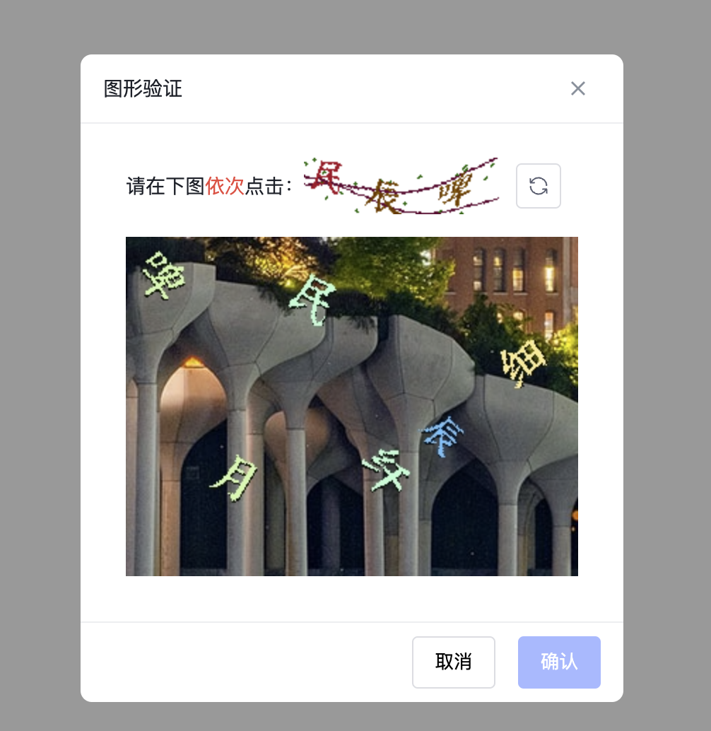
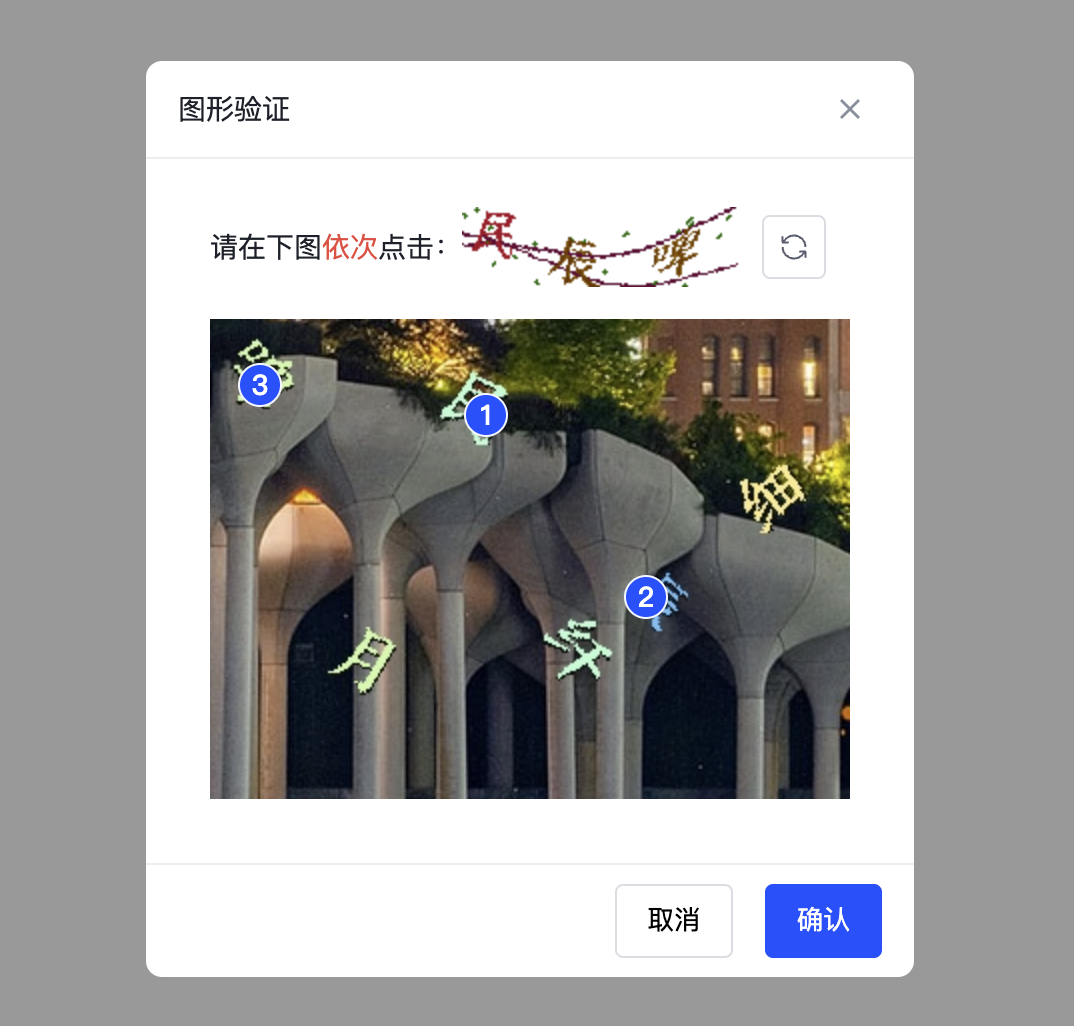
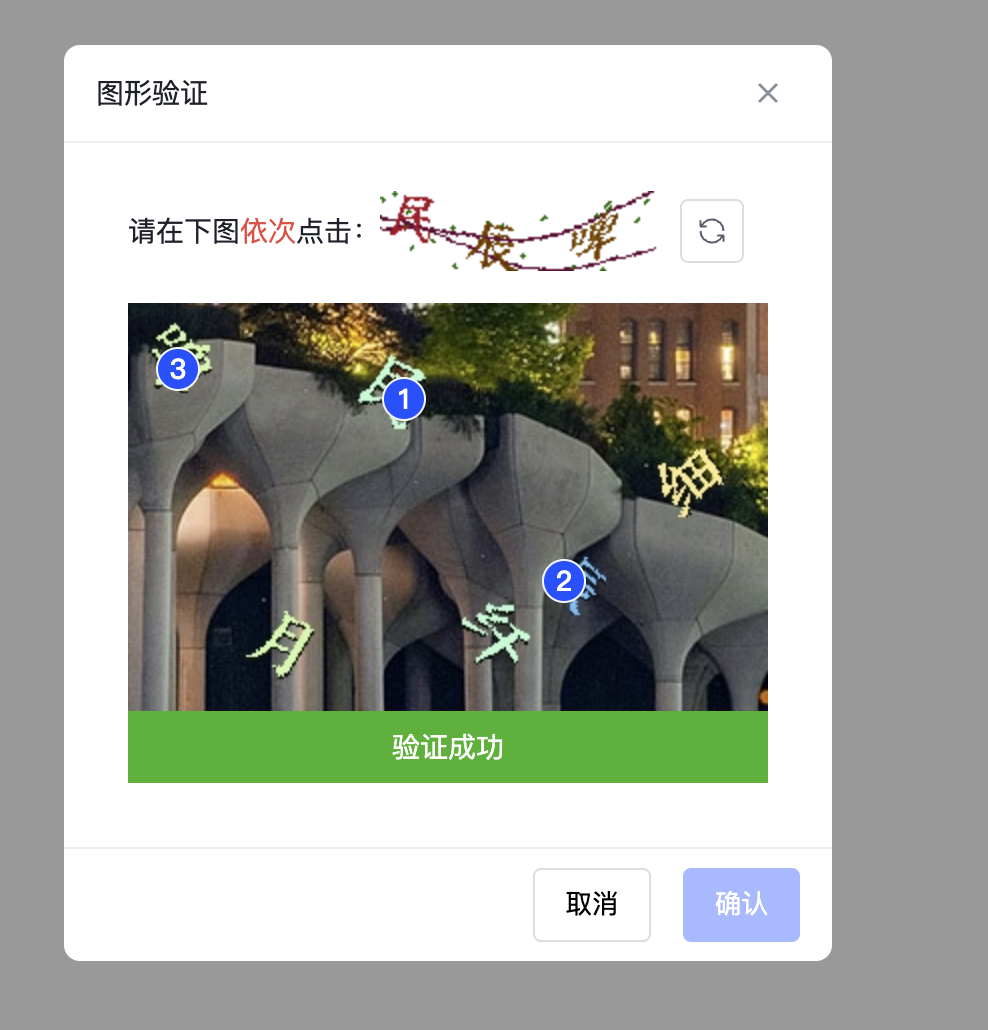
特性
- 生成基于行为的随机验证码,用于验证用户交互。
- 在 Vue 3 项目中轻松集成。
- 定制主题。
安装
npm install secure-action使用
<template>
  <SecureAction
    ref="secureActionRef"
    :request="behavioralCaptcha"
    :verify="handleVerify"
  ></SecureAction>
  <button @click="withInterceptor">登录</button>
</template>

<script setup lang="ts">
import { ref } from 'vue'
import {
  SecureAction,
  type SecureActionInstance,
  type VerifyOptions,
  type RequestFnOptions
} from 'secure-action'
import { useBehavioralCaptcha } from 'secure-action'
const secureActionRef = ref<SecureActionInstance>()

const handleSignIn = () => {
  console.log('触发登录')
}

/**
 * useBehavioralCaptcha 辅助验证函数 当验证通过且自动关闭后 触发传入的方法
 *
 * export declare function useBehavioralCaptcha(
 *            instance: Ref<SecureActionInstance | undefined>,
 *            fn: Function): {
 *     withInterceptor: () => Promise<void>;
 * };
 */
const { withInterceptor } = useBehavioralCaptcha(secureActionRef, handleSignIn)

const baseUrl = 'http://127.0.0.1/v1/behavioral_captcha'
const behavioralCaptchaKey = ref('')

// 生成行为验证码
const behavioralCaptcha = ({ loading, onSuccess, onError }: RequestFnOptions) => {
  loading.value = true
  fetch(`${baseUrl}?account=Fady Mak&scene=1`)
    .then((res) => res.json())
    .then((res) => {
      if (String(res.code).endsWith('6200')) {
        const { image, thumbnail, key } = res.data
        onSuccess(image, thumbnail)
        behavioralCaptchaKey.value = key
      } else {
        onError(res.message)
      }
    })
    .finally(() => {
      loading.value = false
    })
}

// 验证验证码
const handleVerify = ({ onError, onSuccess, points }: VerifyOptions) => {
  fetch(`${baseUrl}/verify`, {
    method: 'post',
    body: JSON.stringify({
      account: 'Fady Mak',
      scene: 1,
      dots: String(points),
      key: behavioralCaptchaKey.value
    }),
    headers: {
      'Content-Type': 'application/json'
    }
  })
    .then((res) => res.json())
    .then((res) => {
      if (String(res.code).endsWith('6200')) {
        onSuccess()
      } else {
        onError(res.message)
      }
    })
}
</script>
Props
- Secure Action 组件支持以下 props
| 属性名 | 类型 | 默认值 | 必需 | 描述 |
| ---------------- | ---------- | -------------------------- | ------- | ------------------------------------ |
| request | Function | - | true | 请求函数,用于获取验证码图片和缩略图 |
| verify | Function | - | true | 验证函数,用于验证用户的操作是否正确 |
| title | String | 图形验证 | false | 标题 |
| loadingText | String | 加载中... | false | 加载中的文本提示 |
| validatingText | String | 验证中,请稍等... | false | 验证中的文本提示 |
| successText | String | 验证成功 | false | 验证成功的文本提示 |
| failText | String | 验证失败,请按提示重新操作 | false | 验证失败的文本提示 |
| flat | Boolean | true | false | 是否将 points 属性扁平化成一维数组 |
| errorRefreshWait | Number | 2000 | false | 验证错误时刷新间隔时间(毫秒) |
| successCloseWait | Number | 2000 | false | 验证成功时关闭间隔时间(毫秒) |
| maskClosable | Boolean | true | false | 点击遮罩层是否可以关闭对话框 |
| hideCancel | Boolean | false | false | 是否隐藏取消按钮 |
| closable | Boolean | true | false | 是否显示关闭按钮 |
| keyboard | Boolean | true | false | 是否支持按下键盘的 ESC 键关闭对话框 |
| okText | String | 确认 | false | 确认按钮的文本 |
| cancelText | String | 取消 | false | 取消按钮的文本 |
| maskClass | String | - | false | 遮罩层的类名 |
| class | String | - | false | 容器的类名 |
| maxPoint | Number | 9 | false | 验证点的最大数量 |
| r | Number | 10 | false | 检测的半径(某个点在此半径内是否有点) |
| fallbackBg | String | #f5f5f5 | false | 图片加载失败时的背景色 |
| fallbackText | String | 加载失败 | false | 图片加载失败时的提示语 |
| footerAlign | 'start' | center | 'end' | 'end' | false | 底部按钮对齐位置 |
- types
export type RequestFnOptions = {
  loading: Ref<boolean>
  onSuccess: (image: string, thumbnail: string) => void
  onError: (message?: string) => void
}
export type RequestFn = (options: RequestFnOptions) => void

export type VerifyOptions = {
  loading: Ref<boolean>
  points: number[] | [number, number][]
  onSuccess: (message?: string) => void
  onError: (message?: string) => void
}
export type VerifyFn = (options: VerifyOptions) => void
Slots
| 插槽名 | 描述 | 参数 |
| :------- | :----------- | :--------------- |
| title | 标题 | - |
| loading | 加载中 | - |
| fallback | 加载失败图片 | - |
| status | 状态 | data(结构如下) |
status data类型
 interface StatusData {
   status: '' | 'SUCCESS' | 'ERROR';
   statusText: string
 }
事件
Secure Action 组件触发以下事件:
| 事件名 | 描述 | 参数 | | :----- | :--- | :--- | | verify | 验证 | - |
CSS 变量
| CSS 变量 | 默认值 | 描述 |
| ---------------------------------- | ------------------- | ---------------- |
| --as-color | #1d2129 | 主文字颜色 |
| --as-bg-color | #ffffff | 背景颜色 |
| --as-radius | 8px | 圆角半径 |
| --as-font-size | 14px | 字体大小 |
| --as-color-primary | #164cff | 主要颜色 |
| --as-color-danger | #f53f3f | 危险颜色 |
| --as-color-success | #00b42a | 成功颜色 |
| --as-border | 1px solid #edeef0 | 边框样式 |
| --as-header-height | 48px | 头部高度 |
| --as-header-paddig | 0 16px | 头部内边距 |
| --as-body-paddig | 24px 32px 32px | 内容区域内边距 |
| --as-thumbnail-wrap-margin | 0 0 16px | 缩略图容器外边距 |
| --as-footer-height | 56px | 底部高度 |
| --as-footer-paddig | 0 16px | 底部内边距 |
| --as-button-radius | 4px | 按钮圆角半径 |
| --as-button-gap-x | 16px | 按钮水平间距 |
| --as-button-border-width | 1px | 按钮边框宽度 |
| --as-button-border-style | solid | 按钮边框样式 |
| --as-button-padding-y | 7px | 按钮垂直内边距 |
| --as-button-padding-x | 15px | 按钮水平内边距 |
| --as-button-icon-padding | 7px | 按钮图标内边距 |
| --as-button-icon-image-size | 16px | 按钮图标尺寸 |
| --as-button-border-color-default | #dbdde2 | 按钮默认边框颜色 |
| --as-point-size | 20px | 验证点的尺寸 |
| --as-point-font-weight | 500 | 验证点的字体粗细 |
| --as-point-border | 1px solid #f3f6ff | 验证点的边框样式 |
许可证
本项目基于 MIT 许可证。