
sanity-plugin-simpler-color-input
v3.0.0
Published
A simpler color input
Downloads
16,047
Maintainers
 alyssakirstine
Readme
🤩 Features
✓ Sanity v3 support
✓ Select a custom color using a color picker or HEX values
✓ Select a color from a predefined theme
✓ Use in the Portable Text editor to color or highlight text
✓ Dark mode support
🔌 Install
This is a Sanity Studio v3 plugin.
npm install sanity-plugin-simpler-color-inputor
yarn add sanity-plugin-simpler-color-input💡 How to Use
Add it as a plugin in sanity.config.ts (or .js):
import { defineConfig } from 'sanity'
import { simplerColorInput } from 'sanity-plugin-simpler-color-input'

export default defineConfig({
  //...
  plugins: [
    simplerColorInput({
      // Note: These are all optional
      defaultColorFormat: 'rgba',
      defaultColorList: [
        { label: 'Light', value: '#ffffff' },
        { label: 'Dark', value: '#333333' },
        { label: 'Brand', value: '#ca786d' },
        { label: 'Accent', value: '#626754' },
        { label: 'Custom...', value: 'custom' },
      ],
      enableSearch: true,
    })
  ],
})
Learn more about the colorList and colorFormat properties in the Options section.
Use as a Standalone Field
You can use the simplerColor type in your schema types:
// [...]
{
  fields: [
    // [...]
    {
      name: 'backgroundColor',
      title: 'Background color',
      type: 'simplerColor',
    },
  ]
}
Use in Portable Text editor
Or you can use the textColor and highlightColor types to annotate text in the Portable Text editor:
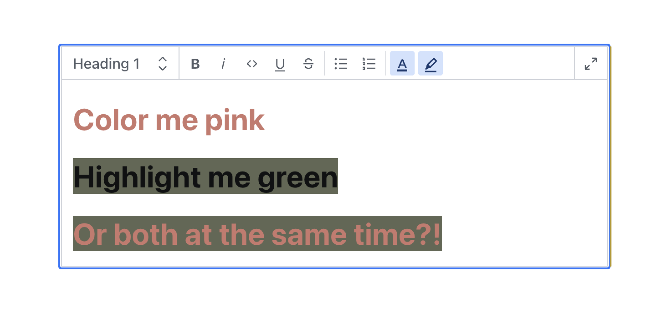
Text Color
{
  type: 'block',
  marks: {
    // ...,
    annotations: [
      // ...,
      {
        type: 'textColor',
      },
    ],
  }
}
Highlight Color
{
  type: 'block',
  marks: {
    // ...,
    annotations: [
      // ...,
      {
        type: 'highlightColor',
      },
    ],
  }
}
Render in Frontend
If you're using the @portabletext/react package, you can pass the following code into the custom components property to render these colors in your frontend.
const myPortableTextComponents = {
  // ...,
  marks: {
    textColor: ({children, value}) => <span style={{color: value.value}}>{children}</span>,
    highlightColor: ({children, value}) => (
      <span style={{background: value.value}}>{children}</span>
    ),
  },
}
This can be adapted to fit the framework you're using. You just need to know that the textColor and highlightColor color values are stored in the value property.
A Note on Sanity's Visual Editing Experience
If you are using Sanity's Visual Editing experience, specifically their overlays and Stega-encoding, you will need to clean the color values before using them in your CSS. See how to do this in the discussion here.
⚙️ Options
Color list
To add a list of predefined selectable color swatches for the user to choose from use colorList. Supports hexadecimal, RGB, or HSL color values. See legal CSS color values for specification.
Note: this will take precedence over the value of defaultColorList in the plugin options.
// ...fields...
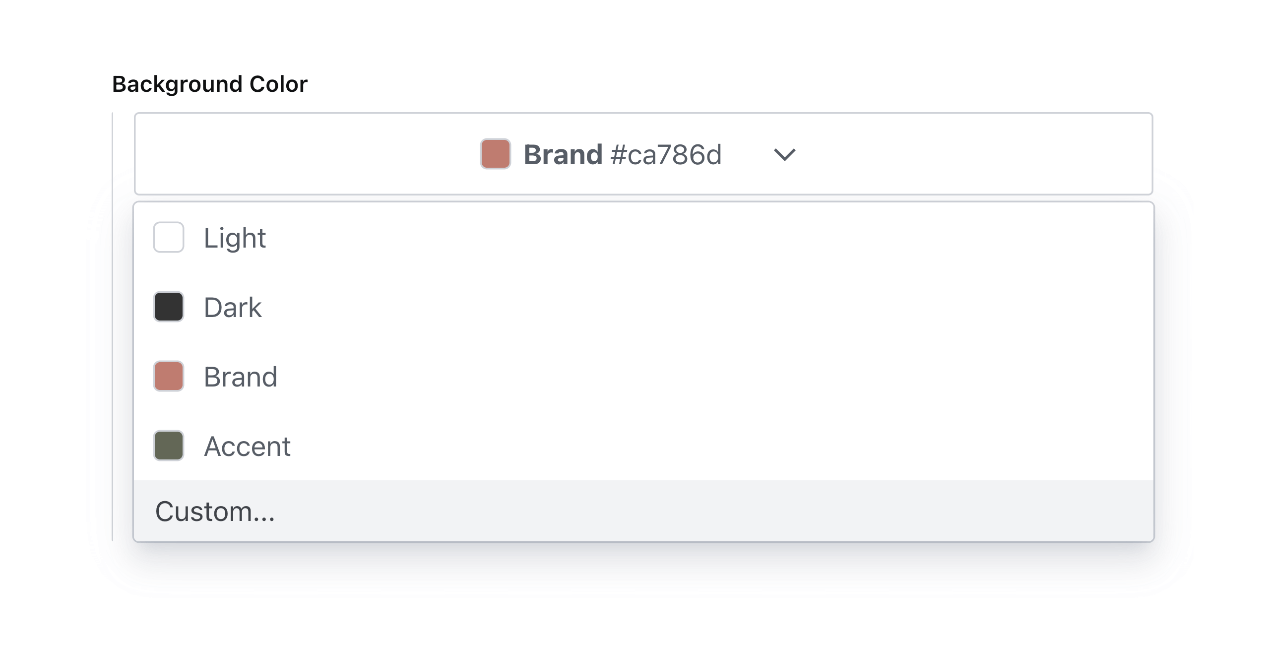
{
name: 'backgroundColor',
title: 'Background Color with List',
type: 'simplerColor', // or textColor or highlightColor
options: {
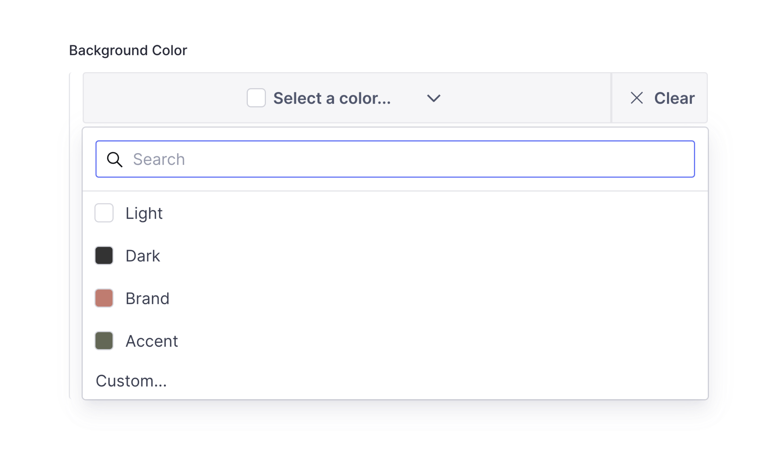
colorList: [
{ label: 'Light', value: '#ffffff' },
{ label: 'Dark', value: '#333333' },
{ label: 'Brand', value: '#ca786d' },
{ label: 'Accent', value: '#626754' },
]
}
}Which will render accordingly:
Allow Custom Values
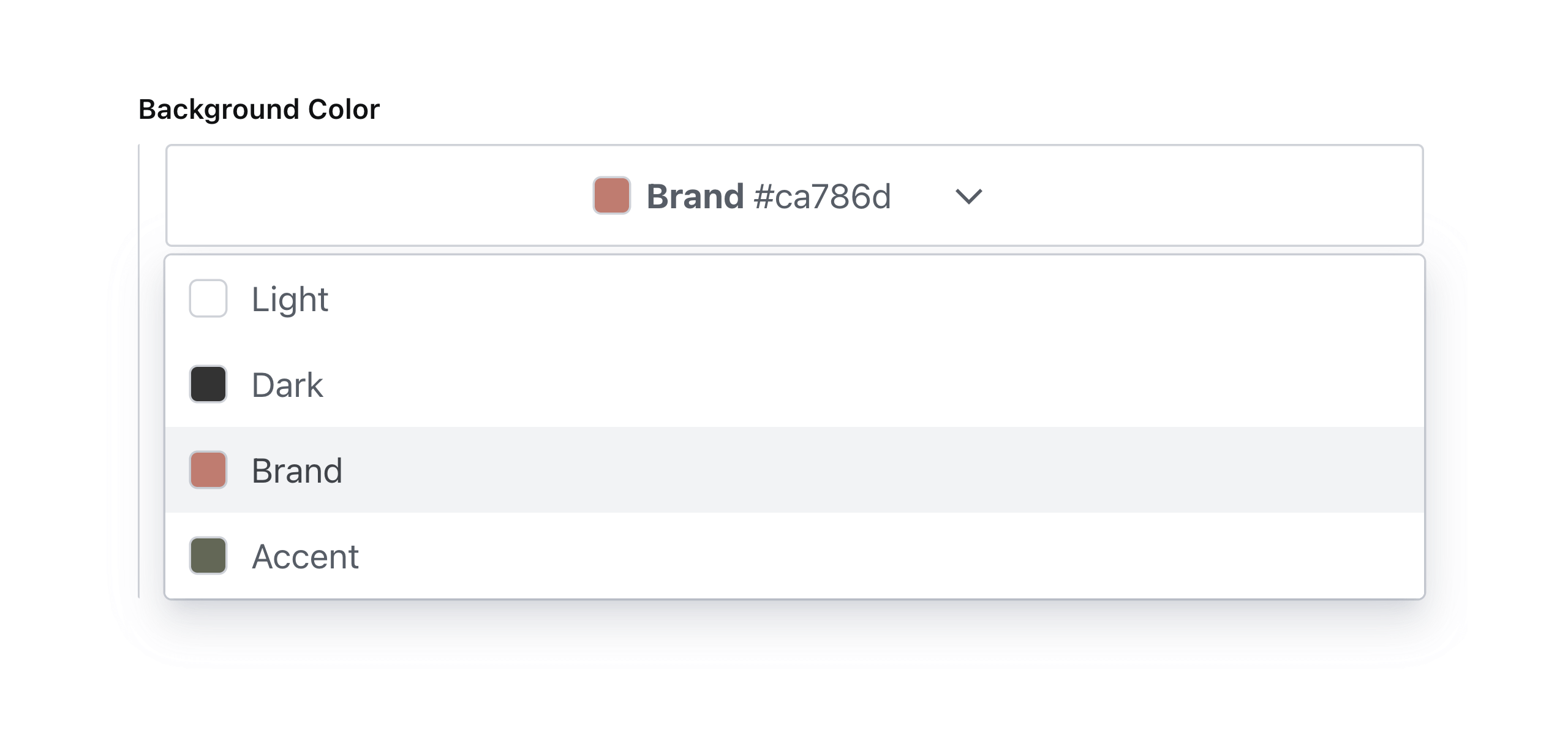
To allow custom color values, add an array item to colorList with its value set to custom.
// ...fields...
{
  name: 'backgroundColor',
  title: 'Background Color with Custom Values',
  type: 'simplerColor', // or textColor or highlightColor
  options: {
    colorList: [
      { label: 'Light', value: '#ffffff' },
      { label: 'Dark', value: '#333333' },
      { label: 'Brand', value: '#ca786d' },
      { label: 'Accent', value: '#626754' },
      { label: 'Custom...', value: 'custom' },
    ],
  }
}
Which will render accordingly:
Note: custom color values will automatically be enabled if no color list is specified.
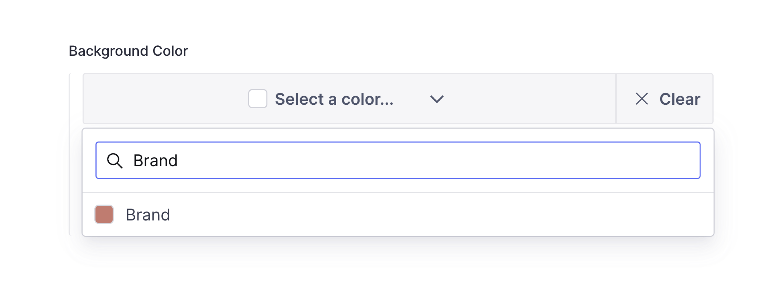
Enable Search
To enable search in the color picker, set enableSearch to true.
// ...fields...
{
  name: 'backgroundColor',
  title: 'Background Color with Search',
  type: 'simplerColor', // or textColor or highlightColor
  options: {
    enableSearch: true,
  }
}
Which will render accordingly:
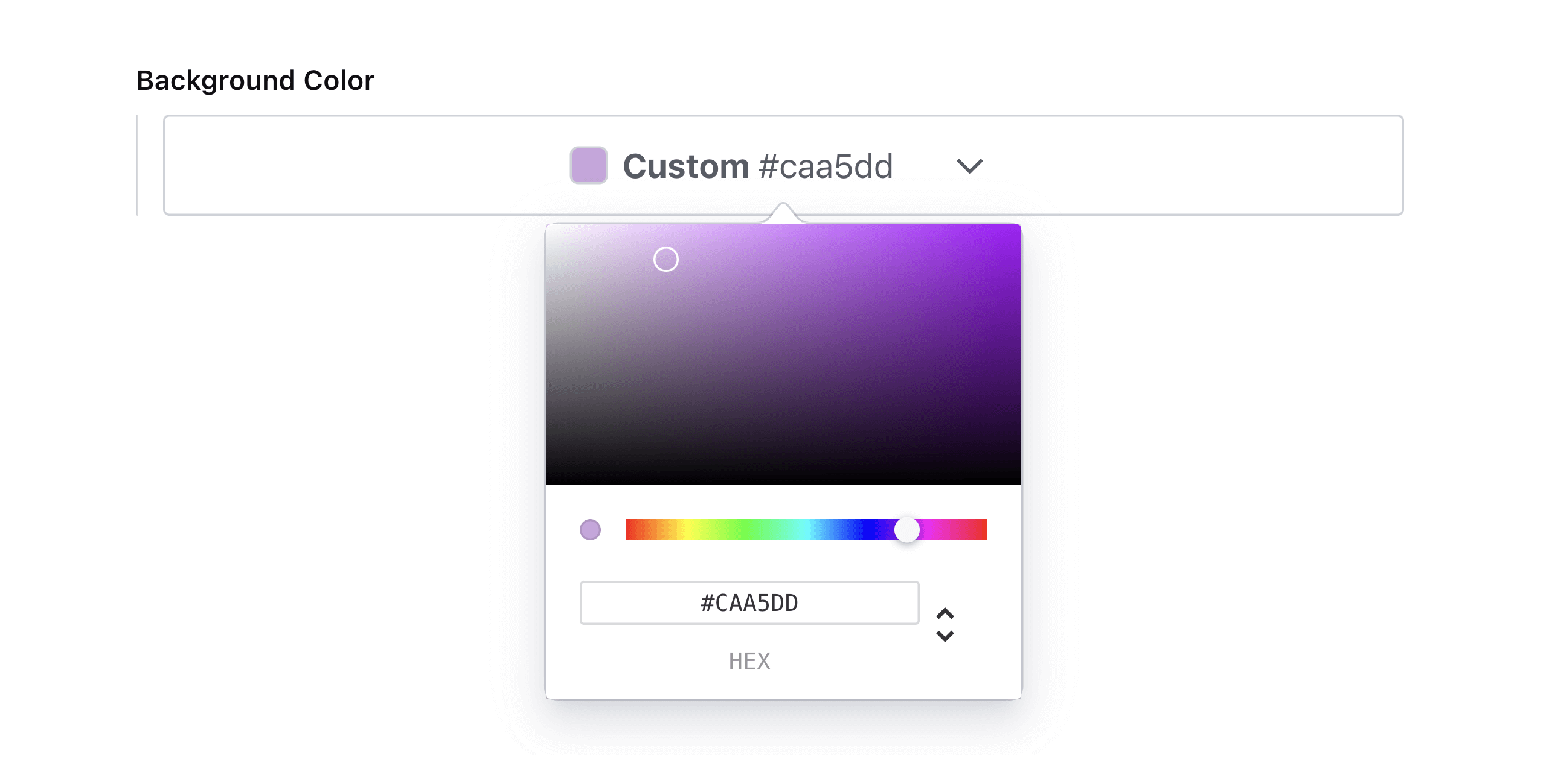
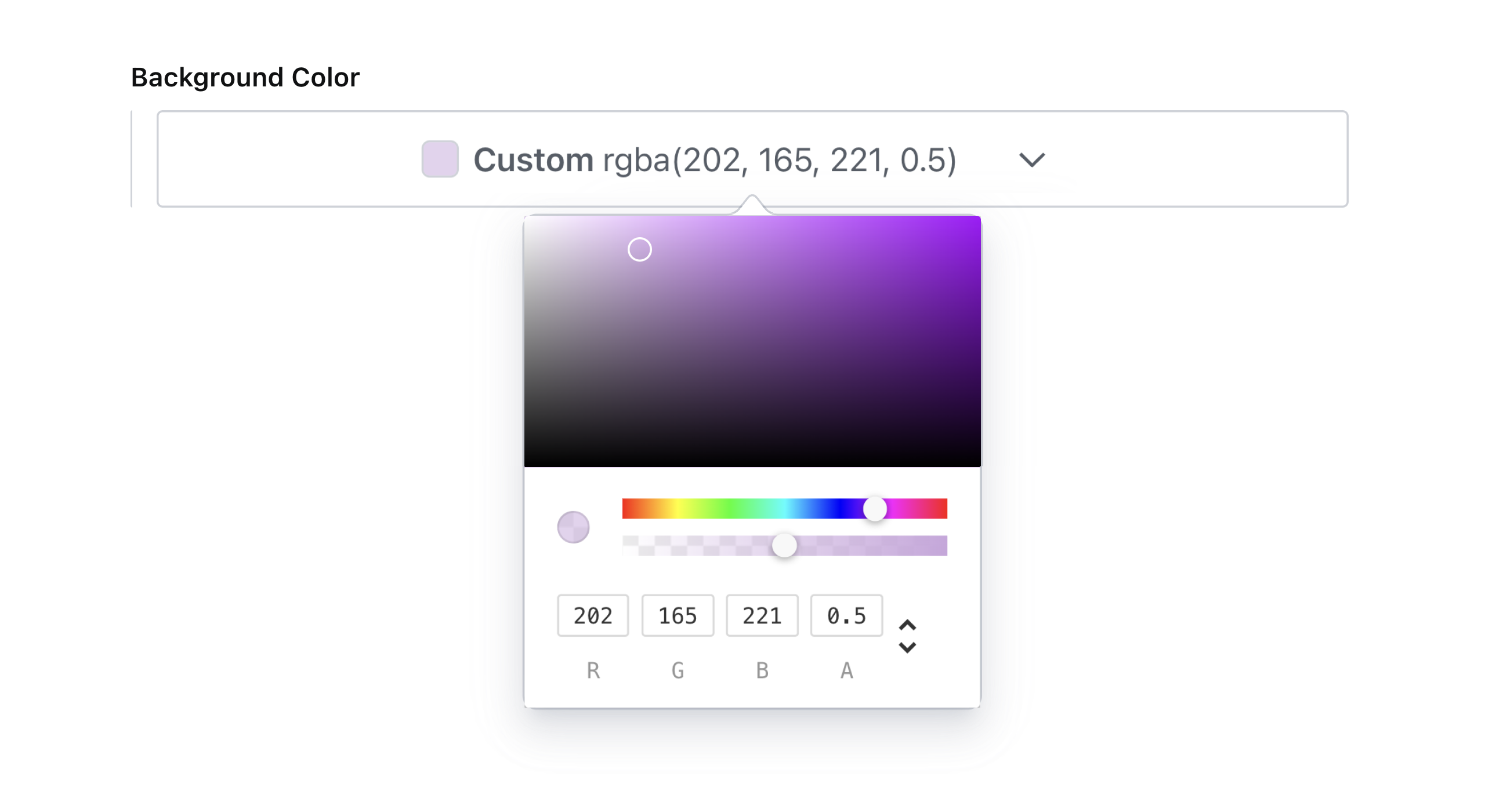
Custom Color Format
The default color format that will be outputted by the color picker is hex. To change this, set colorFormat to any of the following values: hex, hexa, rgb, rgba, hsl, or hsla.
Note: this will take precedence over the value of defaultColorFormat in the plugin config.
// ...fields...
{
  name: 'backgroundColor',
  title: 'Background Color with RGBA Format',
  type: 'simplerColor', // or textColor or highlightColor
  options: {
    colorFormat: 'rgba',
  }
}
Which will render accordingly:
What happened to the enableAlpha option?
This option was removed in favor of the more precise colorFormat setting. The alpha slider will be enabled when the colorFormat is set to hexa, rgba or hsla.
📚 Data model
{
  _type: 'simplerColor', // or textColor or highlightColor
  label: 'Brand',
  value: '#ca786d',
}
💜 License
Created by @AlyssaKirstine
MIT © Cosite LLC
Thank you to @theostrahlen for parts of the code for the Portable Text annotations addition!
🧪 Develop & test
This plugin uses @sanity/plugin-kit with default configuration for build & watch scripts.
See Testing a plugin in Sanity Studio on how to run this plugin with hotreload in the studio.
Release new version
Run "CI & Release" workflow. Make sure to select the main branch and check "Release new version".
Semantic release will only release on configured branches, so it is safe to run release on any branch.