
rn-wheel-scroll-date-input-picker
v2.0.0
Published
A simple and customizable scrollable date picker for React Native, allowing users to input or select dates with a custom text field.
Downloads
21
Maintainers
 mackscript
Readme
rn-wheel-scroll-date-input-picker
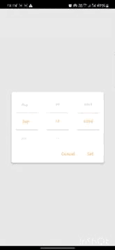
A sleek, scrollable date picker for React Native that allows users to easily select or input dates through a customizable text input field. Designed for flexibility and seamless integration, with options to personalize colors and styles to fit any app's design.
Installation
To install the package, run:
npm install rn-wheel-scroll-date-input-pickerOr using Yarn:
yarn add rn-wheel-scroll-date-input-pickerUsage
Here's how you can use rn-wheel-scroll-date-input-picker in your project:
import React, { useState } from 'react';
import { View, Text, Button } from 'react-native';
import RnDateInputPicker from 'rn-wheel-scroll-date-input-picker';

const App = () => {
   const [showDateModal, setShowDateModal] = useState(false);
   const [newdate, setNewDate] = useState(new Date());
   const closeModal = () => {
    setShowDateModal(false);
   };

  const onSelected = values => {
    setNewDate(values.date);
  };

  return (
    <View>
      <Button title="Select Date" onPress={() => setShowDateModal(true)} />
       <RnDateInputPicker
        lastYear="1900"
        defaultDate={newdate} // 2024-09-09T11:33:40.097Z
        visible={showDateModal} // show Modal
        closeModal={closeModal} // close Modal
        onSelected={onSelected} // seleted Date
      />
    </View>
  );
};

export default App;
Props
| Prop Name | Type | Default | Description |
| ---------------------- | ---------- | ------------ | ----------------------------------------------------------------------------------------------------------------- |
| lastYear | string | "1900" | The minimum year limit that can be selected in the date picker. |
| defaultDate | Date | new Date() | The default date that will be selected when the date picker opens. Pass a JavaScript Date object. |
| visible | boolean | false | Controls the visibility of the date picker modal. Set true to show the modal, and false to hide it. |
| closeModal | function | null | Callback function that closes the modal. Typically passed as a function to hide the modal. |
| onSelected | function | null | Callback function triggered when a date is selected. The selected date is passed as a parameter to this function. |
| btnColor | string | #000 | Defines the background color of the action button (e.g., "Confirm" or "Cancel"). Accepts a valid color string. |
| activeTextColor | string | #000 | Defines the text color for the currently selected date. Accepts a valid color string. |
| highlightBorderWidth | number | 1 | Specifies the width of the border used to highlight the selected date. Accepts a number value for pixel width. |