
rn-slider-button
v1.0.1
Published
RnSlideButton is a customizable React Native component for implementing a sliding button. It features smooth animations and various customization options for the button’s appearance. It requires zero dependencies and works out of the box.
Downloads
21
Maintainers
 dreamcatcher45
Readme
RnSlideButton
RnSlideButton is a customizable React Native component for implementing a sliding button with an optional icon. It features smooth animations and various customization options for the button’s appearance. It requires zero dependencies and works out of the box.
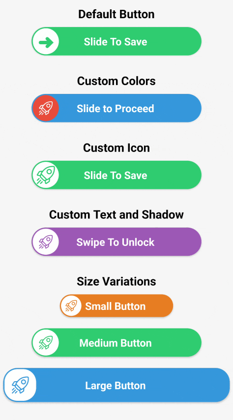
Demo
Usage
Here's a basic example of how to use the RnSlideButton component:
import React from 'react';
import { View, StyleSheet } from 'react-native';
import RnSlideButton from 'rn-slider-button/RnSlideButton';

const App = () => {
  const handleSlideComplete = () => {
    console.log('Slide action completed!');
  };

  return (
    <View style={styles.container}>
      <RnSlideButton
        onSlideComplete={handleSlideComplete}
        width={300}
        height={50}
        backgroundColor="#3498db"
        textColor="#ffffff"
        text="Slide to Confirm"
        thumbColor="#ffffff"
        iconColor="#3498db"
        shadowColor="#000"
        shadowOffset={{ width: 0, height: 2 }}
        shadowOpacity={0.3}
        shadowRadius={3}
        iconSize={30}
        // iconPath={require('./path-to-your-icon.png')}
      />
    </View>
  );
};

const styles = StyleSheet.create({
  container: {
    flex: 1,
    justifyContent: 'center',
    alignItems: 'center',
    backgroundColor: '#f5f5f5',
  },
});

export default App;
Props
| Prop | Type | Default | Description |
|------------------|---------------------------|------------------|------------------------------------------------------------------------|
| onSlideComplete | () => void | - | Function to call when the slide action is completed. |
| width | number | 300 | Width of the slide button. |
| height | number | 50 | Height of the slide button. |
| backgroundColor | string | #2ecc71 | Background color of the button. |
| textColor | string | #ffffff | Color of the text inside the button. |
| text | string | Slide To Save | Text to display inside the button. |
| thumbColor | string | #ffffff | Color of the draggable thumb. |
| iconColor | string | #2ecc71 | Color of the icon inside the thumb. |
| shadowColor | string | #000 | Shadow color for the button. |
| shadowOffset | { width: number, height: number } | { width: 0, height: 2 } | Offset of the shadow. |
| shadowOpacity | number | 0.2 | Opacity of the shadow. |
| shadowRadius | number | 2 | Radius of the shadow blur. |
| iconSize | number | 24 | Size of the icon inside the thumb. |
| iconPath | number | - | Optional: Path to the icon image (require the image using require). |