rn-slide-to-confirm
v1.0.6
Published
Slide to confirm for React Native
Maintainers
Readme
rn-slide-to-confirm
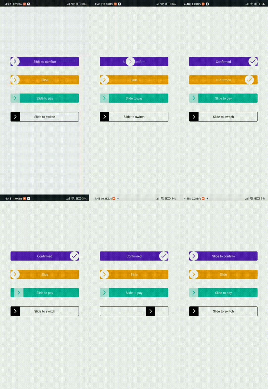
Slide to confirm button for react native
Demo

Installation
npm i rn-slide-to-confirmBasic usage
import React, { useState } from 'react';
import { View } from 'react-native';
import SlideToConfirm from 'rn-slide-to-confirm';

const Slider = () => {
    const [sliderState, setSliderState] = useState(false);

    return (
        <View>
            <SlideToConfirm
                unconfimredTipText={"Slide to confirm"}
                unconfirmedTipTextStyle={{
                    color: "white",
                    fontSize: 18
                }}

                confirmedTipText={"Confirmed"}
                confirmedTipTextStyle={{
                    color: "white",
                    fontSize: 18
                }}
                state={sliderState}
                onSlideConfirmed={() =>setSliderState(true)}
                sliderStyle={{
                    justifyContent: 'center',
                    width: 300,
                    height: 40,
                    borderRadius: 8,
                    overflow: 'hidden',
                }}
            />
        </View>
    );
}

export default Slider;
Props
| Prop | Type | Description | | :-------- | :------- | :------------------------- | | onSlide |callback | callback while sliding | | onSlideEnd |callback | callback when sliding ended | | onSlideRelease |callback | callback when sliding released | | onSlideBegin |callback | callback when sliding begin | | onSlideConfirmed |callback | callback when sliding confirmed | | onSlideNotConfirmed |callback | callback when sliding not confirmed | | defaultColor | string | set default color for all components (default is "#5920BC") | | defaultIconSize | number | set icon size (default is 30) | | tipAnimationEnable |boolean | set slider tip animation (default is true) | | tipTextSlideAnimEnable |boolean | set tip text animation (default is true) | | sliderTipDuration |number | duration time for slide tip animation (default is 300) | | sliderTipDistanceFromLeft |number | distance from left when slide tip animation started (default is 40) | | goToBackDuration | number | duration time for go back after slide ending or not confirmed (default is 300) | | confirmedPercent | number | range: 0 - 1 , slider will be confirmed at this percent of the width of the slider (default is 0.8) | | ballPadding |number | padding of slider ball - left and right. this is recommended prop for adding padding to an inside component of the slider (default is 0) | | disableOnConfirmed |boolean | disables gesture handler after sliding confirmed default(false)| | state |boolean | current state of slider. This is recommended prop for changing state of slider. it helps you to change state after an action with pretty animation (default is false)| | unconfimredTipText |string | shown text in slider before confirmed (while slider is unconfimred). default is "" | | confirmedTipText |string | shown text in slider while slider is confirmed. default is ""| | confirmedTipTextStyle |style |confirmed tip text style | | unconfirmedTipTextStyle |style | unconfirmed tip text style | | sliderStyle |style | custom slider container style. Don't forget making overflow:"hidden" in custom style. because inside component of slider can go out of box | | sliderButtonComponent |component | custom slider button component. you can create your custom inside component of slider container |
