rn-flabel-textfield
v0.1.4
Published
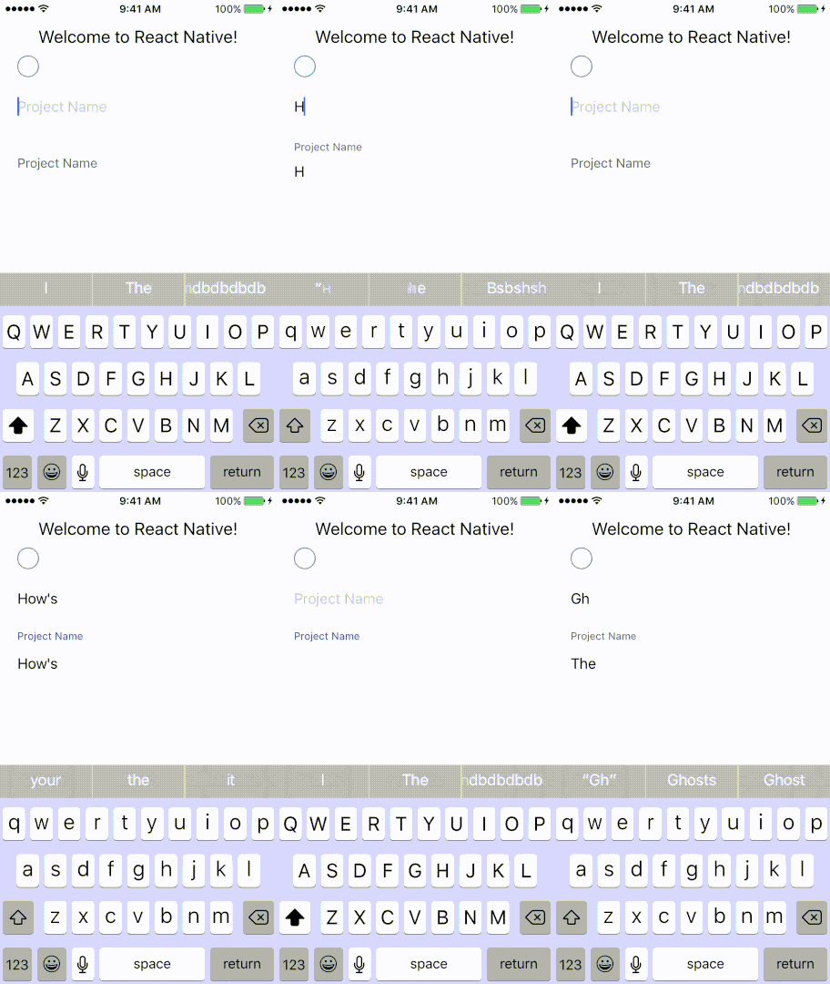
A simple wrapper around 'TextInput'. Works both for iOS and Android. Note the wrapped TextField has no placeholder - the placeholder is 'simulated' by the floating label being down where the placeholder would normally be. I might later add a version which
Downloads
2
Readme
React Native Floating Label TextField
A simple wrapper around 'TextInput'. Works both for iOS and Android. Note the wrapped TextField has no placeholder - the placeholder is 'simulated' by the floating label being down where the placeholder would normally be. I might later add a version which actually uses placeholder but for now, trying to use the placeholder causes issues with appearance.**
install
npm i --save rn-flabel-textfield
Props:
Accepts all TextField props plus the following:
| Property | Type | Default | Description |
|-----------|--------|---------|--------------------------------------------|
| duration | number | 250 | Animation duration |
| inactiveColor | string | 'dimgrey' | Color of floating label when the TextInput has no focus or when the floating label is down |
| placeholderFontSize | number | 15 | Font size of placeholder |
| flabelFontSize | number | 12 | Font size of floating label |
| activeColor | string | '#414Db1' | Color of focused floating label |
| flabelPadding | number | 20 | Top padding of the floating label when it is down |
| flabelActivePadding | number | 0 | Top padding of the floating label when it is up |
| wrapperStyle | object | {} | Style for the View that wraps the floating label and the TextInput |
example usage:
import FloatLabelTextField from 'rn-flabel-textfield'
...
<FloatLabelTextField
    placeholder={'Project Name'}
    onChangeText={newProject.setProjectName}
    value={newProject.name}
    style={{height: 60}}
    wrapperStyle={{marginTop: 15}}
/>
Checkbox, TextInput and Floating label textinput
License: MIT
** small flicker when using Animated, which isn't there with LayoutAnimation which in turn causes blurry placeholder issues on iOS.
