react-video-seek-slider-fork
v6.0.6
Published
React video seek slider like youtube
Downloads
74
Readme
react-video-seek-slider
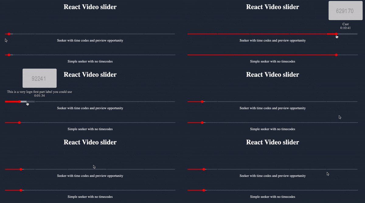
The simplest, light weight and dependency free html video seeker like YouTube for React With time codes and video preview opportunity
Demo codesandbox demo

What's new in v6
- Added time codes and seeker preview fully like in youtube player!
- The codebase is completely refactored and optimized
Braking changes from v5 -> v6
props names that are changed
progress->bufferTimehideSeekTimes->hideThumbTooltip
Braking changes from v4 -> v5
All time values you pass to props like max, currentTime and progress now are in milliseconds instead of seconds.
onChange prop will also return time param in milliseconds as well.
How to install
npm i react-video-seek-slider
or
yarn add react-video-seek-slider
How to import
For TypeScript usage there is a index.d.ts
import { VideoSeekSlider } from "react-video-seek-slider";Also you have to use css file in a lib folder:
import "react-video-seek-slider/styles.css"How to use
//JSX
    const [currentTime, setCurrentTime] = useState(0);
    /// .....
    <VideoSeekSlider
        max={1152000}
        currentTime={currentTime}
        bufferTime={400000}
        onChange={setCurrentTime}
        secondsPrefix="00:00:"
        minutesPrefix="00:"
        timeCodes={[
          {
            fromMs: 0,
            description: 'Description label of the first part',
          },
          {
            fromMs: 130000,
            description: 'Description label of the last part',
          },
        ]}
    />
Available component props
max(number, required) - video duration (in milliseconds)currentTime(number, required) - current video progress (in milliseconds)bufferTime(number) - Current buffer progress (in milliseconds)hideThumbTooltip(boolean) - hide hover seek time (Default: false)onChange((time:number, offsetTime:number)=>void, required) - script to be run when thumb change positionoffset(number, default:0) - when you need start slider with offset timeminutesPrefix(string, default: '') - when video duration is less than an hour you can use time prefix like "0:" so the time tooltip will show e.g "0:25:23"secondsPrefix(string, default: '') - when video duration is less than one minute it's possible to use time prefix like "0:00:" and the time tooltip will show e.g "0:00:10"limitTimeTooltipBySides(boolean, default: true) - limit the time tooltip position inside of the slidertimeCodes(TimeCode[], default: undefined) - will divide slider into parts according to an array of timesgetPreviewScreenUrl((hoverTimeValue: number) => string, default: undefined) - the callback function is going to be called each time when a slider in hovered. It will pass a current hover mouse time and expect and preview image url to be returned
TimeCode object
fromMs(number, required) - time stamp in milliseconds from where the part is startingdescription(string, required) - label that will appear on seeking tooltip
To use time codes you should provide to the component an array of timeCode objects according to scheme above. The very first part is always should start from fromMs=0. The other parts any valuer according to those places where you would like to slice a slider.
For development
just use:
$ npm i
$ npm run dev
open your browser http://localhost:3000
For Build
$ npm run build