react-ui-notification
v0.0.3
Published
A simple and flexible UI notifications component using React.
Downloads
4
Maintainers
Readme
React UI Notification
A simple component for flexible UI notifications using React.
Installation
npm install react-ui-notification --save

See src/main.js for a sample usage of the Component.
Example:
import Styling from `./CustomStyling.js`;

<Notification
  onDismiss={this.hideAlert}
  isActive={this.state.isAlertActive}
  position="top"
  styles={Styling}
  message="Hello there, old chap!">
</Notification>
Options
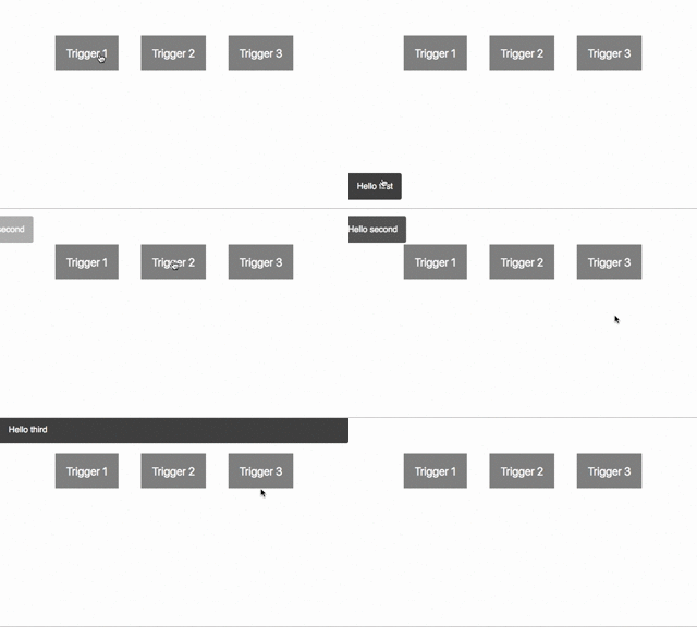
position: top        # Toast, at the top
position: bottom     # Toast, at the bottom
position: full       # Full width bar
autoDismiss: Bool    # Auto-dismiss notification
dismissAfter: Number # Time to auto-dismiss (in ms)
styles: Object       # Object with CSS styling (see example)
Styling
Some basic styling is provided by default.
You can customise your own styles by copying the contents of the ExampleStyling.js (also found in the lib folder of the npm package) and tweaking styles per your needs, passing it as a React property of styles.
Todo
- [ ] Add the possibility to have a title
- [ ] More (better) styling by default
- [ ] Pause dismiss on hover
- [x] Inline styles
