
react-ui-gauge-component
v1.0.0
Published
It's a React UI component for creating guages
Downloads
8

Readme
Gauge Component for React
A library that provides basic gauge styles and widgets to create gauges efficiently for React projects.
Installation and usage
The easiest way to use react-ui-gauge-component is to install it from npm.
npm i react-ui-gauge-componentThen use it in your app
import React, { Fragment } from 'react';
import withGauge, { HeartBeat, Needle } from 'react-ui-gauge-component';
const defaultTitleColor = "black";
const defaultValueColor = "black";
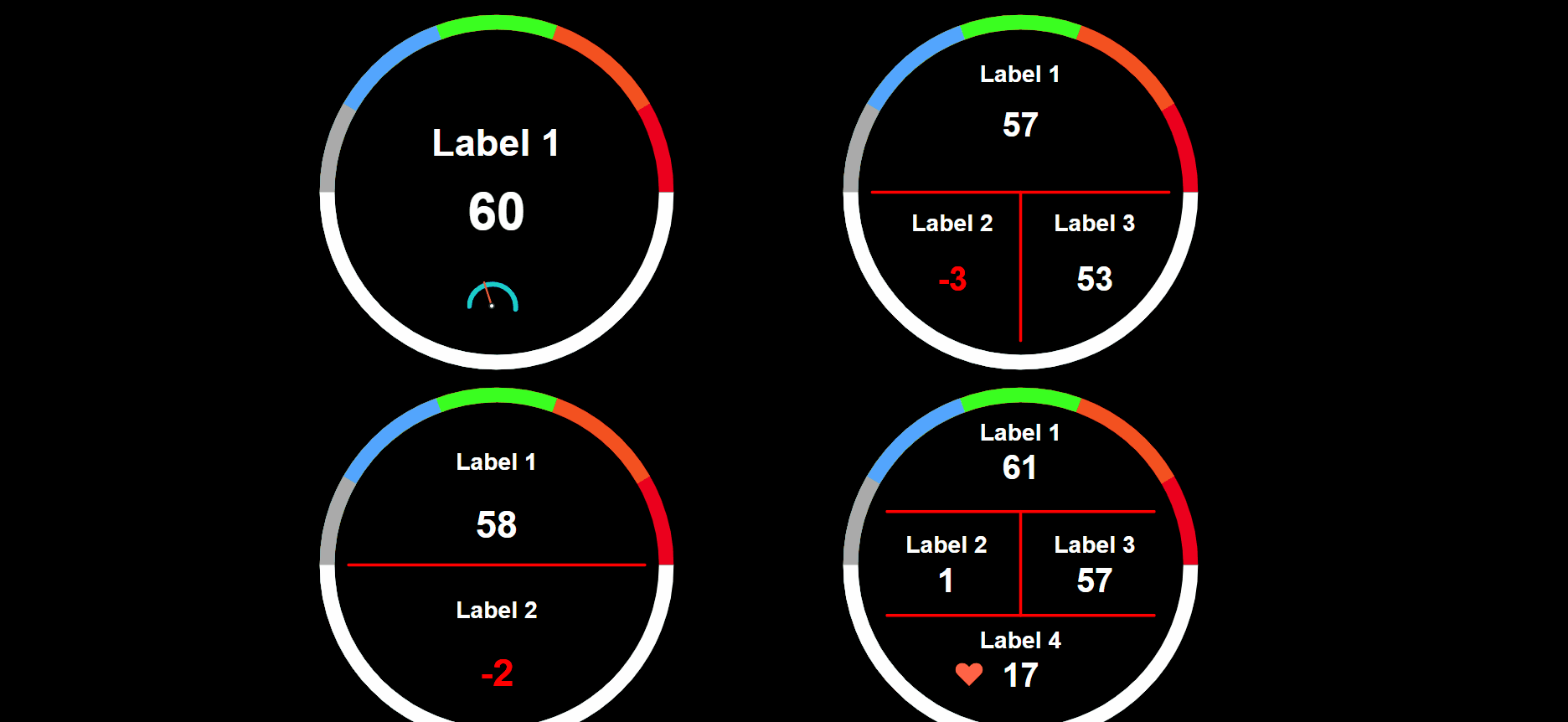
const Gauge1 = withGauge({
WrappedComponent: Needle({value:data[0], min: 0, max: 100}),
fields: [{title: "Label 1", value: "100", titleColor: defaultTitleColor, valueColor: defaultValueColor}]
});
const Gauge2 = withGauge({
WrappedComponent: HeartBeat,
colorArray: ["#eb001e", "#000", "#3aff20", "#53a5fd", "#aaaaaa"],
fields: [
{title: "Label 1", value: "100", titleColor: defaultTitleColor, valueColor: defaultValueColor},
{title: "Label 2", value: "100", titleColor: defaultTitleColor, valueColor: defaultValueColor}]
});
const Gauge3 = withGauge({
WrappedComponent: HeartBeat,
fields: [
{title: "Label 1", value: "100", titleColor: defaultTitleColor, valueColor: defaultValueColor},
{title: "Label 2", value: "100", titleColor: defaultTitleColor, valueColor: defaultValueColor},
{title: "Label 3", value: "100", titleColor: defaultTitleColor, valueColor: defaultValueColor}]
});
const Gauge4 = withGauge({
WrappedComponent: HeartBeat,
fields: [
{title: "Label 1", value: "100", titleColor: defaultTitleColor, valueColor: defaultValueColor},
{title: "Label 2", value: "100", titleColor: defaultTitleColor, valueColor: defaultValueColor},
{title: "Label 3", value: "100", titleColor: defaultTitleColor, valueColor: defaultValueColor},
{title: "Label 4", value: "100", titleColor: defaultTitleColor, valueColor: defaultValueColor}]
});
const DashboardExample = () => {
return (
<Fragment>
<Gauge1/>
<Gauge2/>
<Gauge3/>
<Gauge4/>
<Fragment/>
)
}
export default DashboardExample;
Props
withGauge
- WrappedComponent - Put a react component as a widget to compose a new gauge. The default widget is the heartbeat icon.
- colorArray - Put an array of color for the gauge border.
colorArray: ["#eb001e", "#f35120", "#3aff20", "#53a5fd", "#aaaaaa"]- fields - Put an array of key, value pairs for the gauge's contents.
fields: [
        {title: "Gauge 1", value: "100", titleColor: "black", valueColor: "black"},
        {title: "Gauge 2", value: "100", titleColor: "black", valueColor: "black"},
        {title: "Gauge 3", value: "100", titleColor: "black", valueColor: "black"},
        {title: "Gauge 4", value: "100", titleColor: "black", valueColor: "black"}]
Needle
- value: defult value is zero
- min: defult value is zero
- max: defult value is 100
License
MIT Licensed. Copyright (c) Jen-Hsuan Hsieh 2021.
About
Links
Refernces
- [Guide] 發佈 npm 套件 - 從手動到自動(0):專案與套件建置篇
- 發佈 npm 套件 - 從手動到自動(2):手動 publish 篇
- React.js编译
- 如何使用Rollup打包样式文件并添加LiveReload
- Babel helpers are bundled into the output file
- rollup使用过程中遇到的各种问题
- rollup打包js的注意點-haorooms部落格分享
- The complete guide to publishing a React package to npm
- How does React decide to re-render a component?