
react-textfield
v0.0.6
Published
Elegant text filed of React Component.
Downloads
69

Readme
react-textfield


Elegant textfield of React Component.
Live Playground
For examples of the react-textfield in action, go to http://blog.yayoc.com/react-textfield.
OR
To run that demo on your own computer:
- Clone this repository
npm installnpm run storybook- Visit http://localhost:9001/
Getting Started
Install dependencies
Ensure packages are installed with correct version numbers by running:
(
  export PKG=react-textfield;
  npm info "$PKG" peerDependencies --json | command sed 's/[\{\},]//g ; s/: /@/g; s/ *//g' | xargs npm install --save "$PKG"
)
Which produces and runs a command like:
npm install --save react-textfieldInclude component
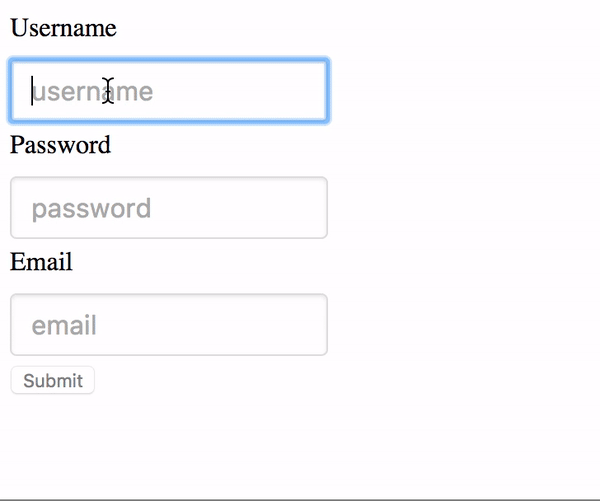
import { TextField, validator } from 'react-textfield';Make some elegant textfield
<ReactTextField
  name="username"
  type="text"
  placeholder="username"
  validators={usernameValidators}
  successMessage="This Username is available."
/>
API
We have one component and validators for all of your textfield needs.
ReactTextField
This controlled components is designed to make input textfield with some messages easily.
We will make accessible and convenient form for end-users by showing appropriate success or error messages.
props
Type: This props will pass as a type attribute of Input tag.
type: PropTypes.oneOf([
  'text',
  'password',
  'email',
  'tel',
  'url',
])
Name:
This props will pass as a name attribute of Input tag.
If you are using multiple components, This props must be unique.
Validators:
This props is array of validator object which contains both error message and handler as properties.
Args of the handler is string value ( text field value ), Return value is boolean type.
You can set validator from utilities, or register custom validator by yourself.
Indeed, it is possible to confirm validator methods provided here.
About using custom validater, please check example.
// One of Error object includes validater and error message.
validators: PropTypes.arrayOf(React.PropTypes.shape({
  message: PropTypes.string.isRequired,
  validator: PropTypes.func.isRequired,
})),
Placehodler: This props will pass as placeholder attribute of Input tag.
successMessage:
The success message will appear when validation is passed.
Unless you set this props, success message will not appear.
afterValidate:
A handler will execute after validating.
First args is isValid(boolean type), second args is name (string type).
onChange: A event handler of input text filed. In addition to original args, Name will pass as second args.
onBlur: A event handler of input text filed.
onFocus: A event handler of input text filed.
ValidateOnBlur: Default value is false. When embedding true, validating will be occurred onBlur event only.
Validators
length: Validate the length of value. The second args { min: integer, max: integer }.
isAlphanumeric: Validate whether alphanumeric or not.
mustContainUpperCase: Validate whether value contains upper case at least one.
isEmail: Validate whether value is formatted of Email address.
isURL: Validate whether value is formatted of Email address.
Examples
render() {
  const usernameValidators = [
    {
      message: 'Username must be 4 - 12 characters',
      validator: value => validator.length(value, { min: 4, max: 12 }),
    },
    {
      message: 'Username must be alphanumeric.',
      validator: value => validator.isAlphanumeric(value),
    },
  ];

  <ReactTextField
    name="username"
    placeholder="username"
    validators={usernameValidators}
    successMessage="This Username is available."
  />
}
Custom validator sample
check the value of input text is some text.
const customValidator = {
  message: 'text must be some text.',
  validator: value => value === 'some text',
}
Style
Passing style props make override default style by embedding inline style. Style object must be following format.
const style = {
  container: {
    textAlign: 'center',
  },
  input: {
    margin: '30px',
  },
  successMessage: {
    fontSize: '20px',
    color: '#3949AB',
  },
  errorMessage: {
    fontSize: '20px',
    color: '#E91E63',
  },
};
Tests
npm test