
react-tabs-simple
v1.0.0
Published
Simple React tabs wrapper component. Wrap around HTML to turn into tabs.
Downloads
3
Maintainers
 rickygoach
Readme
React Tabs Simple Wrapper Component
Simple React tabs wrapper component. Wrap around HTML to turn into tabs..
How it works
- The component works as a wrapper which turns the content added into tabs.
How to use
Install
Installation: npm install react-tabs-simple
Usage
Import the package into your app:
import { TabsComponent } from "react-tabs-simple";
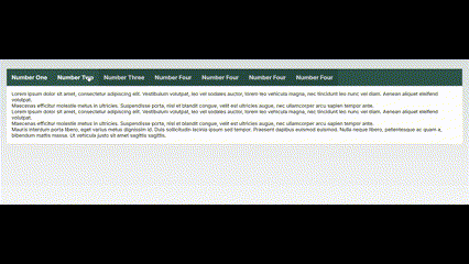
Component Example:
    <TabsComponent
        tabPadding={"1rem"}
        tabColour={"white"}
        tabBackgroundColour={"#2C514C"}
        tabRowBackgroundColour={"#355853"}
        contentPadding={"1rem"}
        contentColour={"black"}
        contentBackgroundColour={"white"}
    >
        <>
            <div className="tab">
                <h3>Number One</h3>
            </div>
            <div className="content">
                <p> Mauris interdum porta libero, eget varius metus dignissim id. Duis sollicitudin lacinia ipsum sed tempor. Praesent dapibus euismod euismod. Nulla neque libero, pellentesque ac quam a, bibendum mattis massa. Ut vehicula justo sit amet sagittis sagittis.</p>
            </div>
        </>
        <>
            <div className="tab">
                <h3>Number Two</h3>
            </div>
            <div className="content">
                <p>Lorem ipsum dolor sit amet, consectetur adipiscing elit. Vestibulum volutpat, leo vel sodales auctor, lorem leo vehicula magna, nec tincidunt leo nunc vel diam. Aenean aliquet eleifend volutpat.</p>
                <p>Maecenas efficitur molestie metus in ultricies. Suspendisse porta, nisl et blandit congue, velit est ultricies augue, nec ullamcorper arcu sapien tempor ante.</p>
                <p>Lorem ipsum dolor sit amet, consectetur adipiscing elit. Vestibulum volutpat, leo vel sodales auctor, lorem leo vehicula magna, nec tincidunt leo nunc vel diam. Aenean aliquet eleifend volutpat.</p>
                <p> Maecenas efficitur molestie metus in ultricies. Suspendisse porta, nisl et blandit congue, velit est ultricies augue, nec ullamcorper arcu sapien tempor ante.</p>
                <p> Mauris interdum porta libero, eget varius metus dignissim id. Duis sollicitudin lacinia ipsum sed tempor. </p>
            </div>
        </>
        <>
            <div className="tab">
                <h3>Number Three</h3>
            </div>
            <div className="content">
                <p>Lorem ipsum dolor sit amet, consectetur adipiscing elit. Vestibulum volutpat, leo vel sodales auctor, lorem leo vehicula magna, nec tincidunt leo nunc vel diam. Aenean aliquet eleifend volutpat.</p>
                <p> Mauris interdum porta libero, eget varius metus dignissim id. Duis sollicitudin lacinia ipsum sed tempor. </p>
                <p>Maecenas efficitur molestie metus in ultricies. Suspendisse porta, nisl et blandit congue, velit est</p>
            </div>
        </>
    </TabsComponent>
Component Options:
- The <TabsComponent> MUST follow this format
    <>
        <div className="title">

        </div>
        <div className="content">

        </div>
    </>

-  `tabPadding={"1rem"} `
    Padding for tab.

-   `tabColour={"white"}`
    Text colour for tab.

-  `tabBackgroundColour={"#2C514C"}`
    Tab Background Colour.

-  `tabRowBackgroundColour={"#355853"}`
    Background colour for tab row

-  `contentPadding={"1rem"}`
    Content section padding.

-  `contentColour={"black"}`
    Content section text colour.

-  `contentBackgroundColour={"white"}`
    Content section background colour.