
react-stone-mason
v1.0.22
Published
Downloads
5

Readme
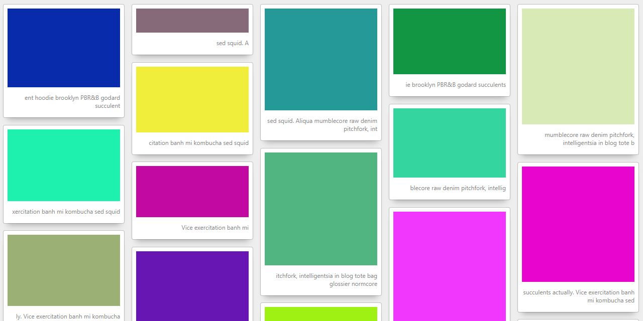
React Stone Mason
Responsive masonry layout engine for react.
What makes this different
Obviously, this isn't the first masonry layout component for react.
- Uses standard media queries to set column counts. Media queries are parsed and intepreted by the browser, not the component.
- Unopinionated about whats inside, with no modifications to your elements. No event handlers bound, no styles applied.
- Simple layout logic. Items are rendered by the browser in a standard inline-block flow, then the component repositions the elements vertically to consume white space between column neighbors.
live demo: https://nihlton.github.io/mason/
Installation
npm install react-stone-mason
or
yarn add react-stone-mason
Usage
const columnConfig = {
	[break point]: {
		query: '[CSS media query]',
		columns: [number of columns],
	},
	...
}
<Mason columns={columnConfig}>{ children }</Mason>
break point - any name, for readability.
CSS media query - (optional) a media query string. see: Window.matchMedia()
- if a query isn't provided, the column value will be treated as the default/fallback value.
columns - number of columns to divide child elements into.
Notes:
- CSS transitions and animations on element size can foil the resizeObserver.
- The Mason component will wrap your elements in a div and apply the following CSS properties to the Mason owned divs:
- box-sizing: inherit;
- display: inline-block;
- vertical-align: top;
- width: var(--cell-width);
- Adding additional styles to these Mason controlled elements can interfer with positioning. Proceede with caution.
Basic Example
import React from 'react'
import Mason from 'react-stone-mason'

function App() {

  return (
    <div className="App">
      <Mason columns={ default: { columns: 3 } }>{ [children] }</Mason>
    </div>
  );
}

export default App
Responsive Example
import React from 'react'
import Mason from 'react-stone-mason'

function App() {

  const columnConfig = {
    small: {
      query: '(max-width: 720px)',
      columns: 2
    },
    medium: {
      query: '(min-width: calc(721px)) and (max-width: calc(1022px) )',
      columns: 3
    },
    large: {
      query: '(min-width: 1023px)',
      columns: 4
    }
  }


  return (
    <div className="App">
      <Mason columns={columnConfig}>{ [children] }</Mason>
    </div>
  )
}

export default App;