
react-stepper-component-simple
v1.0.0
Published
React stepper component with mobile and desktop config.
Downloads
81
Maintainers
 rickygoach
Readme
React Stepper Component Simple
React stepper component with mobile and desktop config.
How it works
- The
<StepperComponent>acts as a wrapper and the<StepperItemComponent>is a wrapper for each step.
How to use
Install
Installation: npm install react-stepper-component-simple
Usage
Import the package into your app:
import { StepperComponent, StepperItemComponent } from "react-stepper-component-simple";
Component Example:
<StepperComponent
stepNumberBackgroundColour="#2C514C"
stepNumberTextColour="white"
stepNumberWidth="24px"
stepNumberHeigth="24px"
buttonStyles={{padding: "1rem 2rem", border: 0, backgroundColor: "#2C514C", color: "white"}}
contentWrapperStyles={{padding: "1rem"}}
stepTitleDirectionMobile="column"
stepTitleDirectionDesktop="row"
mobileBreakpoint={768}
>
<StepperItemComponent header="Step One">
<div className="step-content">
<h2>Step one content</h2>
<p>
Cras vel dui molestie, condimentum urna ac, lacinia ex. Vestibulum ante ipsum primis in faucibus orci luctus et ultrices posuere cubilia curae; Pellentesque bibendum, sapien ut rhoncus aliquam, ante metus auctor ante, ut pharetra purus dolor vitae ante. Aenean rhoncus eu leo non fermentum.
</p>
</div>
</StepperItemComponent>
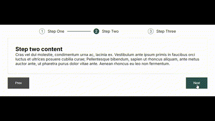
<StepperItemComponent header="Step Two">
<div className="step-content">
<h2>Step Two content</h2>
<p>
Cras vel dui molestie, condimentum urna ac, lacinia ex. Vestibulum ante ipsum primis in faucibus orci luctus et ultrices posuere cubilia curae; Pellentesque bibendum, sapien ut rhoncus aliquam, ante metus auctor ante, ut pharetra purus dolor vitae ante. Aenean rhoncus eu leo non fermentum.
</p>
</div>
</StepperItemComponent>
<StepperItemComponent header="Step Three">
<div className="step-content">
<h2>Step three content</h2>
<p>
Cras vel dui molestie, condimentum urna ac, lacinia ex. Vestibulum ante ipsum primis in faucibus orci luctus et ultrices posuere cubilia curae; Pellentesque bibendum, sapien ut rhoncus aliquam, ante metus auctor ante, ut pharetra purus dolor vitae ante. Aenean rhoncus eu leo non fermentum.
</p>
</div>
</StepperItemComponent>
</StepperComponent> Component Options:
-  `stepNumberBackgroundColour="#2C514C"`
    Step number background colour.

-  `stepNumberTextColour="white"`
    Step number text colour.

-   `stepNumberWidth="24px"`
    Step number width.

-  `stepNumberHeigth="24px"`
    Step number height.

-  `buttonStyles={{padding: "1rem 2rem", border: 0, backgroundColor: "#2C514C", color: "white"}}`
    Prev and next button styles.

-  `contentWrapperStyles={{padding: "1rem"}}`
    Content wrapper styles.

- `stepTitleDirectionMobile="column"`
    Step title flex direction mobile.

-  `stepTitleDirectionDesktop="row"`
    Step title flex direction desktop.

-  `mobileBreakpoint={768}`
    Mobile breakpoint.