
react-smooth-toast
v1.0.24
Published
A lightweight, customizable, and easy-to-use toast notification library for React. Add sleek and responsive toast messages to your app with flexible styling options and built-in accessibility support. Perfect for developers seeking a simple, fast, and ada
Downloads
63
Maintainers
 m-sohaibnadeem
Keywords
Readme
React Smooth Toast
All in one light weight toast notification library for React built with TypeScript. This library provides an easy-to-use API for displaying toast notifications with customizable icons, styles, positions, and animations.
Changelog Version 1.0.24 👌
Note: No Breaking Changes
Enhanced Progress Bar variant to have different color based on the type of the toast.
Added
pauseOnHoverprop to theToastContainercomponent to pause the toast countdown when hovering over the toast.Added
groupIdandgroupCountprops to theToastContainercomponent to control the behavior of grouped toasts. Now you can control how many toasts will be shown in the group. It will have a info tooltip on hover to show the total number of toasts in the group.Added
SpinnerIconto theToastcomponent to show a loading spinner when the toast is pending.
Features
- Multiple Toast Types: Supports
success,error,info, andwarningtoasts. - Multiple Toast Variants: Supports
minimal,material,modern,progress,rounded,glassmorphism,dark,gradientand more variants coming soon. - Multiple Toast Positions: Supports
top-left,top-right,bottom-left,bottom-right,top-center,bottom-center. - Customizable: Easily customize icons, class names, styles, and positions.
- Animations: Built-in smooth entry and exit animations with pure CSS options.
- Responsive: Toasts are positioned correctly on different screen sizes.
- Easy Integration: Simple setup with context and hooks.
Installation
Install the library using npm:
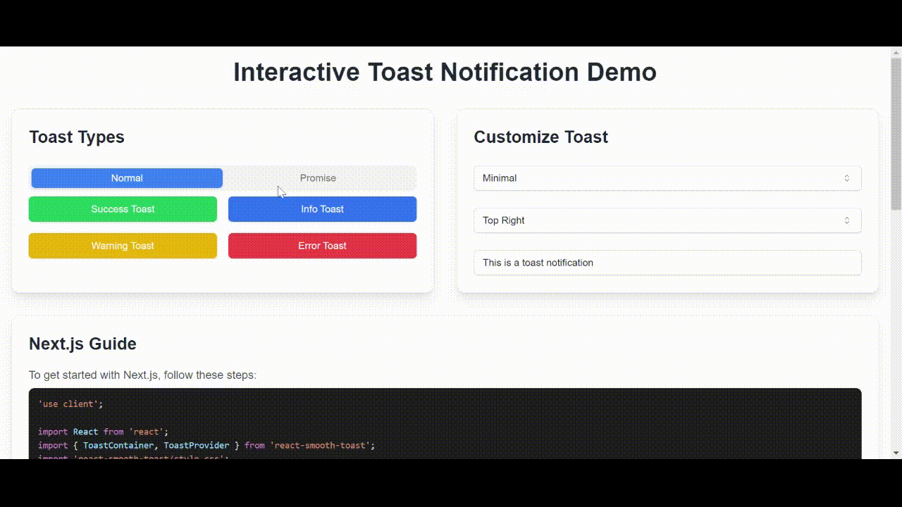
npm install react-smooth-toastPlayground
Demo gif
Getting Started
1. Wrap Your Application with the ToastProvider
To use the toast notifications, wrap your application with the ToastProvider from the library.
// src/index.tsx or src/main.tsx
import React from 'react';
import ReactDOM from 'react-dom/client';
import App from './App';
import { ToastProvider } from 'react-smooth-toast';
import 'react-smooth-toast/style.css';

ReactDOM.createRoot(document.getElementById('root')!).render(
  <React.StrictMode>
    <ToastProvider>
      <App />
    </ToastProvider>
  </React.StrictMode>
);
2. Add the ToastContainer to Your Application
Include the ToastContainer component to render the toasts in your UI. You can set the position of the container.
// src/App.tsx
import React from 'react';
import ToastContainer from 'react-smooth-toast';
import useToast from 'react-smooth-toast';

const App: React.FC = () => {
  const toast = useToast();

  const showToast = () => {
    toast.success('This is a success message!', { duration: 4000 });
    toast.error('This is an error message!', { icon: '❌' });
    toast.info('This is an info message!', { className: 'custom-class' });
    toast.warning('This is a warning message!', { style: { backgroundColor: 'orange' } });
  };

  return (
    <div>
      <button onClick={showToast}>Show Toasts</button>
      <ToastContainer position="top-right" variant="minimal"/>
    </div>
  );
};

export default App;
API
ToastProvider
Wraps your application and provides context for the toast notifications.
ToastContainer
A component that renders the list of toasts.
Props:
position: (optional) Defines the position of the toast container. Options are'top-left','top-right','bottom-left','bottom-right'. Default is'top-right'.
useToast()
A custom hook that provides functions to trigger toasts of various types.
Methods:
success(message: string, options?: ToastOptions): Displays a success toast.error(message: string, options?: ToastOptions): Displays an error toast.info(message: string, options?: ToastOptions): Displays an info toast.warning(message: string, options?: ToastOptions): Displays a warning toast.
ToastOptions
Options for customizing toasts.
id: (optional) Unique identifier for the toast.type:'success' | 'error' | 'info' | 'warning'.message: The message to be displayed in the toast.icon: (optional) A React node to display as an icon.duration: (optional) Duration in milliseconds before the toast is dismissed. Default is3000ms.style: (optional) Inline styles for the toast.className: (optional) Custom class name for additional styling.
Customization
Icons and Styles
Customize icons and styles for individual toasts:
toast.success('Success!', {
  icon: <YourCustomIcon />,
  style: { backgroundColor: 'green' },
  className: 'my-custom-class'
});
Positions
Position the toast container anywhere on the screen using the position prop:
<ToastContainer position="bottom-left" variant="minimal"/>Example
Here's a quick example of using the toast notifications in your app:
import React from 'react';
import ToastContainer from 'react-smooth-toast';
import useToast from 'react-smooth-toast';

const App: React.FC = () => {
  const toast = useToast();

  return (
    <div>
      <button onClick={() => toast.success('Operation successful!')}>Success</button>
      <button onClick={() => toast.error('Something went wrong!')}>Error</button>
      <button onClick={() => toast.info('Here is some information.')}>Info</button>
      <button onClick={() => toast.warning('Warning! Be careful.')}>Warning</button>
      <ToastContainer position="top-right" variant="material"/>
    </div>
  );
};

export default App;
Roadmap 🛣️
- Add more variants
- Add more animations
- Add more positions
- Add more options
- Reduce bundle size
Contribution
Contributions, issues, and feature requests are welcome! Feel free to check the issues page if you want to contribute.
License
This project is licensed under the MIT License - see the LICENSE.md file for details.
Feel free to use and modify this library to fit your needs! Happy coding! 🚀