react-simple-spoiler
v0.1.4
Published
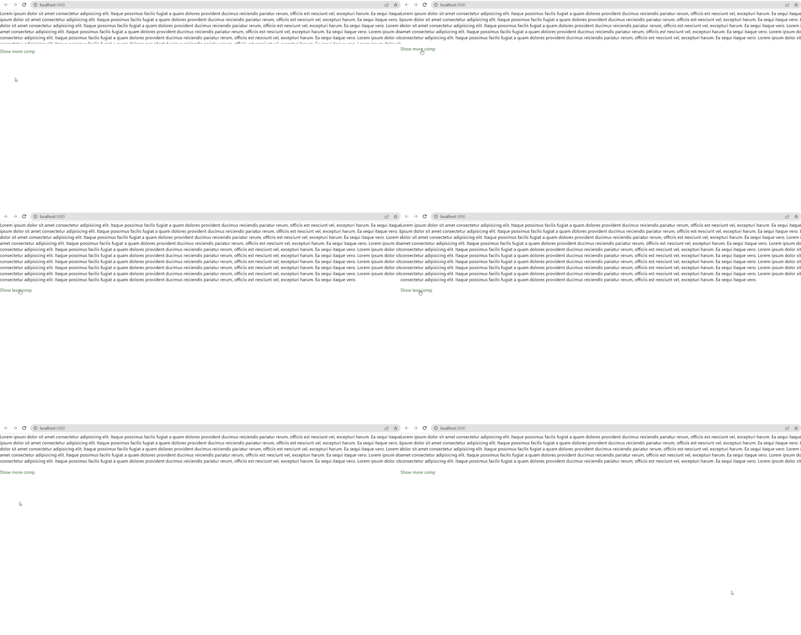
React Simple Spoiler helps you to create a collapsible spoiler component where some portion of your component is visible and can be toggled.
Downloads
97
Readme
react-simple-spoiler
React Simple Spoiler helps you to create a collapsible spoiler component where some portion of your component is visible and can be toggled.

Installation
Use the package manager npm to install react-simple-spoiler.
npm install react-simple-spoiler --saveUsage
import { ReactSpoiler } from 'react-simple-spoiler';

const App = () => {
  return (
    <ReactSpoiler
      noOfLines={5}
      containerStyle={{ background: 'red' }}
      showMoreComponent={<p>Show more comp</p>}
      showLessComponent={<p>Show less comp</p>}
    >
      Lorem ipsum dolor sit amet consectetur adipisicing elit. Itaque possimus
      facilis fugiat a quam dolores provident ducimus reiciendis pariatur rerum,
      officiis est nesciunt vel, excepturi harum. Ea sequi itaque vero. Lorem
      ipsum dolor sit amet consectetur adipisicing elit. Itaque possimus facilis
      fugiat a quam dolores provident ducimus reiciendis pariatur rerum,
      officiis est nesciunt vel, excepturi harum. Ea sequi itaque vero.
    </ReactSpoiler>
  );
};

export default App;
Props
children: React.ReactNode
Element where you want to create a spoiler.
noOfLines?: number
How many lines do you want to show initially. Default is: 4. It does not work if you use collapsedSize prop.
lineHeight?: number
If you are using a different line height for your children then provide it to this prop to make the spoiler more cleaner. If you do not provide the value then it automatically calculates the line height of the spoiler element. It does not work if you use collapsedSize prop.
collapsedSize?: number
How much height that you want to open initially. Note: If you use this props then the noOfLines and lineHeight props won't work.
containerStyle?: React.CSSProperties
Provide style to the show more/less container.
showMoreComponent?: React.ReactNode;
Show more component. Default is a string "Show More"
showLessComponent?: React.ReactNode;
Show less component. Default is a string "Show Less"
Contributing
Pull requests are welcome. For major changes, please open an issue first to discuss what you would like to change.
