
react-simple-multi-select
v1.1.0
Published
"simple multi select and easy to use, built on styled components
Downloads
119
Maintainers
 ravip2900
Readme
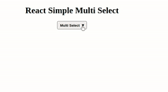
React Simple Multi Select
React Simple Multi Select is easy to use and configure.
Installation
$ npm install --save react-simple-multi-selectRunning example in local
$ git clone https://github.com/ravip2900/react-simple-multi-select.git
$ npm start
It'll open localhost:2900 port, where you can see live demo.
1). Array of values Example
import React from 'react';
import ReactDOM from 'react-dom'
import MultiSelect from 'react-simple-multi-select';

class  Example extends React.Component{
  constructor(props){
    super(props);
    this.state={
      itemList: [
        "React Js",
        "Node Js",
        "Express Js",
        "Next Js",
        "Vue Js",
        "Mongo Db"
      ],
      selectedItemList: [
        "React Js",
        "Next Js",
        "Mongo Db"
      ]
    };
    this.changeList = this.changeList.bind(this);
  }

  changeList(selectedItemList){
    this.setState({selectedItemList});
  }

  render(){
    return(
      <div>
        <h1>React Simple Multi Select</h1>
        <MultiSelect
          title={"Multi Select"}
          itemList={this.state.itemList}
          selectedItemList={this.state.selectedItemList}
          changeList={this.changeList}
        />
      </div>
    )
  }
}
2). Array of Objects Example
import React from 'react';
import ReactDOM from 'react-dom'
import MultiSelect from 'react-simple-multi-select';

class  Example extends React.Component{
  constructor(props){
    super(props);
    this.state={
      itemList: [
        {key:"React Js", value:"react"},
        {key:"Node Js", value:"node"},
        {key:"Express Js", value:"express"},
        {key:"Next Js", value:"next"},
        {key:"Vue Js", value:"vue"},
        {key:"Mongo Db", value:"mongo"}
      ],
      selectedItemList: [
        {key:"React Js", value:"react"},
        {key:"Next Js", value:"next"},
        {key:"Mongo Db", value:"mongo"}
      ]
    };
    this.changeList = this.changeList.bind(this);
  }

  changeList(selectedItemList){
    this.setState({selectedItemList});
  }

  render(){
    return(
      <div>
        <h1>React Simple Multi Select</h1>
        <MultiSelect
          title={"Multi Select"}
          itemList={this.state.itemList}
          selectedItemList={this.state.selectedItemList}
          changeList={this.changeList}
          isObjectArray={true}
        />
      </div>
    )
  }
}
Configurable Props
Props | Type | Required | Default Value | Description
--- | --- | --- | --- | ---
title | String | true | Multi Select | title of the multi select
itemList | Array | true | [] | list of items
selectedItemList | Array | true | [] | selected list of items
changeList | Func | true | null | function to modify the list
borderRadius | Number | false | 4 | border radius
borderColor | String | false | default | border color
borderTopColor | String | false | default | border top color
borderRightColor | String | false | default | border right color
borderLeftColor | String | false | default | border left color
borderBottomColor | String | false | default | border bottom color
textColor | String | false | default | multi select text color
iconColor | String | false | default | icon color
isObjectArray | Boolean | false | false | required if passing array of objects
listItemColor | String | false | black | list item color
listBackgroundColor | String | false | white | list background color
License
MIT (Free Package)