
react-resize-bounding
v1.0.5
Published
React highly customizable component for resizing nested content
Downloads
22
Maintainers
 yamogoo
Readme

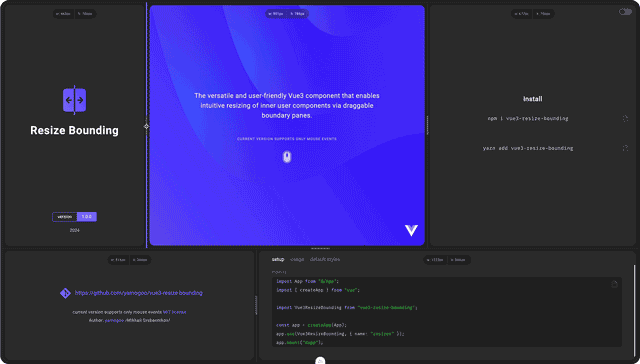
React Resize Bounding is a simple, highly customizable React component that allows you to intuitively resize nested content using draggable border panels.
Interactive Grid (Example):
Installation
npm i react-resize-bounding
# or
yarn add react-resize-bounding
Usage
// @filename: MyComponent.tsx (.js)
import { useState } from "react";
import ResizeBounding from "react-resize-bounding";

export default function App() {
  const [width, setWidth] = useState(320);
  const [height, setHeight] = useState(480);

  return (
    <ResizeBounding
      width={width}
      height={height}
      directions="hv"
      updateWidth={(width) => setWidth(width)}
      updateHeight={(height) => setHeight(height)}
      style={{ border: "1px solid gray" }}
      options={{ knob: { show: true } }}
      // KNOB INNER CONTENT START
      knob={<div className="some-icon"></div>}
      // KNOB INNER CONTENT END
    >
      {/* CONTENT START */}
      <div style={{ width: "100%", height: "100%" }}>My Container</div>
      {/* CONTENT END */}
    </ResizeBounding>
  );
}
Properties
Events
Customization
Overriding:
// @filename: MyResizeBoundingComponent.tsx (.js)
import ResizeBoundingComponent, { type Props } from "react-resize-bounding";

const ResizeBounding = (props: Props) => {
  return (
    <ResizeBoundingComponent
      {...props}
      options={{
        knob: {
          show: true,
        },
      }}
    >
      {props.children}
    </ResizeBoundingComponent>
  );
};

export default ResizeBounding;
Touch Area To increase the touch area, set the value to
options.activeAreaWidthor use increased height of theknobDefault value is undefined
States styling:
By default, to style the active state (both .focused or .pressed), the .active class is used;
So the style definition looks like this:
const styles = {
  // Active (focused/pressed) state:
  splitter: {
    [`.${globalClassNames(prefix).pane}.active &`]: {
      background: "cornflowerblue",
    },
  },
  knob: {
    [`.${globalClassNames(prefix).pane}.active &`]: {
      background: "cornflowerblue",
    },
  },
};
To separately configure the focused state or the pressed state of a splitter/knob, use the included :options="{ addStateClasses: true }" flag and the generated state classes:
const styles = {
  splitter: {
    // Focused state:
    [`.${prefix}-pane.focused &`]: {
      backgroundColor: "blue",
    },
    // Pressed state:
    [`.${prefix}-pane.pressed &`]: {
      backgroundColor: "red",
    },
  },

  knob: {
    // Focused state:
    [`.${prefix}-pane.focused &`]: {
      backgroundColor: "blue",
    },
    // Pressed state:
    [`.${prefix}-pane.pressed &`]: {
      backgroundColor: "red",
    },
  },
};
Using css (preprocessors)
Use the included :options="{ addStateClasses: true }" flag to style the .selected and .pressed states separately.
// @filename: MyResizeBounding.tsx (.js)
import { useState } from "react";
import ResizeBounding from "react-resize-bounding";

export default function App() {
  const [width, setWidth] = useState(320);
  const [height, setHeight] = useState(480);

  return (
    <ResizeBounding
      width={width}
      height={height}
      directions="hv"
      updateWidth={(width) => setWidth(width)}
      updateHeight={(height) => setHeight(height)}
      style={{ border: "1px solid gray" }}
      options={{ addStateClasses: true, knob: { show: true } }}
      // KNOB INNER CONTENT START
      knob={<div className="some-icon"></div>}
      // KNOB INNER CONTENT END
    >
      {/* CONTENT START */}
      <div style={{ width: "100%", height: "100%" }}>My Container</div>
      {/* CONTENT END */}
    </ResizeBounding>
  );
}
// @filename: MyResizeBounding.scss
$prefix: "resize-bounding-";
.#{$prefix} {
&-container {
}
&-pane {
/* Normal state */
.#{$prefix}splitter {
&--container {
}
}
.#{$prefix}knob {
}
/* * * Default `options` settings * * */
/* Both selected and pressed states */
&.active {
.#{$prefix}splitter {
}
.#{$prefix}knob {
}
}
/* * * Separate states ({ addStateClasses: true }) * * */
/* Normal state */
&.normal {
.#{$prefix}splitter {
}
.#{$prefix}knob {
}
}
/* Focused state */
&.focused {
.#{$prefix}splitter {
}
.#{$prefix}knob {
}
}
/* Pressed state */
&.pressed {
.#{$prefix}splitter {
}
.#{$prefix}knob {
}
}
}
}Default settings (options/styles)
// @filename: MyResizeBoundingComponent.tsx (.js)

import ResizeBounding, { PREFIX } from "vue3-resize-bounding";

/* * * Default styles and classes * * */

const options = {
  width: 4,
  activeAreaWidth: undefined,
  position: "central", // 'central' | 'internal' | 'external'
  knob: {
    show: true,
    normalHidden: true,
  },
  cursor: {
    horizontal: "col-resize",
  },
  touchActions: true,
};

// Below are all the default styles purely for demonstration purposes
// In reality, you can only override the necessary properties
const styles = (prefix: string): IStyles => ({
  container: [
    globalClassNames(prefix).container,
    { displayName: globalClassNames(prefix).container, position: "relative" },
  ],
  pane: [
    globalClassNames(prefix).pane,
    {
      displayName: globalClassNames(prefix).pane,
      position: "absolute",
      display: "block",
      zIndex: 9999,
      touchAction: "none",
    },
  ],
  splitter: [
    globalClassNames(prefix).splitter,
    {
      displayName: globalClassNames(prefix).splitter,
      position: "absolute",
      zIndex: 9999,
      transition: "background 125ms ease-out",
      [`.${globalClassNames(prefix).pane}.active &`]: {
        background: "cornflowerblue",
      },
      /*
      Focused state:
      [`.${globalClassNames(prefix).pane}.focused &`]: {},
      Pressed state:
      [`.${globalClassNames(prefix).pane}.pressed &`]: {}
      */
    },
  ],
  splitterContainer: [
    globalClassNames(prefix).splitterContainer,
    {
      displayName: globalClassNames(prefix).splitterContainer,
      position: "relative",
      top: "50%",
      left: "50%",
      width: `0px`,
      height: `0px`,
    },
  ],
  knob: [
    globalClassNames(prefix).knob,
    {
      displayName: globalClassNames(prefix).knob,
      position: "relative",
      width: "64px",
      height: "6px",
      background: "gray",
      borderRadius: "3px",
      transform: "translate(-50%, -50%)",
      transition: "background 125ms ease-out",
      [`.${globalClassNames(prefix).pane}.active &`]: {
        background: "cornflowerblue",
      },
      /*
      Focused state:
      [`.${globalClassNames(prefix).pane}.focused &`]: {},
      Pressed state:
      [`.${globalClassNames(prefix).pane}.pressed &`]: {}
      */
    },
  ],
});
Author
Mikhail Grebennikov - yamogoo
This project is licensed under the terms of the MIT license.