react-resizable-element
v0.1.5
Published
Adds ability to resize width/height of an element.
Downloads
1,059
Maintainers
Readme


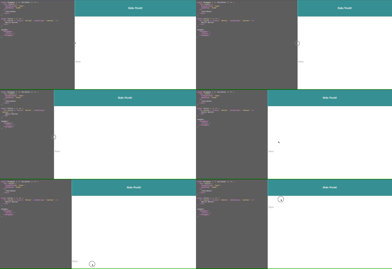
The above demo is hosted through example directory on github pages.
Installation
yarn add react-resizable-element # or npm i --save react-resizable-elementUsage
import { Resizable } from 'react-resizable-element';

const App = () => {
  return (
    <Resizable direction="right">
      <div>Resizable Content</div>
    </Resizable>
  );
};
import { useResizable } from 'react-resizable-element';
const App = () => {
const { container, handle } = useResizable({ direction: 'right' });
return (
<div className="container" ref={container}>
<span className="handle" ref={handle} />
<div>Resizable Content</div>
</div>
);
};Resizable
| Prop | Type | Default | Description |
| ------------- | ---------------------------------------------------------- | ------- | --------------------------------------------- |
| classes | { root: string; handle: string } | {} | CSS class applied to root and handle elements |
| className | string | | CSS class applied to root element |
| direction | 'top' | 'bottom' | 'right' | 'left' | | Direction of resize |
| minSize | number | 0 | Minimum threshold in pixels |
| maxSize | number | 10000 | Maximum threshold in pixels |
| resizable | boolean | true | Enable/disable resizing of elements |
| style | React.CSSProperties | {} | style applied to root element |
useResizable
Parameters: an object of options for this Resizable hook
| Name | Type | Default | Description |
| ------------- | ---------------------------------------------------------- | ------- | --------------------------- |
| direction | 'top' | 'bottom' | 'right' | 'left' | | Direction of resize |
| minSize | number | 0 | Minimum threshold in pixels |
| maxSize | number | 10000 | Maximum threshold in pixels |
Return Values
| Name | Type | Description |
| ---------- | ------------------ | ------------------------------------------------------------------- |
| container | MutableRefObject | Pass it to resizable container element |
| handle | MutableRefObject | Pass it to handle element to add onPointerDown event for resizing |
| isResizing | boolean | Flag for determining if container is being resized |
Optimizations
react-resizable-element ensures that your app has:
no unnecessary code imported:
The package is tree shakeable which means if you are importing
useResizablehook only, it'll make sure unusedResizablecomponent won't be bundled in your application.no unnecessary re-renders:
Core of the package works without any re-renders even when you use
useResizable. But if you have any use-case where you have to useisResizingflag then you will get 2 re-renders on demand, i.e. when user start and stop resizing.
without any code changes from you.
Contribution
Commands
TSDX has been used to scaffold this package inside /src, and also sets up a Parcel-based playground for it inside /example.
The recommended workflow is to run TSDX in one terminal:
yarn start # or npm startThis builds to /dist and runs the project in watch mode so any edits you save inside src causes a rebuild to /dist.
Then run the example inside another:
cd example
yarn # or npm i to install dependencies
yarn start # or npm start
The default example imports and live reloads whatever is in /dist, so if you are seeing an out of date component, make sure TSDX is running in watch mode like we recommend above. No symlinking required, we use Parcel's aliasing.
To do a one-off build, use npm run build or yarn build.
Configuration
Code quality is set up for you with prettier, husky, and lint-staged. Adjust the respective fields in package.json accordingly.
Jest
Jest tests are set up to run with yarn test or npm test.
Bundle analysis
Calculates the real cost of your library using size-limit with npm run size and visulize it with npm run analyze.
Rollup
TSDX uses Rollup as a bundler and generates multiple rollup configs for various module formats and build settings.

