
react-ratings-emoji
v1.0.8
Published
react emoji rating component
Downloads
26
Maintainers
 petyaivanchova
Readme
react-ratings-emoji
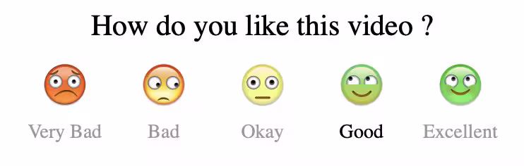
The Emojis component is a React component that allows users to rate something using a row of emojis. Each emoji represents a rating, and users can click on an emoji to select their rating. The component supports different sizes, reverse order display, and custom styling and labels.
Installation
To install the Emojis component, add it to your project via npm:
npm install react-ratings-emojiOr with Yarn:
yarn add react-ratings-emojiUsage
First, import the Emojis component and the emoji images you want to use. Then, use the component in your JSX with the desired props.
Example
import React, { useState } from 'react';
import {Emojis} from 'react-ratings-emoji';

function App() {
  const [selectedEmoji, setSelectedEmoji] = useState(null);

  const handleEmojiSelect = (index) => {
    setSelectedEmoji(index);
  };
  return (
    <div className="App">
      <h1>Your Rating: {selectedEmoji !== null ? selectedEmoji : "None"}</h1>

      <Emojis
        labels={["Excellent", "Good", "Neutral", "Bad", "Very Bad"]}
        size="medium"
        reverse={true}
        heading="Please rate your experience:"
        className="custom-emoji-rating"
        onSelect={handleEmojiSelect}
      />
    </div>
  );
}

export default App;
Props
| Name | Type | Description | Example |
|---|---|---| --- |
|labels | (Array) | An array of strings representing the labels for each emoji. The number of labels should match the number of emojis. | ['Very Bad', 'Bad', 'Okay', 'Good', 'Excellent'] |
| reverse | (boolean) | If true, reverses the order of emojis and labels. Defaults to false. | reverse={true}
| size | ('small', 'medium', 'large') | Determines the size of the emojis and labels. Available options are: 'small': Emoji width:30px and height:20px, label font size is 8px. 'medium': Emoji width:60px and height:40px, label font size is 14px. 'large': Emoji width:120px and height:80px, label font size is 20px. | size="large"
| className | (string) | A custom CSS class to apply additional styles to the component. This class can be used to override default styles and apply custom colors, margins, etc. | className="custom-style"
| heading | (string) | The text to display above the emoji rating component. This can be used to provide a title or instruction for the emoji rating. | heading="Rate Your Experience"
| onSelect | (index: number) =>void | A callback function that is called when an emoji is selected. The function receives the value of the selected emoji as an argument. This is useful for handling the selected emoji's value in the parent component. Clarified that the value passed to onSelect corresponds to the emoji's rating, which ranges from 1 to 5 | onSelect={handleEmojiSelect}
CSS Variables
The Emojis component uses CSS variables for dynamic styling. You can override these variables using the className prop to change the label color and other styles.
.custom-style {
  color: #ff5722;
}
Custom Styling Example
import React from 'react';
import {Emojis} from 'react-ratings-emoji';

function App() {
  const labels = ['Excellent', 'Good', 'Okay', 'Bad', 'Very Bad'];

  return (
    <div>
      <style>
        {`
          .custom-style {
            color: #ff5722;
          }
        `}
      </style>
      <Emojis
        labels={labels}
        size="medium"
        reverse={false}
        className="custom-style"
      />
    </div>
  );
}

export default App;
Contributing
Contributions are welcome! Please fork the repository and submit a pull request with your changes. Make sure to follow the coding standards and include tests for your changes.