
react-portfolio-component-library
v1.1.0
Published
react-portfolio-component
Downloads
19

Readme
Tutorial Intro

포트폴리오 제작에 많은 시간투자를 했던 경험을 바탕으로,
누구나 손쉽고 빠르게 포트폴리오 사이트를 제작할 수 있는 라이브러리를 개발하게 되었습니다!앞으로 디자인 시스템을 도입하여 다양하게 커스터마이징할 수 있는 기능을 제공할 계획입니다.
React 프로젝트를 생성하고 이 라이브러리를 활용해 직접 포트폴리오를 만들어 보세요!
설치
$ npm install react-portfolio-component-library구조
import { BrowserRouter } from "react-router-dom";
import {
  Header,
  Banner,
  Profile,
  Visual,
  ListNormal,
  ListHorizontal,
  ListCard,
  ListLego,
  Intro,
  PortfolioContent,
  PortfolioGroup,
} from "react-portfolio-component-library";

function App() {
  return (
    <BrowserRouter>
      <PortfolioGroup>
        <Header />
        <PortfolioContent>
          <Visual />
          <Intro />
          <ListNormal />
          <ListHorizontal />
          <Banner />
          <ListCard />
          <ListLego />
          <Profile />
        </PortfolioContent>
      </PortfolioGroup>
    </BrowserRouter>
  );
}

export default App;
PortfolioGroup
전체를 감싸는 컴포넌트로 필수항목 입니다.
<PortfolioGroup className={"portfolio-group"} as={"div"}>
  ...
</PortfolioGroup>
Props
| 이름 | 설명 | 타입 | 기타 |
| :---------- | :------- | :------- | :--- |
| className | class 명 | String | |
| as | tag 명 | String | |
PortfolioContent
Header를 제외한 content를 감싸는 컴포넌트로 필수항목 입니다.
gsap와 locomotive가 정의되어 있습니다.
<PortfolioContent className={"main-group"} as={"main"}>
  ...
</PortfolioContent>
props
| 이름 | 설명 | 타입 | 기타 |
| :---------- | :------- | :------- | :--- |
| className | class 명 | String | |
| as | tag 명 | String | |
Header
헤더 영역입니다.
기본 로고가 제공되며, logo 를 통해 사용자가 정의한 로고 이미지로 대체됩니다.
<Header logo={IMG_PATH} alt={"logo"} title={"title"} /><Header></Header>컴포넌트 안에 내용을 넣으면 사용자가 정의한 내용으로 대체됩니다.
<Header className={"header"}>
  <h1>
    <img src={LOGO_IMG} alt={"logo"} />
  </h1>
</Header>
Props
| 이름 | 설명 | 타입 | 기타 |
| :---------- | :---------------------- | :------- | :--- |
| className | class 명 | String | |
| logo | 로고 이미지 경로 | String | |
| alt | 로고 이미지 대체 텍스트 | String | |
| title | 로고 옆 타이틀 | String | |
Visual
최상단 배너 영역입니다.

<Visual
  className={"visual"}
  bgcolor={"#fff"}
  title={{
    main: "MY\nPORTFOLIO",
    badge: "HELLO, WORLD!",
    move: "WELCOME MY PORTFOLIO",
  }}
/>
Props
| 이름 | 설명 | 타입 | 기타 |
| :---------- | :------- | :------- | :--- |
| className | class 명 | String | |
| bgcolor | 배경 색 | String | |
| title | 타이틀 | object | |
title 객체
| 이름 | 설명 | 타입 | 기타 |
| :------ | :-------------- | :------- | :--- |
| main | 타이틀 | String | |
| badge | 뱃지 타이틀 | String | |
| move | 움직이는 타이틀 | String | |
Intro
마우스 스크롤에 반응하는 인트로 리스트 영역 입니다.

5가지의 기본 이미지와 아이콘을 제공하며 items 배열을 통해 변경 가능합니다.
<Visual
  className={"intro"}
  bgcolor={"#f5feff"}
  title={{
    main: "Plan and\norgnize\n",
    highlight: "anything",
  }}
  items={[
    {
      id: "01",
      title: "Blog",
      icon: ICON_PATH,
      thumb: IMG_PATH,
      alt: "Blog",
    },
  ]}
/>
Props
| 이름 | 설명 | 타입 | 기타 |
| :---------- | :------------ | :------- | :--- |
| className | class 명 | String | |
| bgcolor | 배경 색 | String | |
| title | 타이틀 | Object | |
| items | 리스트 아이템 | Array | |
title 객체
| 이름 | 설명 | 타입 | 기타 |
| :---------- | :---------------- | :------- | :--- |
| main | 타이틀 | String | |
| highlight | 하이라이트 타이틀 | String | |
items 배열
| 이름 | 설명 | 타입 | 기타 |
| :------ | :----------------- | :------- | :--- |
| id* | 아이템 ID | String | |
| title | 아이템 타이틀 | String | |
| icon | 아이템 아이콘 | String | |
| thumb | 아이템 썸네일 | String | |
| alt | 썸네일 대체 텍스트 | String | |
ListNormal
노멀 리스트 영역입니다.
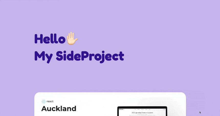
<ListNormal
  className={"list-normal"}
  bgcolor={"#c2aeec"}
  title={"Hello✋🏻\nMy Portfolio"}
  items={[
    {
      id: "01",
      type: "react",
      title: "React",
      desc: "React 사이트입니다.",
      github: "https://github.com/username/repository",
      site: "https://example.com/site",
      thumb: IMG_PATH,
      speed: 4,
    },
  ]}
/>
Props
| 이름 | 설명 | 타입 | 기타 |
| :---------- | :------------ | :------- | :--- |
| className | class 명 | String | |
| bgcolor | 배경 색 | String | |
| title | 타이틀 | String | |
| items | 리스트 아이템 | Array | |
items 배열
| 이름 | 설명 | 타입 | 기타 |
| :------- | :----------------- | :------- | :--- |
| id* | 아이템 ID | String | |
| type | 아이템 타입 | String | |
| title | 아이템 타이틀 | String | |
| desc | 아이템 설명 | String | |
| github | 아이템 깃허브 링크 | String | |
| site | 아이템 사이트 링크 | String | |
| thumb | 아이템 썸네일 | String | |
| speed | 스크롤 속도 | Number | |
ListHorizontal
가로 스크롤 리스트 영역입니다.
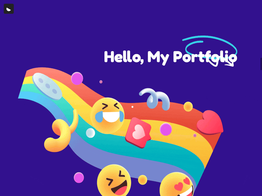
<ListHorisontal
  className={"list-horisontal"}
  bgcolor={"#310591"}
  title={"Hello✋🏻\nMy Portfolio"}
  items={[
    {
      id: "01",
      title: "title",
      desc: "description",
      site: "https://example.com/site",
      thumb: IMG_PATH,
      alt: "title",
    },
  ]}
/>
Props
| 이름 | 설명 | 타입 | 기타 |
| :---------- | :------------ | :------- | :--- |
| className | class 명 | String | |
| bgcolor | 배경 색 | String | |
| title | 타이틀 | String | |
| items | 리스트 아이템 | Array | |
items 배열
| 이름 | 설명 | 타입 | 기타 |
| :------ | :----------------- | :------- | :--- |
| id* | 아이템 ID | String | |
| title | 아이템 타이틀 | String | |
| desc | 아이템 설명 | String | |
| site | 아이템 사이트 링크 | String | |
| thumb | 아이템 썸네일 | String | |
| alt | 썸네일 대체 텍스트 | String | |
Banner
배너 영역입니다.

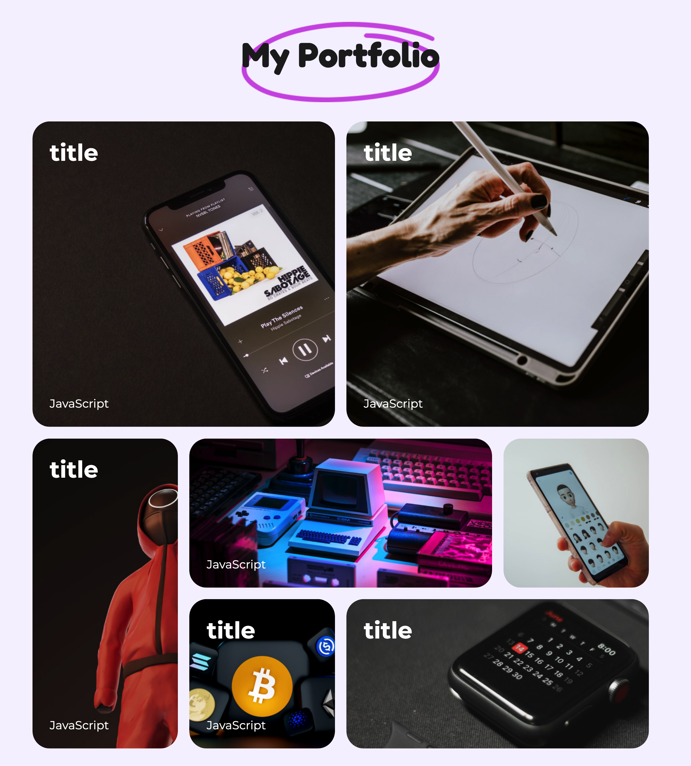
<Banner className={"banner"} bgcolor={"#fde445"} />ListCard
리스트 카드 영역입니다.
<ListCard
  className={"list-card"}
  bgcolor={"#f5f5f5"}
  title={{
    main: "Hello,",
    highlight: "My Portfolio",
  }}
  items={[
    {
      id: "01",
      site: URL,
      thumb: IMG_PATH,
      title: "title",
      desc: "desc",
    },
  ]}
/>
Props
| 이름 | 설명 | 타입 | 기타 |
| :---------- | :------------ | :------- | :--- |
| className | class 명 | String | |
| bgcolor | 배경 색 | String | |
| title | 타이틀 | Object | |
| items | 리스트 아이템 | Array | |
title 객체
| 이름 | 설명 | 타입 | 기타 |
| :---------- | :---------------- | :------- | :--- |
| main | 타이틀 | String | |
| highlight | 하이라이트 타이틀 | String | |
items 배열
| 이름 | 설명 | 타입 | 기타 |
| :------ | :------------ | :------- | :--- |
| id* | 아이템 ID | String | |
| site | 아이템 URL | String | |
| thumb | 아이템 썸네일 | String | |
| title | 아이템 타이틀 | String | |
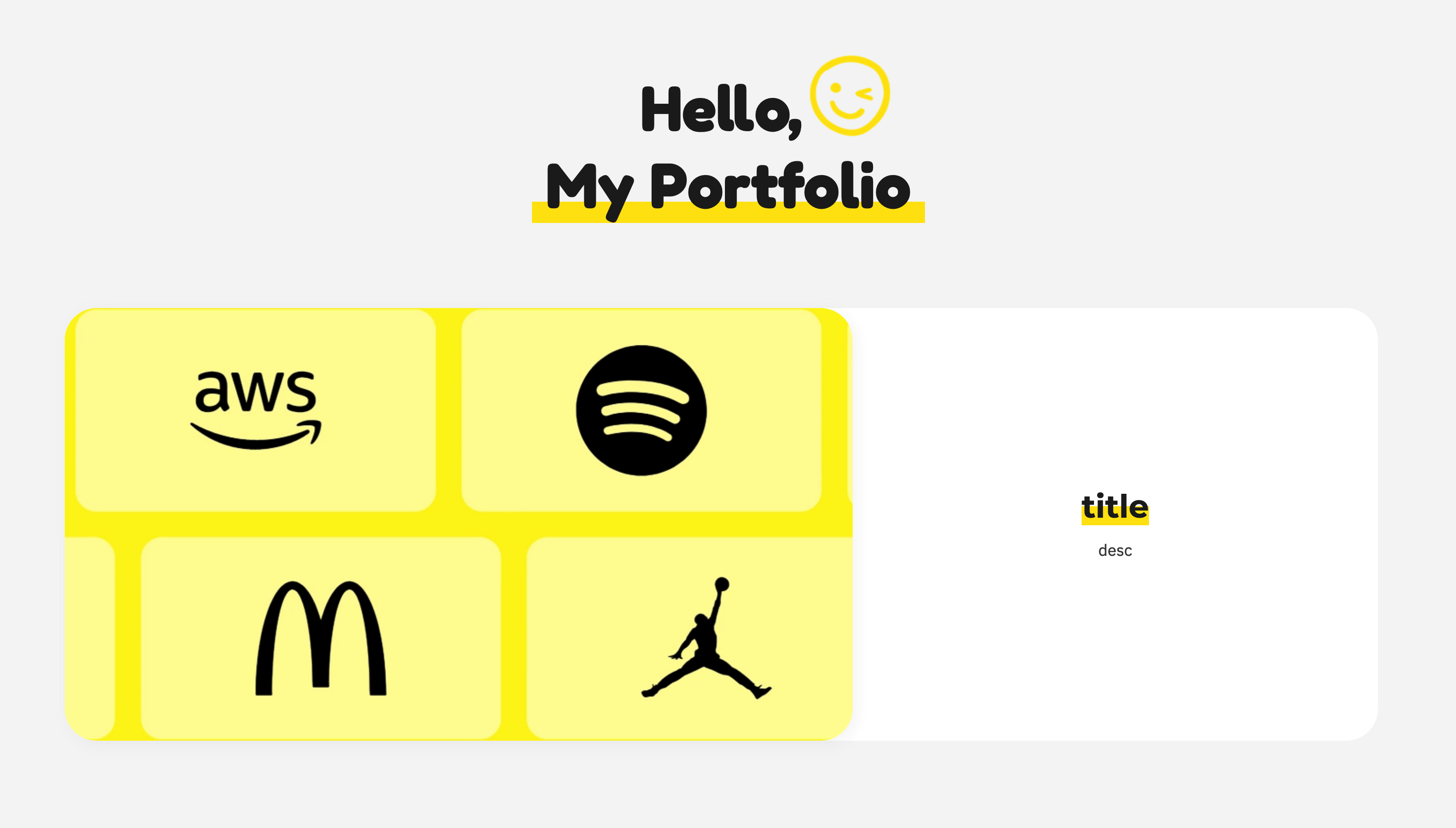
ListLego
레고 리스트 영역입니다.
<ListLego
  className={"list-lego"}
  bgcolor={"#f6f3ff"}
  title={{
    main: "Hello,",
    highlight: "My Portfolio",
  }}
  items={[
    {
      id: "01",
      title: "title",
      type: "JavaScript",
      site: "https://example.com/site",
      thumb: IMG_PATH,
      alt: "title",
    },
  ]}
/>
Props
| 이름 | 설명 | 타입 | 기타 |
| :---------- | :------------ | :------- | :--- |
| className | class 명 | String | |
| bgcolor | 배경 색 | String | |
| title | 타이틀 | Object | |
| items | 리스트 아이템 | Array | |
title 객체
| 이름 | 설명 | 타입 | 기타 |
| :---------- | :---------------- | :------- | :--- |
| main | 타이틀 | String | |
| highlight | 하이라이트 타이틀 | String | |
items 배열
| 이름 | 설명 | 타입 | 기타 |
| :------ | :----------------- | :------- | :--- |
| id* | 아이템 ID | String | |
| title | 아이템 타이틀 | String | |
| type | 아이템 타입 | String | |
| site | 아이템 URL | String | |
| thumb | 아이템 썸네일 | String | |
| alt | 썸네일 대체 텍스트 | String | |
Profile
프로필 영역입니다.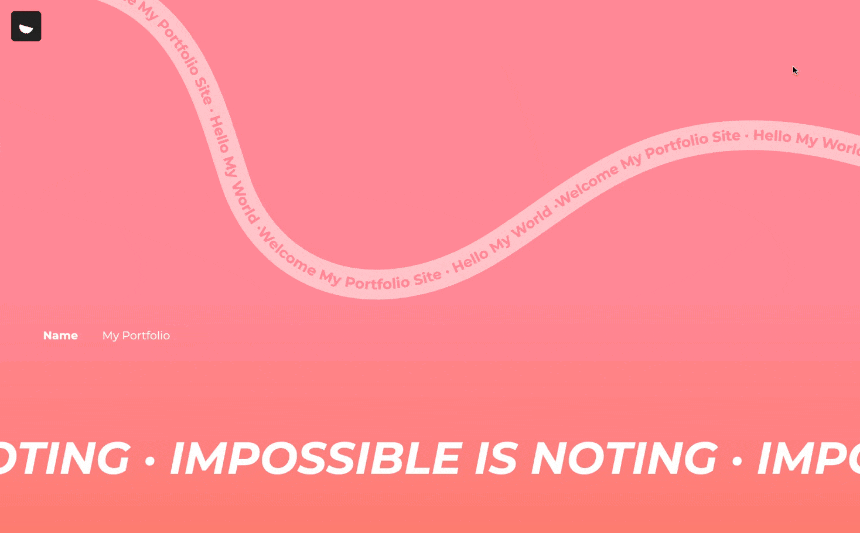
<Profile
  className={"profile"}
  bgcolor={"#f6f3ff"}
  bggradient={"#f06b67"}
  data={{
    textpath: "Welcome My Portfolio Site · Hello My World · ",
    footersbj: "IMPOSSIBLE IS NOTING · ",
    notice: "더 좋은 결과를 위해 수정중에 있습니다",
    photo: IMG_PATH,
    info: {
      name: "My Portfolio",
      email: "[email protected]",
      phone: "010-1234-5678",
      portfolio: "https://example.com/portfolio",
      github: "https://github.com/username",
      blog: "https://blog.example.com",
    },
  }}
/>
Props
| 이름 | 설명 | 타입 | 기타 |
| :----------- | :----------------- | :------- | :--- |
| className | class 명 | String | |
| bgcolor | 배경 색 | String | |
| bggradient | 그라디언트 배경 색 | String | |
| data | textpath, 정보 등 | Object | |
data 객체
| 이름 | 설명 | 타입 | 기타 |
| :---------- | :------------------------- |:---------| :--- |
| textpath | 물결모양의 움직이는 텍스트 | String | |
| footersbj | 하단에 흘러가는 텍스트 | String | |
| notice | 공지사항 | String | |
| photo | 이미지 | String | |
| info | 정보 | Object | |
info 객체
| 이름 | 설명 | 타입 | 기타 |
| :---------- | :------------- | :------- | :--- |
| name | 성함 | String | |
| email | 이메일 | String | |
| phone | 연락처 | String | |
| portfolio | 포트폴리오 URL | String | |
| github | 깃허브 URL | String | |
| blog | 블로그 URL | String | |