
react-native-weekly-view
v1.1.0
Published
Calendars made simple!
Downloads
6
Maintainers
 emilje
Readme
react-native-weekly-view
Calendars made simple!


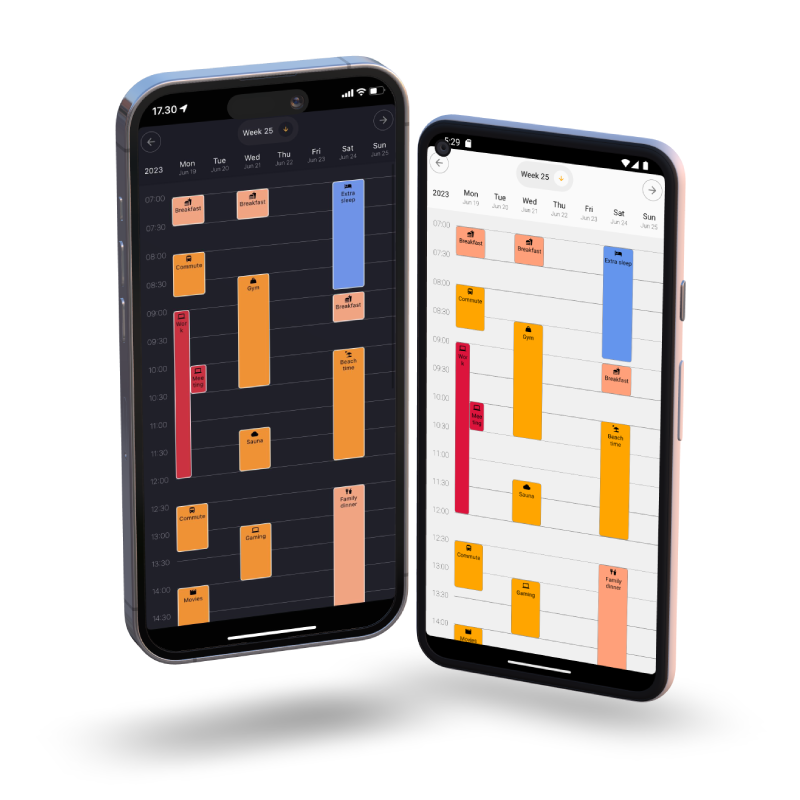
Device mockups created at deviceframes.
Installation
Use npm or yarn.
npm install react-native-weekly-view
yarn add react-native-weekly-view
Usage
Import WeeklyView and add some events.
import { WeeklyView } from "react-native-weekly-view";

<WeeklyView
  events={EVENTS}
  onEventPress={(event) => {
    // Do something with the calendar event.
  }}
/>
The events should be formatted in the following way. Please check types at the bottom for more details.
const EVENTS = [
  {
    id: 1,
    isoStart: "2023-06-23T07:00:00.000+03:00",
    isoEnd: "2023-06-23T08:00:00.000+03:00",
    name: "Breakfast",
    icon: <Icon name={"food"} size={14} />,
    disabled: true,
  },
  {
    id: 2,
    isoStart: "2023-06-23T08:30:00.000+03:00",
    isoEnd: "2023-06-23T09:00:00.000+03:00",
    name: "Lunch",
    color: "pink",
    icon: <Icon name={"food"} size={14} />,
    disabled: false,
  }, ...]
Customization
WeeklyView is highly customizable and allows you to change colors, font sizes and much more through the following props:
  locale,
  timezone,
  theme,
  eventContainerStyle,
  style,
  timetableStartHour,
  timetableEndHour,
  intervalLengthMinutes,
  intervalHeight,
  translationWeek,
  showWeekend
Please check props below for more information.
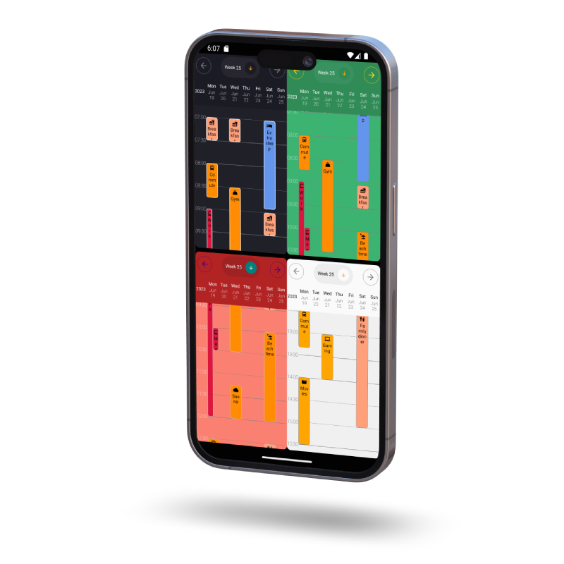
Device mockup created at deviceframes.
Example
To run the example, clone the project git clone https://github.com/emilje/react-native-weekly-view.git, navigate into the example folder cd example and run npm i.
If you want to run the project using Expo, also install expo npm i expo and when the installation is finished
run npx expo start.
Development (Expo + Typescript)
Fork the project and install dependancies npm i.
Create a new branch.
In package.json switch the "main" to "node_modules/expo/AppEntry.js".
Run npm start and have fun!
Remember to change main field back to "dist/index.js" before making any pull requests. 👀
Props
| Name | Type | Description | Required |
|------|------|-------------|----------|
|events|array|An array of calendarEvent objects. Check the types below.|Yes|
|locale|string| Iana subtag of a language - en, fi, hr, sv. Used to translate weekdays in the header. For more information: https://www.iana.org/assignments/language-subtag-registry/language-subtag-registry | No |
|onEventPress|function|A callback function that has access to a clicked calendar event. (event) => { Do something cool here! }|Yes|
|timezone|string|Iana timezone identifier - Europe/Helsinki for example.. You can see a list of the codes here: https://en.wikipedia.org/wiki/List_of_tz_database_time_zones|No|
|theme|string|You can choose one of the premade themes "light" or "dark" and then customize them if needed. Defaults to dark theme|No|
|timetableStartHour|number|At which hour the timetable starts.|No|
|timetableEndHour|number|At which hour the timetable ends.|No|
|intervalLengthMinutes|number|Minutes between intervals.|No|
|intervalHeight|number|Vertical space between intervals.|No|
|eventContainerStyle|object|Style object used for customizing the events. Check the types below.|No|
|style|object|Style object used for customizing the general look of the header and the timetable. Check the types below.|No|
|translationWeek|string|How the word "Week" will appear.|No|
|showWeekend|boolean|`Will hide saturday and sunday if false.|No|
Types
calendarEvent
| Property | Type | Description | Required |
|------|------|-------------|----------|
|id|number/string|Unique identifier of an event|Yes|
|isoStart|string|Event start in ISO format - 1993-02-24T10:00:00.000+01:00|Yes|
|isoEnd|string|Event end in ISO format - 2023-02-24T11:00:00.000+01:00|Yes|
|name|string|Name of the event. Appears under the icon in the calendar.|Yes|
|disabled|boolean|Affects how the event is rendered. Default is gray colored with a line through. Disabled color can be adjusted in props.|Yes|
|icon|JSX Element|A JSX element. Can be some custom component or an icon library component <MaterialCommunityIcons name="food-fork-drink" size={12} />|No|
|color|string|Change the event background color. Useful for color coding events.|No|
eventContainerStyle
| Property | Type | Description | Required |
|------|------|-------------|----------|
|backgroundColor|string|Background color for all events non disabled events. Can be overriden in the calendarEvent object.|No|
|disabledColor|string|Background color for a disabled/cancelled event.|No|
|borderWidth|number/undefined|Change the border width around an event. Undefined for no border.|No|
|borderColor|string|Border color.|No|
|borderRadius|number|Border radius.|No|
|fontSize|number|Font size used for showing event name.|No|
|textColor|string|Color used for showing the event name.|No|
style
| Property | Type | Description | Required |
|------|------|-------------|----------|
|headerColor|string|Header background color.|No|
|headerTextColor|string|Header text color.|No|
|fontSizeHeader|number|Header font size.|No|
|timetableColor|string|Timetable background color.|No|
|timetableTextColor|string|Timetable text color.|No|
|fontSizeTimetable|number|Timetable font size.|No|
|dropdownColor|string|Color for the week dropdown.|No|
|dropdownCurrentWeekColor|string|Background color of the current week in the list.|No|
|accentColor|string|Color of the current weekday highlight, week dropdown arrow color and the currently selected week eye icon color|No|
|weekButtonColor|string|Color of the week dropdown button.|No|
|weekButtonIconColor|string|Color of the down arrow circular background in the week dropdown button.|No|
|dropdownSelectedWeekIcon|JSX Element|Icon next to the currently selected week in the dropdown.|No|
|arrowColor|string|Color of the left/right arrows.|No|