react-native-tableview-list
v0.1.17
Published
UITableView-based SectionList
Downloads
31
Readme
react-native-tableview-list
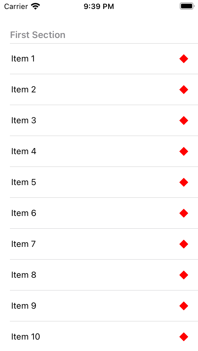
SectionList-like component backed by a UITableView (iOS only).
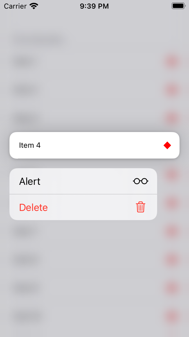
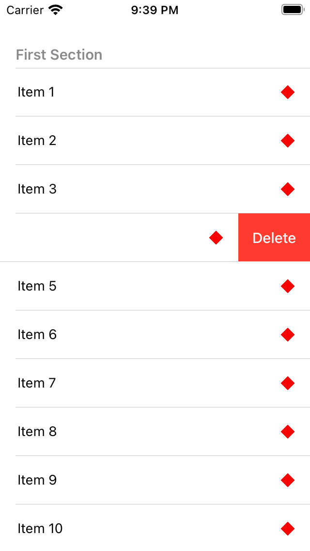
The aim is to have the fully native experience: swipe to delete (with correct haptics and automatic dismissal when scrolling), press and hold menus etc. Performance is probably on par with the default SectionList component.
Only renders custom cells - if you need the standard styles, use react-native-tableview. This library will also handle custom cells - but doing so breaks stuff like Context.
| | | |
| ----------------------------------------------------------------------------------------------------------- | ----------------------------------------------------------------------------------------------------------- | ----------------------------------------------------------------------------------------------------------- |
|  |
|  |
|  |
|
Installation
npm install react-native-tableview-listUsage
import TableviewListView from 'react-native-tableview-list';

<TableviewListView
  sections={[{ title: 'title', key: 'key', data: [1, 2, 3] }]}
  rowHeight={50}
  renderItem={({ item }) => (
    <>
      <Text>{item}</Text>
      <View style={styles.lozenge} />
    </>
  )}
/>;
If you need a FlatList-like list, pass a single section with the title set to an empty string ('').
Props
Properties marked with an asterisk (*) are required
| Name | Type | Description |
| ------------------------- | -------------------------------------------------------------------------- | --------------------------------------------------------------------------------------------- |
| sections * | Section[] | See below for props |
| renderItem * | ({ item, index, section }) => ReactElement | Render row |
| keyExtractor | (Row, index, sectionIndex) => string | Needed if data does not have a key or id property |
| rowHeight * | number | Currently all rows must have the same, fixed height |
| separatorInset | { left?: number, right?: number } | Margin applied to the left and right of each separator |
| separatorColor | string | Color string or PlatformColor |
| cellContainerStyle | style | Customise cell style: do not chagne postion, width, or height |
| onPressRow | ({ item, index, section }) => void | Called when a row is pressed |
| editing | boolean | Enable indicators for moving and deleting rows |
| moveRows | 'none' or 'within-section' | Allows re-ordering of rows |
| onMoveRow | ({ fromSection, fromItem, fromIndex, toSection, toItem, toIndex }) => void | Called when a row is moved (see moveRows) - you MUST udpate your data when this is called |
| onDeleteRow | ({ item, index, section }) => void | Enables swipe to delete - you MUST delete the item when this is called |
| menu | MenuItem[] | See below for props |
| leadingActions | ActionItem[] | See below for props |
| trailingActions | ActionItem[] | See below for props |
| initialNumToRender | number | See VirtualisedList |
| maxToRenderPerBatch | number | See VirtualisedList |
| windowSize | number | See VirtualisedList |
| updateCellsBatchingPeriod | number | See VirtualisedList |
| ListEmptyComponent | ReactElement | Displayed when there's no data |
Types
type Section<Row> = {
  title: string;
  key?: string;
  data: Row[];
  // Enables press and hold interaction
  menu?: MenuItem<Row>[];
  // Swipe actions for left-hand-side (in LTR layouts)
  leadingActions?: ActionItem<Row>[];
  // Swipe actions for right-hand-side (in LTR layouts)
  trailingActions?: ActionItem<Row>[];
  // Allows re-ordering of rows within a section
  // **MUST** be used with onMoveRow
  moveRows?: 'none' | 'within-section';
  // Used with moveRows property
  // You **MUST** update your data when this is called
  onMoveRow: (e: MoveRowEvent<Row>) => void;
  // Enables swipe to delete for section
  // You **MUST** delete the item when this is called
  onDeleteRow?: (e: RowEvent<Row>) => void;
};

type MenuItem<Row> = {
  title: string;
  key?: string;
  // See SF Symbols
  systemIcon: string;
  // Red text
  destructive?: boolean;
  // Greyed out
  disabled?: boolean;
  // Display children inline - rather than as a submenu
  inline?: boolean;
  // Submenu
  children?: MenuItem<Row>[];
  // On press
  onPress: (e: RowEvent<Row>) => void;
};

type ActionItem<Row> = {
  title: string;
  key?: string;
  destructive?: boolean;
  onPress?: (e: RowEvent<Row>) => void;
};

type RowEvent<Row> = {
  item: Row;
  section: Section<Row>;
  index: number;
};

type MoveRowEvent<Row> = {
  fromItem: Row;
  fromSection: Section<Row>;
  fromIndex: number;
  toItem: Row;
  toSection: Section<Row>;
  toIndex: number;
};
Contributing
See the contributing guide to learn how to contribute to the repository and the development workflow.
License
MIT
