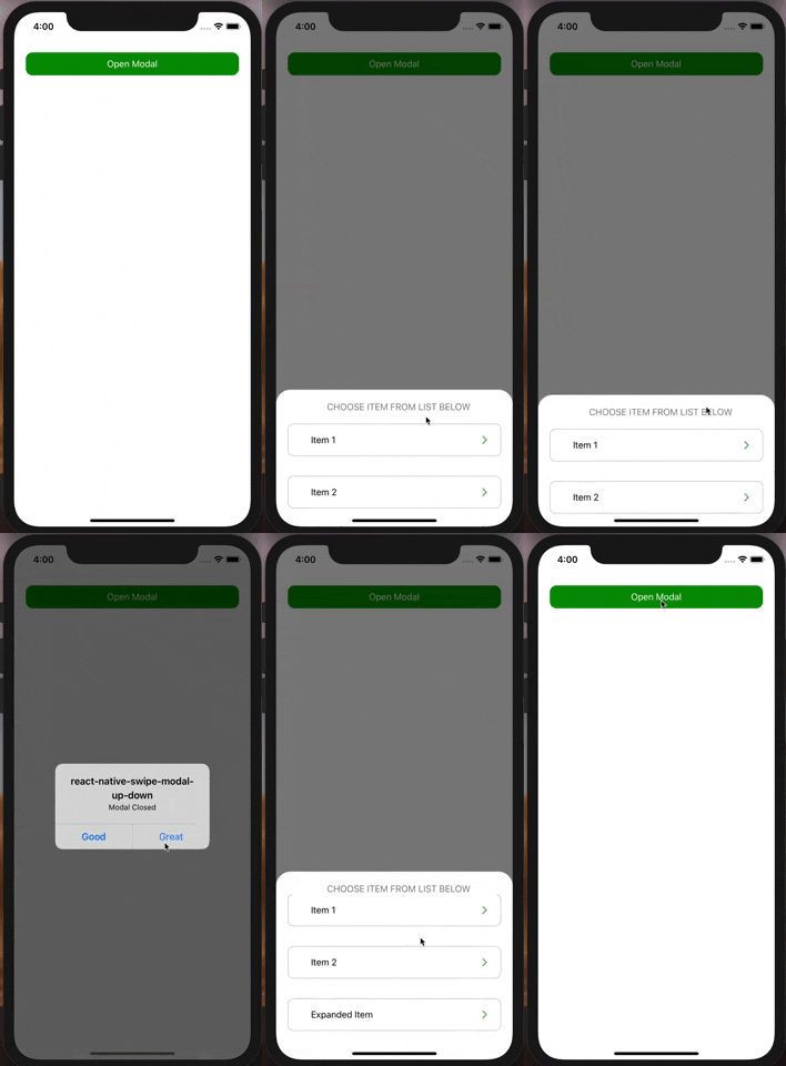
react-native-swipe-modal-up-down
v1.1.0
Published
react native swipe up down it's animation modal to swipe down or up as Facebook comments, profile picture animation. it support flat-list and scroll view inside it without conflict with animation down and scrolling down
Downloads
1,318
Maintainers
Readme
react-native-swipe-modal-up-down
react native swipe up down it's animation modal to swipe down or up as Facebook comments, profile picture animation. it support flat-list and scroll view inside it without conflict with animation down and scrolling down
[ ]
]
Getting Started
$ npm install react-native-swipe-modal-up-downUsage
import SwipeUpDownModal from 'react-native-swipe-modal-up-down';
  let [ShowComment, setShowModelComment] = useState(false);
  let [animateModal, setanimateModal] = useState(false);

<SwipeUpDownModal
  modalVisible={ShowComment}
  PressToanimate={animateModal}
  //if you don't pass HeaderContent you should pass marginTop in view of ContentModel to Make modal swipeable
  ContentModal={
    <View style={styles.containerContent}>
      <FlatList
        data={data}
        renderItem={({item, index}) => (
          <item key={index} Data={item} />
        )}
        keyExtractor={item => item.id}
      />
    </View>
  }
  HeaderStyle={styles.headerContent}
  ContentModalStyle={styles.Modal}
  HeaderContent={
    <View style={styles.containerHeader}>
          <Button
              Title={"Press Me"}
              onPress={() => {
                setanimateModal(true);
              }}
           />
    </View>
  }
  onClose={() => {
      setModelComment(false);
      setanimateModal(false);
  }}
/>

const styles = StyleSheet.create({
  containerContent: {flex: 1, marginTop: 40},
  containerHeader: {
    flex: 1,
    alignContent: 'center',
    alignItems: 'center',
    justifyContent: 'center',
    height: 40,
    backgroundColor: '#F1F1F1',
  },
  headerContent:{
    marginTop: 0,
  },
  Modal: {
    backgroundColor: '#005252',
    marginTop: 0,
  }
});
props
Props | Type | default | Note
------------- | ------------- | ------------- | -------------
modalVisible | Boolean | false | Set visiablity of Modal
ContentModal | React Element | null | for example: <View><Button text="Hello Mina" align="center" onPress={() => {}}/></View>
ContentModalStyle | any | opacity, flex: 1, marginTop: 55 | you shouldn't pass opacity or transform
HeaderContent | React Element | null | for example: <View style={{flex: 1, alignContent: 'center', alignItems: 'center', justifyContent: 'center', height: 40}}><Text> Header Content </Text></View>
HeaderStyle | any | opacity, width: 700, marginTop: 50, position: 'absolute' | you shouldn't pass opacity or transform
onClose | func | () => null | Called when Modal closed
ImageBackgroundModal | image | null | you can set imagebackground of modal instead of backgroundColor
ImageBackgroundModalStyle | any | null | for example : borderTopLeftRadius: 25, borderTopRightRadius: 25
duration | milliseconds | 450 | Length of animation
DisableHandAnimation | Boolean | false | Disable Hand animate
PressToanimate | Boolean | null | close modal showing animation by set value equal true
PressToanimateDirection | String | 'down' | Direction of animating Modal while closing, accepted value('up','down').
OpenModalDirection | String | 'down' | Direction of animating Modal while Opening, accepted value('up','down').
fade | Boolean | true | fading animation while opening/closing
MainContainerModal | style | backgroundColor: 'rgba(0, 0, 0, 0.5)',flex:1 | Main Container of modal
