react-native-section-alphabet-list
v3.0.0
Published
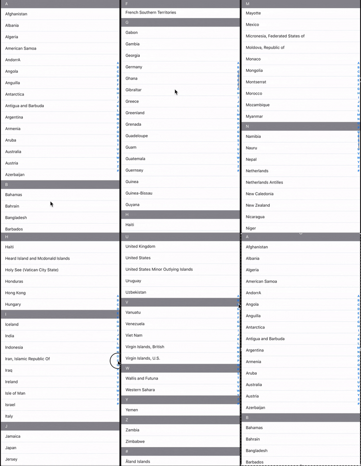
A simple React Native component that takes an array of data and renders a SectionList with alphabetically sorted data.
Downloads
12,962
Maintainers
Readme
react-native-section-alphabet-list
A simple React Native component that takes an array of data and renders a SectionList with alphabetically (or custom) sorted data.

Motivation
Unlike alternatives, this package takes an array of data rather than an object with letters as keys.
For example,
Other packages
const data = {
  A: [{...}, ...],
  B: [{...}, ...],
  C: [{...}, ...],
  ...
}
This package
const data = [{...}, {...}, {...}, ...]For react-native-section-alphabet-list, the data does not need to be pre-formatted and sorted before use. The component handles all this logic internally. You can also provide an array of characters to sort your sections in a custom order.
Installation
Using npm:
npm install react-native-section-alphabet-listor with yarn:
yarn add react-native-section-alphabet-listBasic Usage
import { AlphabetList } from "react-native-section-alphabet-list";

const data = [
  { value: 'Lillie-Mai Allen', key: 'lCUTs2' },
  { value: 'Emmanuel Goldstein', key: 'TXdL0c' },
  { value: 'Winston Smith', key: 'zqsiEw' },
  { value: 'William Blazkowicz', key: 'psg2PM' },
  { value: 'Gordon Comstock', key: '1K6I18' },
  { value: 'Philip Ravelston', key: 'NVHSkA' },
  { value: 'Rosemary Waterlow', key: 'SaHqyG' },
  { value: 'Julia Comstock', key: 'iaT1Ex' },
  { value: 'Mihai Maldonado', key: 'OvMd5e' },
  { value: 'Murtaza Molina', key: '25zqAO' },
  { value: 'Peter Petigrew', key: '8cWuu3' },
]

render() {
  return (
    <AlphabetList
      data={data}
      indexLetterStyle={{
        color: 'blue',
        fontSize: 15,
      }}
      renderCustomItem={(item) => (
        <View style={styles.listItemContainer}>
          <Text style={styles.listItemLabel}>{item.value}</Text>
        </View>
      )}
      renderCustomSectionHeader={(section) => (
        <View style={styles.sectionHeaderContainer}>
          <Text style={styles.sectionHeaderLabel}>{section.title}</Text>
        </View>
      )}
    />
  )
}
API
Props
| Prop | Description | Type | Signature (func) | Default |
| --- | --- | --- | --- | --- |
| data | List of objects to be sorted and rendered in the SectionList. Each item must have both a value property and unique a key property. | array | | |
| index (optional) | The characters used to sort each item into sections. These characters are rendered on the right-hand side and clicking on each item scrolls the user to its respective section. The default is the letters of the alphabet. | array | | ['a', 'b', 'c', 'd', 'e', 'f', ...] (see DEFAULT_CHAR_INDEX here)|
| renderCustomItem (optional) | Render a row in the SectionList. Should return a valid React Element. | func | { item: { value: string, key: string } } : ReactElement | |
| renderCustomSectionHeader (optional) | Render a section header in the SectionList. Should return a valid React Element. | func | { section: { title: string, index: number, data: array } } : ReactElement | |
| renderCustomListHeader (optional) | Render a list header in the SectionList. Should return a valid React Element. | func | | |
| renderCustomIndexLetter (optional) | Render a custom index letter element. Should return a valid React Element. | func | { item: { title: string, index: number, data: array }, index: number, onPress: func } : ReactElement | |
| getItemHeight (optional) | For sectionListGetItemLayout. This may be necessary if each item has a dynamic height. This allows for smooth scrolling and accurate positioning when scrolling to a section. | func | { sectionIndex: number, rowIndex: number } : number | |
| sectionHeaderHeight (optional) | The height of the section header. | number | | 40 |
| listHeaderHeight (optional) | The height of the list header. | number | | 0 |
| letterListContainerStyle (optional) | Override the style of the letter list container. | object | | undefined |
| indexContainerStyle (optional) | Override the style of the list index container. | object | | undefined |
| indexLetterStyle (optional) | Override the style of the list letter index text. | object | | undefined |
| indexLetterContainerStyle (optional) | Override the style of the list letter index container. | object | | undefined |
| uncategorizedAtTop (optional) | If true, the uncategorised items (the # section) is moved to the top of the list. | boolean | | false |
You can also provide any valid SectionList props. A list of available props can be found here.
Custom index
You can provide a custom array of characters to the component using the index prop. For example, if we wanted to sort alphabetically in-reverse, we could do:
const customIndex = [
  'z',
  'y',
  'x',
  'w',
  ...
]

<AlphabetList
  ...
  index={customIndex}
/>
Contributing
Pull requests are welcome. For major changes, please open an issue first to discuss what you would like to change.
Please make sure to update the tests as appropriate.
