
react-native-range-timepicker
v1.0.1
Published
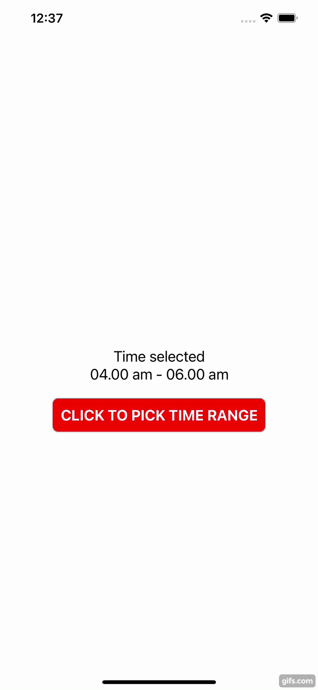
A React Native component for picking time ranges
Downloads
21
Maintainers
 farhanibrahim
Readme
react-native-range-timepicker
A React Native component for picking time ranges
Installation
npm install react-native-range-timepickeror
yarn add react-native-range-timepickerUsage
import * as React from 'react';
import { StyleSheet, View, Text, TouchableOpacity } from 'react-native';
import TimeRangePicker from 'react-native-range-timepicker';

export default function App() {
  const [visible, setVisible] = React.useState<boolean>(false);
  const [start, setStart] = React.useState<string>('');
  const [end, setEnd] = React.useState<string>('');

  const onSelect = ({ startTime, endTime }: any) => {
    setStart(startTime);
    setEnd(endTime);
    setVisible(false);
  };

  const onClose = () => {
    setVisible(false);
  };


 return (
    <View style={styles.container}>
      <View style={styles.timeContainer}>
        <Text style={styles.text}>Time selected</Text>
        <Text style={styles.text}>{`${start)} - ${end}`}</Text>
      </View>
      <TouchableOpacity style={styles.button} onPress={() => setVisible(true)}>
        <Text style={styles.buttonText}>CLICK TO PICK TIME RANGE</Text>
      </TouchableOpacity>
      <TimeRangePicker
        visible={visible}
        onClose={onClose}
        onSelect={onSelect}
      />
    </View>
  );
}

const styles = StyleSheet.create({

  // ...
})
Props
| Props | Description | | ----------- | ----------- | | visible (required) | State to show or hide the timepicker | | onSelect (required) | Function when select the time range. | | onClose (required) | Function when close the timepicker. | | title (optional) | Title will appear on top of the timepicker. |
Contributing
See the contributing guide to learn how to contribute to the repository and the development workflow.
License
MIT