react-native-progress-button
v1.0.3
Published
A react native progress button for Android and IOS
Downloads
125
Maintainers
Readme
react-native-progress-button
A react native button component that can show progress.


Installation
$ npm install react-native-progress-button --save
Usage
import {ProgressButton} from 'react-native-progress-button';

<ProgressButton {...props}/>
Properties
Props | Description | Default
------- | ------- |-------
style | button style -width: width of button -height:height of button. -borderWidth:width of outer border. -borderRadius: radius of outer border, this will influence inner progress view in android. -backgroundColor: background color of button, not visiable when buttonState is 'static'. -padding: padding area betweenn outer border and inner progresss view | -width:400 -height:40 -borderWidth:0 -borderRadius:5-backgroundColor:'limegreen'-padding:0
buttonState | the state which control button whether in progress, one of three follow value:-'staic': static button, button not in progress.-'indeterminate': indeterminate progress button, activityIndicator is shown.-'progress': like progress bar. | 'static'
smoothly | whether the progress is smooth,only used when buttonState is 'progress' | true
paused | Whether to pause the animation of progress,-false: pause a progress animation or deley new progress animation start.-true: restart a progress animation, The progress speed is the same as before the pause, so try not set timingConfig before restart the progress| false
timingConfig | config of the Animated.timing() in which smooth progress animation used. duration, delay, easing | {duration: 100}
progressColor | background color of inner progress bar. | 'limegreen'
unfilledColor | Color of the remaining progress. | 'lightgrey'
progress | Progress value when the button in 'progress' state. A number between 0 and maxProgress| 0
activityIndicator | a indetermimate indicator when buttonState is 'indetermimate',shown left of text | ActitvityIndicator
activityIndicatorPadding | padding area between indetermimate indicator and text | 5
text | Text shown in the center of the button | 'OK'
textStyle | text style of the text. they will be included in style attr of text | textStyle:{color: 'white'}
onPress | A function to be called as soon as the user press the button.(event, buttonState, progress) => {} |
onProgressAnimatedFinished | A function to be called as soon as the progress animation finished, (progress) => {}
Notes
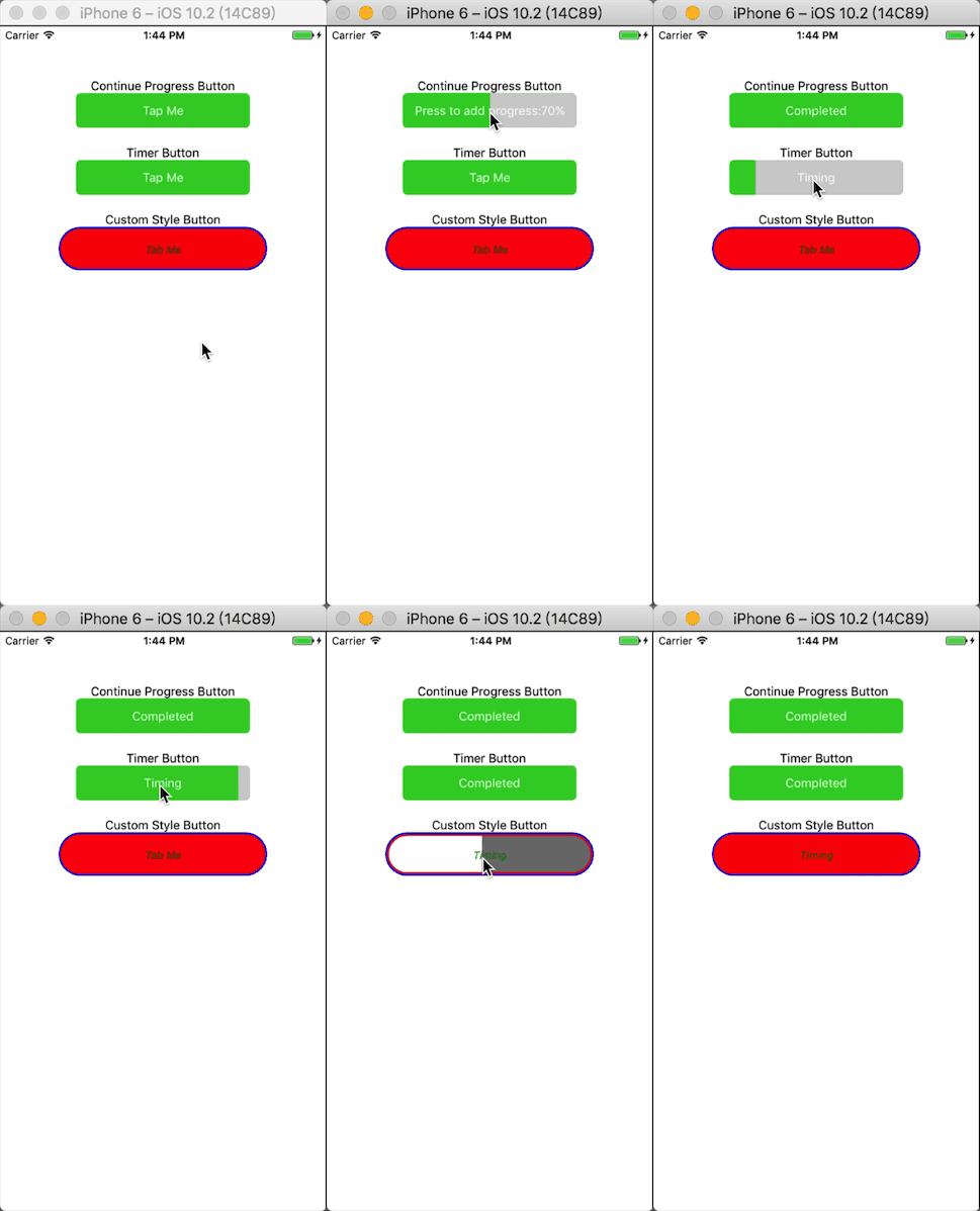
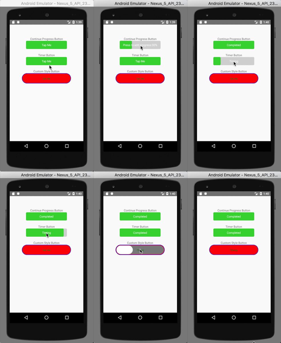
Because of overflow:hidden is not supported on Android, inner progress view displayed diffrently between android and ios when buttonState is progress. inner progress view will has border radius , but not in ios, according to outer border radius in android. And when the progress is small, inner progress view will look odd.So try not to set border radius too large in android.
License
MIT
