
react-native-press-and-hold-button
v0.6.0
Published
A customizable press and hold button component for React Native
Downloads
130
Maintainers
 ayonshafiul
Readme
react-native-press-and-hold-button
A big press and hold button component for React native
Installation
If you're using expo, react-native-svg is already included with the expo client, so no need to do anything.
If you're using react-native-cli and haven't setup react-native-svg make sure to follow Installation steps first
yarn add react-native-press-and-hold-buttonOr
npm install react-native-press-and-hold-button


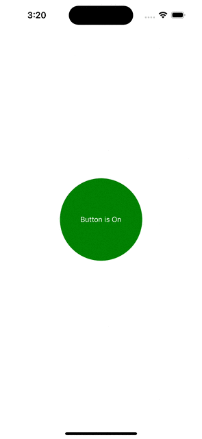
PressAndHoldButton
import { StyleSheet, Text, View } from 'react-native';

import PressAndHoldButton from 'react-native-press-and-hold-button';

export default function App() {
  return (
    <View style={styles.container}>
      <PressAndHoldButton
        size={190}
        onToggle={async () => {
          // simulate long api calls waiting time
          await new Promise((resolve, _) => setTimeout(resolve, 5000));
          // error out the response
          // throw new Error('Simulate error');
        }}
        onError={(err) => console.log((err as Error).message)}
        renderChild={(isOn: boolean, isLoading: boolean) => {
          return (
            <View
              style={[
                {
                  backgroundColor: isLoading
                    ? '#B2BEB5'
                    : isOn
                      ? 'green'
                      : 'red',
                  width: 160,
                  height: 160,
                  borderRadius: 80,
                  justifyContent: 'center',
                  alignItems: 'center',
                },
              ]}
            >
              <Text style={{ color: 'white' }}>
                {isLoading
                  ? 'Loading...'
                  : isOn
                    ? 'Button is On'
                    : 'Button is Off'}
              </Text>
            </View>
          );
        }}
        circleProps={{
          strokeWidth: 5,
          strokeColor: 'black',
          strokeLineCap: 'round',
        }}
      />
    </View>
  );
}

const styles = StyleSheet.create({
  container: {
    flex: 1,
    justifyContent: 'center',
    alignItems: 'center',
  },
});
Props
| Prop Name | Type | Required | Description | | ----------------------- | ------------------------------------------------- | ------------ | --------------------------------------------------- | | size | number | Yes | Specifies the size of the button. | | onToggle | (state: boolean) => void | Yes | Function called when the button is toggled. | | renderChild | (state: boolean, isLoading: boolean) => ReactNode | No | Optional function to render custom child content. | | containerStyle | ViewStyle | No | Style for the button container. | | circleProps | CircleProps | No | Optional props for the circle component. | | onError | (err: any) => void | No | Callback for handling errors. | | longPressDuration | number | No | Duration (in ms) to trigger the long press event. | | loadingAnimationEnabled | boolean | No | Enables or disables the loading animation. | | loadingAnimation | 'scale' | 'bounce' | No | Specifies the type of loading animation if enabled. |
CircleProps
| Prop Name | Type | Required | Description | | ----------------- | ----------------------------- | ------------ | ------------------------------------------- | | strokeWidth | number | Yes | Specifies the width of the circle's stroke. | | strokeColor | string | Yes | Defines the color of the circle's stroke. | | strokeLineCap | 'butt' | 'round' | 'square' | Yes | Determines the shape of the stroke ends. |
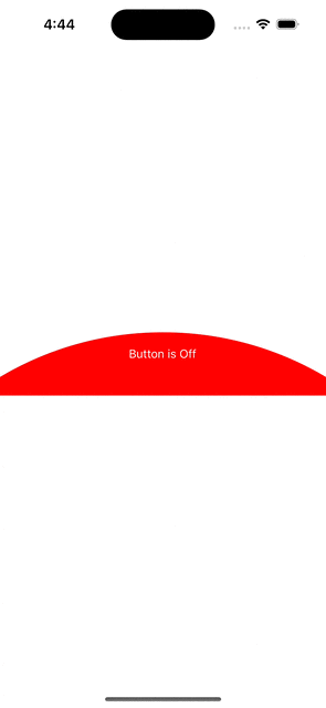
PressAndHoldButtonSemiCircle
import { Dimensions, StyleSheet, Text, View } from 'react-native';

import { PressAndHoldButtonSemiCircle } from 'react-native-press-and-hold-button';
const width = Dimensions.get('window').width;

export default function App() {
  return (
    <View style={styles.container}>
      <PressAndHoldButtonSemiCircle
        width={width}
        height={100}
        onToggle={async () => {
          // simulate long api calls waiting time
          await new Promise((resolve, _) => setTimeout(resolve, 5000));
          // error out the response
          // throw new Error('Simulate error');
        }}
        onError={(err) => console.log((err as Error).message)}
        renderChild={(isOn: boolean, isLoading: boolean) => {
          return (
            <Text style={{ color: 'white' }}>
              {isLoading
                ? 'Loading...'
                : isOn
                  ? 'Button is On'
                  : 'Button is Off'}
            </Text>
          );
        }}
        circleProps={{
          strokeWidth: 5,
          strokeColor: 'black',
          strokeLineCap: 'round',
          semiCircleColor: 'red',
          semiCircleOffset: 34,
        }}
        loadingAnimation="scale"
        longPressDuration={2000}
      />
    </View>
  );
}

const styles = StyleSheet.create({
  container: {
    flex: 1,
    justifyContent: 'center',
    alignItems: 'center',
  },
});
Props
| Prop Name | Type | Required | Description |
| ------------------- | -------------------------------------------------------------------------------------------------------------------------- | -------- | ----------------------------------------------------------------------------- |
| width | number | Yes | The width of the semi-circle button. |
| height | number | Yes | The height of the semi-circle button. |
| onToggle | () => Promise<void> | Yes | Callback function triggered on button toggle with an async operation. |
| onError | (err: Error) => void | No | Function called when an error occurs. |
| renderChild | (isOn: boolean, isLoading: boolean) => React.ReactNode | Yes | Function that renders a child component based on button state and loading. |
| circleProps | { strokeWidth: number; strokeColor: string; strokeLineCap: 'round'; semiCircleColor: string; semiCircleOffset: number; } | No | Object for customizing the circle's appearance (e.g., color, stroke). |
| loadingAnimation | 'scale' \| 'bounce' \| 'none' | No | Defines the type of animation shown during loading (e.g., scale, bounce). |
| longPressDuration | number | No | Duration in milliseconds for how long the button should be pressed to toggle. |
CircleProps
| Prop Name | Type | Required | Description |
| ------------------ | ------------------------------- | -------- | ------------------------------------------------------------------- |
| strokeWidth | number | Yes | The width of the stroke around the semi-circle. |
| strokeColor | string | Yes | The color of the stroke around the semi-circle. |
| strokeLineCap | 'round' \| 'butt' \| 'square' | Yes | The shape of the end of the stroke line. Default is round. |
| semiCircleColor | string | Yes | The color of the semi-circle itself. |
| semiCircleOffset | number | Yes | The offset position of the semi-circle, adjusting its top position. |
Contributing
See the contributing guide to learn how to contribute to the repository and the development workflow.
License
MIT
Made with create-react-native-library