
react-native-polygonal-menu
v1.2.0
Published
### Display and handle clicks on menus composed of non-rectangular buttons
Downloads
12

Readme
React Native Polygonal Menu
Display and handle clicks on menus composed of non-rectangular buttons
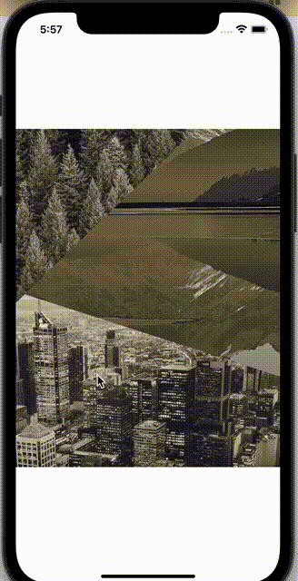
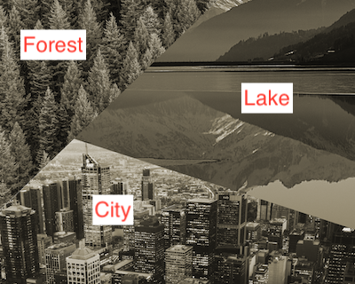
Imagine an image consisting of 3 parts (we'll call them regions here): a forest, a lake, and a city. The idea of the <PolygonalMenu> component is to detect clicks on each region and let the main program handle the user choice.
Installation
npm i react-native-polygonal-menu
Basic usage
- Get a background image composed of several regions
Using a graphics tool (e.g. GIMP), determine the positions of the edges of the polygonal buttons in your menu and store them as array of vertices.
NOTE: the coordinates of the vertices should be given in the units of the original image (pixels).
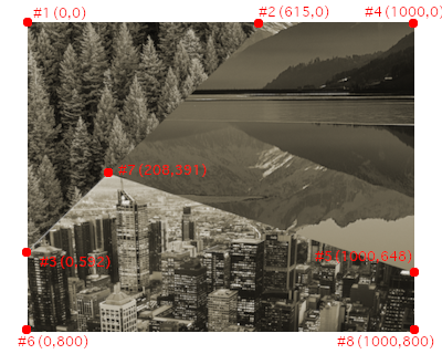
For example, in our case, the borders of the forest regions form a triangle made of point #1, #2 and #3, while the borders of the lake are the segments between points #2, #4, #5 and #7.
Now we can create the regions object like in the example:
const regions = {
  forest: [ { x: 0, y: 0 }, { x: 615, y: 0 }, { x: 0, y: 592 } ],
  // lake: ...
// city: ...- Insert the
<PolygonalMenu>component into your app
<PolygonalMenu
  regions={regions}
  backgroundImage={require('../assets/main-background.png')}
  onSelectRegion={handleSelect}
>
  // Insert any overlaying elements here...
</PolygonalMenu>
This will call handleSelect(region: string) each time a user clicks inside a region.
Highlight the currently selected region
PolygonalMenu also supports automatically highlighting the selected part of the screen, assuming we provide properly clipped transparent PNGs with only the highlighted sections. The highlighted sections images must be same size as the original image.
const HIGHLIGHTED_IMGS = {
  forest: require('../assets/forest_high.png'),
  // The keys must match the region names
}

<PolygonalMenu
  regions={regions}
  backgroundImage={require('../assets/main-background.png')}
  highlightedRegions={HIGHLIGHTED_IMGS}
  onSelectRegion={handleSelect}
/>
Using PolygonalMenu as a controlled component (keeping track of what's highlighted)
By default, PolygonalMenu keeps the currently highlighted region in its internal state. However, sometimes we might want to show the menu with one of the regions selected by default, or use the PolygonalMenu to select a setting that is meant to have lasting effects (with the latest selection highlighted). In this case, you can pass selectedRegion as a prop and handle its state manually in the parent component. The selectedRegion must match one of the highlightedRegions object keys.
const HIGHLIGHTED_IMGS = {
  forest: require('../assets/forest_high.png'),
  // The keys must match the region names
}

const [selectedRegion, setSelectedRegion] = useState<AvailableRegions>('forest')

<PolygonalMenu
  regions={regions}
  backgroundImage={require('../assets/main-background.png')}
  highlightedRegions={HIGHLIGHTED_IMGS}
  onSelectRegion={handleSelect}
  selectedRegion={selectedRegion}
/>
Notes / Caveats
- Make sure your base image is wide enough to cover the entire width of the rendered area. The region detection algorithm currently doesn't support menus based on vertically cropped images.
- You can pass
heightandwidthas optional props to the<PolygonalMenu>component. If these values are not defined, the module assumes we want to use{flex: 1}to fill the whole available space. - The regions must not overlap each other. They can share some vertices (like in the example), or be separated. In the latter case, when clicking on a part of the screen which doesn't belong to any defined region, the
onSelectRegioncallback will receive"_notFound"as the argument.
Thanks
I used RN Module Template to create this module.
Sample photos from Pexels: city - Maxime Francis, forest - Matthew Montrone, lake - Bri Schneiter.